How I Applied Machine Learning to Real Life for Planning My Trip to Hong Kong
Using k-medoids to figure out where I should visit on vacation


Oh, yes, the joy of traveling. Walking unknown paths, eating strange and weird-looking food, and getting lost in the city.
Yet, as fun and adventurous getting lost is, every now and then, we’d appreciate having some sort of guide or idea to know where to go next.
In a couple of days (edit: I’m here!), I’ll be visiting the faraway lands of Macau and Hong Kong. My time there, of course, won’t be unlimited, and so, I need a way to fit all those breathtaking vistas, quirky photo spots, and, well, more photo spots into my schedule.
“How should I start?” and “What should I do today?” were some of the questions I asked myself upon looking at my map (OK, I’m being a bit dramatic, but please play along with me).
To answer them, I had the same idea every product manager and CEO seems to be having these days: “Let’s use machine learning.”
In this project, I’ll apply unsupervised learning — a branch of machine learning — to separate all the places I wish to visit into nine different clusters, where each one represents a particular day, to get a slight idea of how I should plan my upcoming visit.
Moreover, besides just clustering the map, I also want to interpret the different clusters and the overall result.
By employing cluster analysis concepts such as dissimilarity and separation, I’ll be able to deduct further knowledge, such as the minimum distance between two clusters, which is information that may lead me to a better plan.
If you’re asking: “OK Juan, why are you doing this?” Fair enough. After all, mindlessly exploring a new place is one of the coolest things you can do while traveling.
However, I just wanted to take a real-life use case and see how ML supports it. Short answer? Because it’s a fun exercise.
Let’s begin.

The Tools
This project was done entirely in R, using the cluster package named cluster (fitting name) and ggmap for creating the maps. Besides, I also used Google My Maps to create custom maps of my locations.
The Data
This project’s data generation process starts in my head. In that mushy brain, I decided — after consulting Lonely Planet and other blogs — the places I wanted to see.
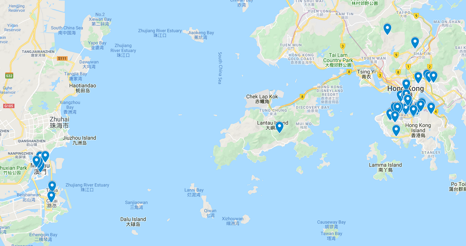
Then, I went to Google’s My Maps, and there, I created a custom map titled “Hong Kong and Macau” and pinned all the locations on it.
A great feature of Google’s My Maps is that it easily allows exporting the maps and pins to an external file. To do this, click on the map layer, mark the “export as KML” option, and download it.
The result is a KML file, that is, an XML format used to describe geographic data. Now, with the data on hands, the next step is to convert it into a beautiful and tidy tabular dataset.
Processing the Data
The KML file follows the following structure.
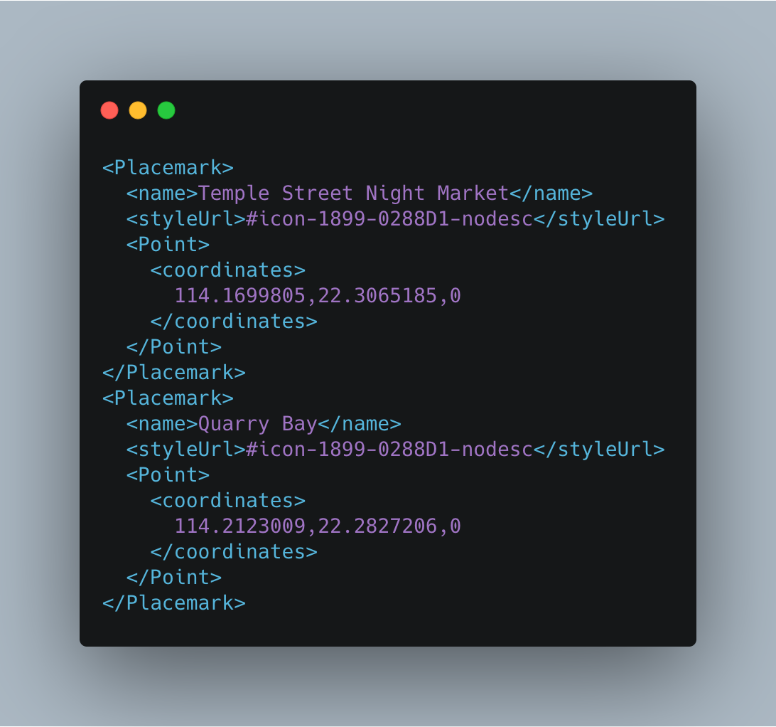
There’s a node named Placemark, and within it, there are three children: name, styleUrl, and Point.
The first one, name, is the location’s name, styleUrl is the pin’s style, and Point is the parent of coordinates, the node that contains the locations’ coordinates (longitude, latitude) and altitude (not used here).
To parse the file, I used a function provided by briatte on GitHub gist. This function takes as input the XML text and returns a data frame with the coordinates, location name, and altitude.
In the next snippet, you’ll find the code.
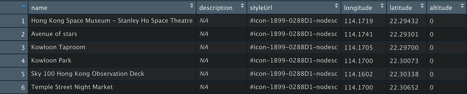
First, we load the XML file, define the functions, and use them to parse the file and convert it to a data frame.
Let’s plot the coordinates to see what it looks like.
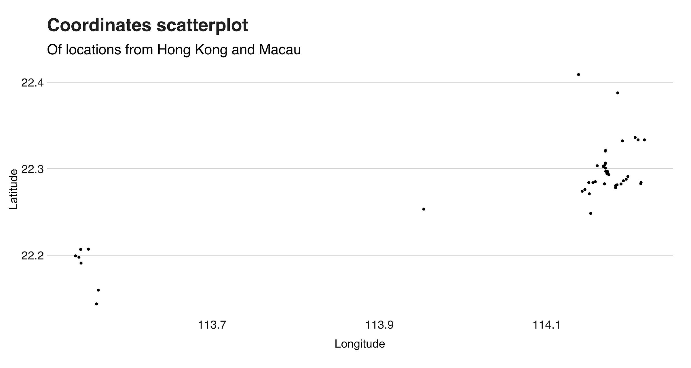
Just dots. On the plot’s left side, you can see the locations from Macau, and on the right, those from Hong Kong.

The Clustering
To cluster the data, I used R’s k-medoids implementation from the package cluster.
To apply it, we have to call the function pam (partitioning over medoids), sending as parameters the dataset and the number of desired clusters, which in this case is nine. Like this: p <- pam(df, k = 3).
By default, this method clusters the data using Euclidean distance as the dissimilarity metric, and as an alternative, it offers the Manhattan distance.
But sadly, it doesn’t include the Haversine distance. In such cases, where the algorithm doesn’t have the desired dissimilarity measure, a possible solution is using a dissimilarity matrix as input.
These kinds of matrices express the pairwise similarity between the points of the dataset — instead of the original dataset. This is how I calculated it:
Now, we cluster.
p <- pam(distances, k = 9, diss = TRUE)
See how the call to pam differs now? Unlike the last example, this time, I’m setting diss = TRUE to specify that the input is a dissimilarity matrix.
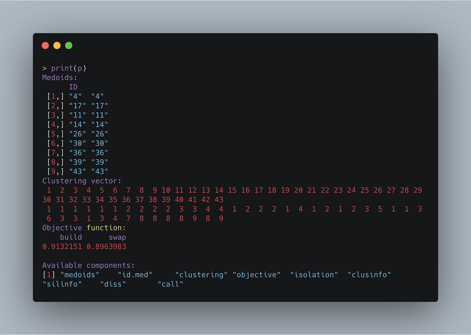
When the training is over (it takes less than a second), the function will return a pam object that represents the clustering.
If you print it using print(p), it’ll output the medoid’s index, clustering vector, the objective function’s value for both the build and swap phase (for the purposes of this article, it isn’t that important to know what this is), and the other available attributes.
The image below shows this.
Now, there’s only one remaining step, and that’s drawing the maps. To create them, I’m using ggmap, an R package that interfaces with the Google Maps API.
A powerful feature of this library is that it is fully compatible with ggplot2, so it is relatively easy to augment the maps with additional layers.
To use it, call the function get_googlemap, using as a parameter the coordinates of the place of interest. As optional parameters, you can set the zoom level, the map type, size, and scaling factor. This is an example:
And this is the clustered map.
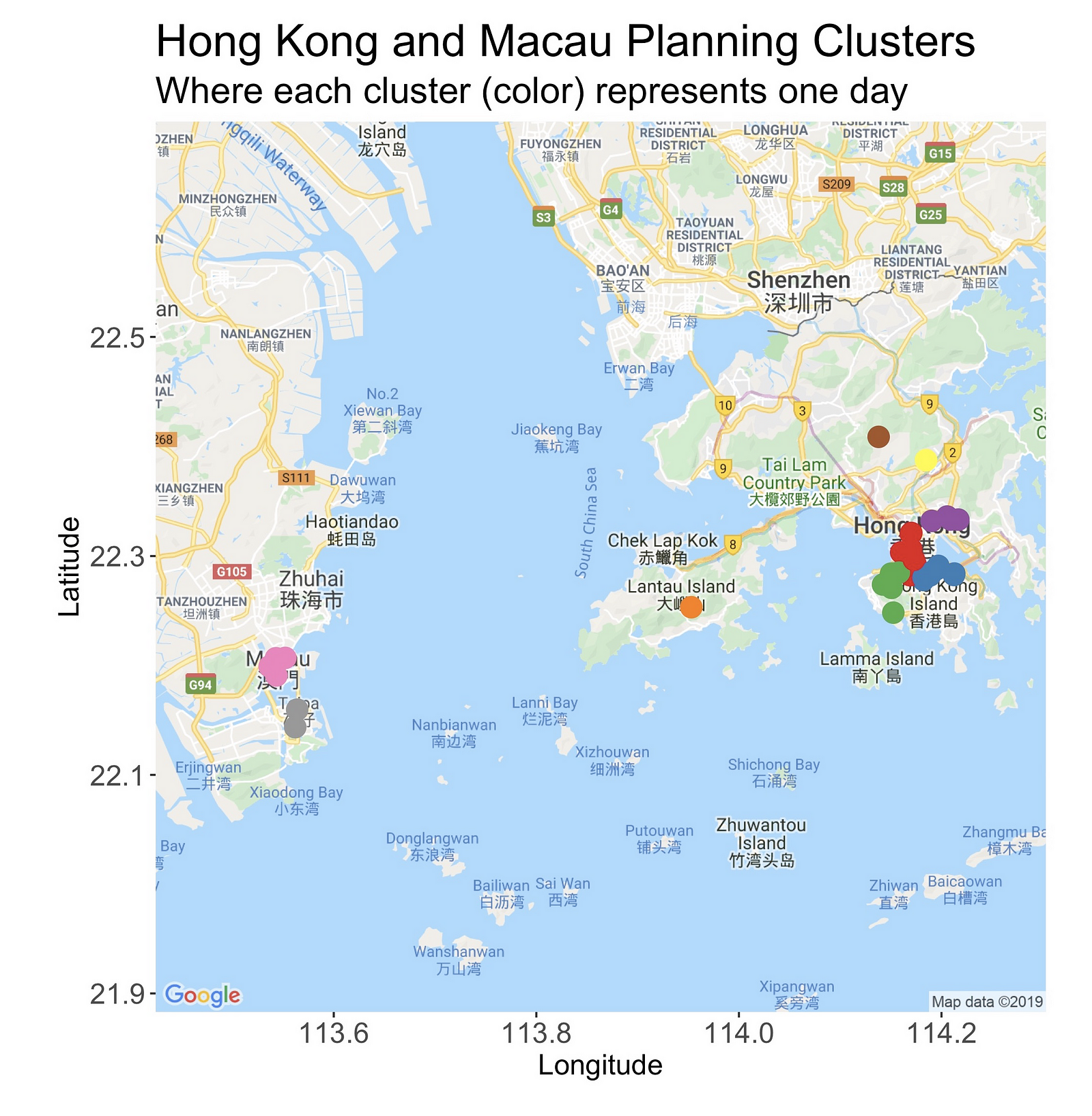
What do you think? Messy? Yes, it is! But right after this overview, I’ll present a zoomed-in version of them. Hold on.
On the west of the map is Macau, and there you’ll find two clusters. The one at the north is situated in the area known as the Macau Peninsula, while the second one is on the gambling paradise of Cotai.
Looking east, on the right side of the Pearl River Delta (a bit of geography is always good), is Hong Kong, and its seven clusters. The loneliest of them all is at Lantau Island, and it points to Sunset Peak, the third-highest peak in HK and a place I’d like very much to visit.
Speaking of summits, you’ll find another one — Tai Mo Shan, the highest point in the country — in the country’s northern region. Likewise, looking east (next to the number “2”), there’s another single-observation-cluster sitting atop of the Ten Thousand Buddhas Monastery.
Lastly, there are four clusters spread across Hong Kong Island and Kowloon. In the following sections, we’ll see a detailed look at them.
Macau Cluster
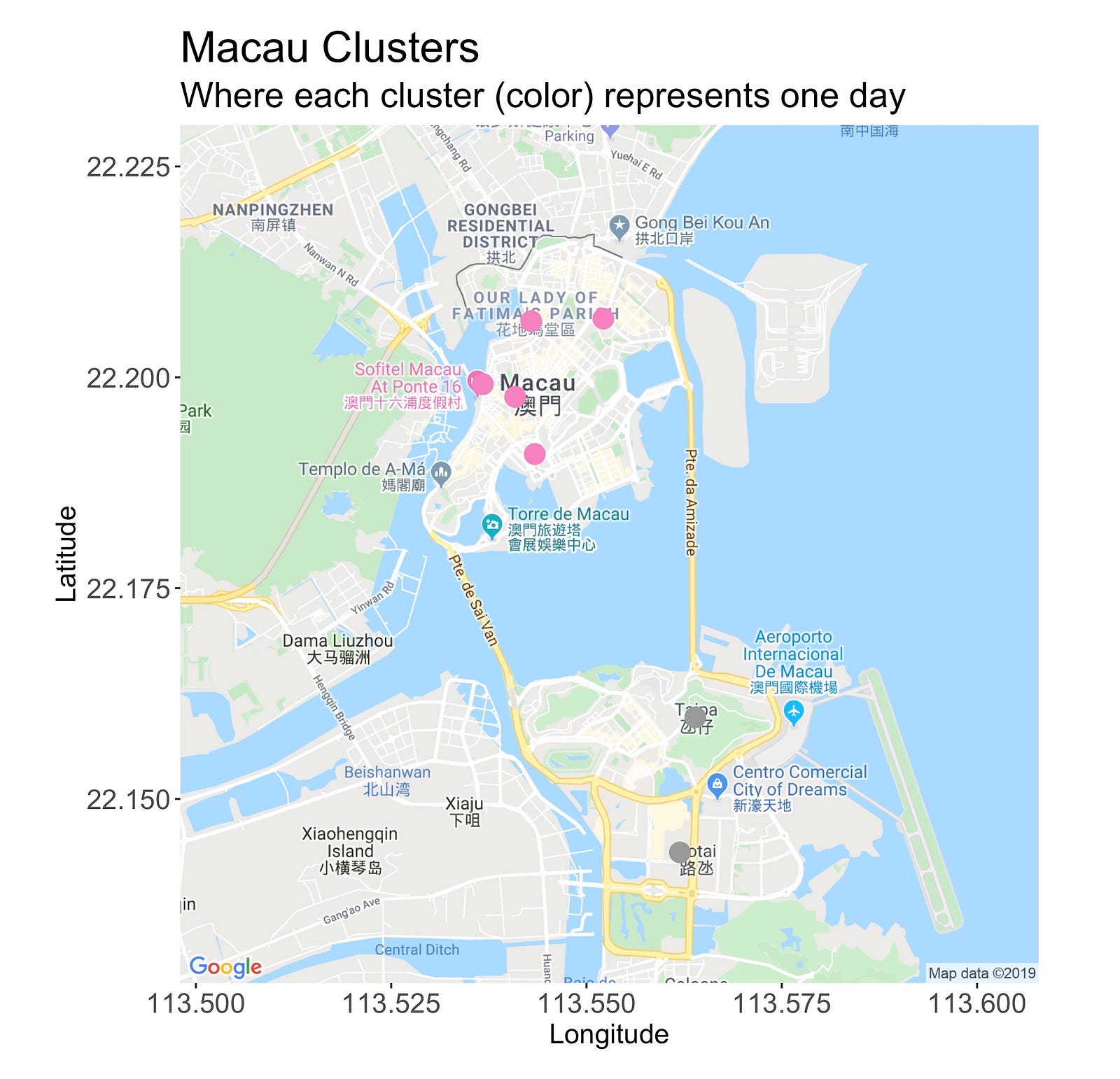
The Macau clusters are pretty well defined. As we’d expect, all the locations from the north island are under the same one, while those from the southern region belong to another one.
New Kowloon Area Clusters
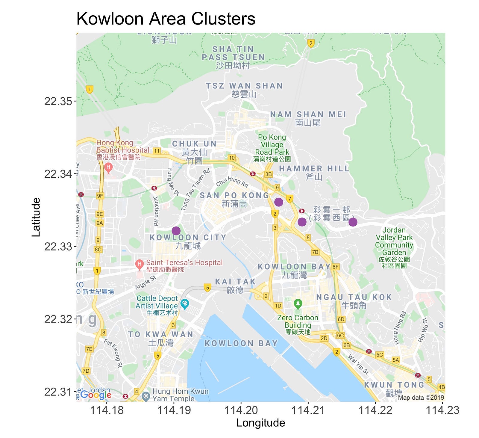
This cluster has four points. The first one, starting from the left, is the Kowloon Walled City Park, a lush and peaceful garden situated on what was the old Kowloon Walled City.
Moving right, you’ll meet both the Choi Hung and Ping Shek Estate, two residential areas with colorful and unique buildings that are perfect to capture on camera.
Then, to change the scenario, there’s the Kowloon Peak, a 602-meter mountain that’s great for waving goodbye to the sun while admiring the picturesque skyline.
Right now, as I write this sentence, it’s been a few days since I arrived in Hong Kong. On my second day, I actually followed the cluster’s “suggestion”, and it was pretty good!
Sure, it was a long day, involving climbing, walking, photographing, and dealing with my almost-dead phone, but totally worthy. I made one change, though. Instead of visiting Kowloon park, I went to another named Nian Lian Garden.
Tsim Sha Tsui and Hong Kong Island Cluster
The following image introduces the clusters located on Tsim Sha Tsui, the area north of the bridge, and Hong Kong Island, the southern island.
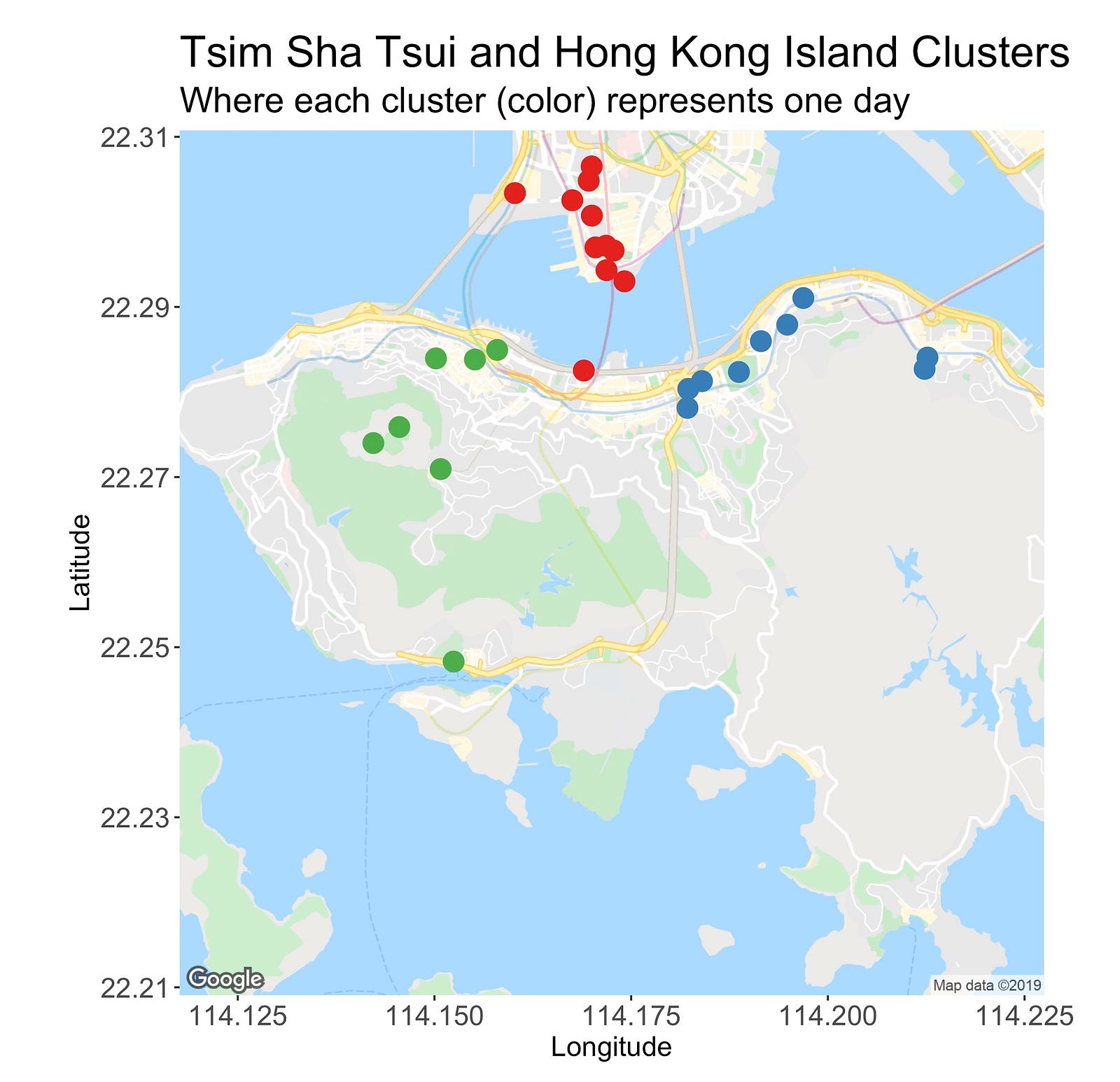
At first, the TST cluster seems like a good one. It’s small, very tight, distant from the others, and even though it has many points (it’s the largest cluster), it’s possible to enjoy and visit its locations in one day.
But hey, wait! What’s that red dot doing down there? That’s not right. This point is what I’d call an outlier or a misclassified observation. Or is it not?
If it is, then this fact essentially dismisses everything I just said about it. But why is it here? Check this out.
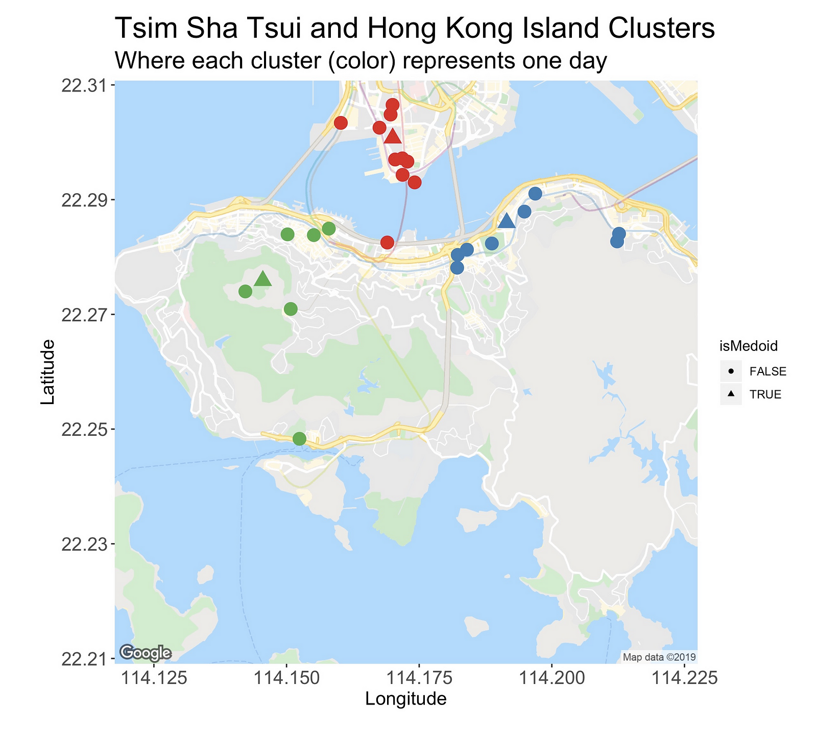
In this new version of the plot, I’m marking with triangles the cluster’s medoid, that is, the most centrally located site. Here, we can better appreciate that even though this isolated red dot is far from the rest of the gang, its medoid is actually closer than the other two.
So, in a technical sense, the datapoint location is “correct” (what is correct in unsupervised learning, anyway?), but for this use case, we’d prefer to have it in either one of the other two clusters.
This red point is also a clear example of one of the main pitfalls of this methodology, which is the miscalculation of the actual distance I have to walk.
The distance I’m using, Haversine, simply tells us about the distance from one coordinate to another, considering only the curvature of the earth. However, our journeys from one site to another aren’t quite linear; we change directions, go into tunnels, and have literal ups and downs.
These are details that add up a couple of extra meters to the travels. To circumvent this issue, we could use something like the Google Maps API to get the distance required to go from A to B.
Going back to the clusters, the green one on the left sits on the Central region. From this busy metropolis, I’m planning on visiting Victoria Peak, and several of its viewing spots, a temple, and HK’s cheapest Michelin star restaurant (very touristic day!).
Lastly, there’s the blue cluster on the right side of the map. It encompasses two areas, Causeway Bay and Quarry Bay. The former one is a shopping district and the second one is an area with several photo spots I’d like to see.

Cluster Analysis
One of the main reasons why I keep coming back to this R package and the k-medoids implementation is because of how simple it is to analyze certain components of the clustering.
More than just fitting the dataset, and obtaining some pretty maps, taking a deeper look at the clustering output is my favorite part of dealing with clusters, and thus, I’m always quite excited to talk about it.
Underneath all the points of a fitted cluster model, there is a whole world of scores waiting to be discovered and interpreted. When analyzed, these statistics allow us to better assess the “goodness” or “effectiveness” of the clusters.
In this section, we’ll take a look at the intra-cluster distance, that is, a measure that looks at the distances within each member of the cluster, and inter-cluster distance, which evaluates how far one cluster is from another.
The following table shows the values.
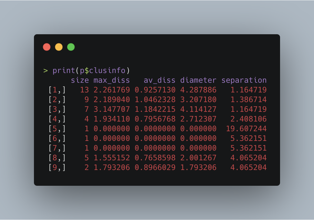
The table’s first column displays the clusters’ cardinality. As seen before, the largest one is made up of 13 points, while the smallest three contain just one mere location.
In the second column, we have the max_diss or maximum dissimilarity column, a measure of the distance between the cluster’s medoid and its farthest member.
For instance, cluster eight’s (Macau Peninsula) max_diss is 1.555152 km, implying that in a perfect and ideal scenario, I’d have to walk this distance to reach from Ruins of St. Paul’s (the medoid) to the Avenida de Venceslau de Morais, the cluster’s farthest point (according to Google Maps, the shortest path between these two places is 1.9 km, a value not so far from ours).
On the lower end, you’ll find that the single-point-clusters have a score of zero because its only point also serves as its medoid, while on the opposite side, there’s cluster three (the green one located at the west part of HK Island) which carries the highest value of 3.147707.
Then, in the third column, there’s the average dissimilarity (av_diss) between the observations and their medoid.
As before, cluster three leads the competition, which can be attributed to the point sitting at the bottom of the group. Being this far from its medoid will increase the average, even though the others are at a reasonable distance.
Although cluster three seems to be the king of dissimilarity, one might think that it’d also take home the diameter crown. However, that’s not going to happen.
The diameter score calculates the maximal dissimilarity between two observations of the cluster, in other words, it measures the distance between the two most-separated points.
This time, cluster number one (TST area; red) owns this category’s highest score. Its value is 4.287886, and the two places in question are the one located south of the bridge and one at the very top of the cluster.
In contrast, the smallest diameter belongs to cluster nine (Cotai in Macau) with a score of just 1.793206, which is also the same as its max dissimilarity since it only has one pair.
Last but not least is the separation value, which quantifies the “minimal dissimilarity between an observation of the cluster and an observation of another cluster.”
Here, we have a very diverse range of values where the minimum is 1.164719 (cluster one and three; TST and the Central region), and the maximum 19.607244 (Sunset Peak and cluster three), making the latter the most isolated location.

Recap and Conclusion
Traveling is one of life’s greatest pleasures. But, as indulging and glamorous as it is, the constant thought of what to do next can be somehow overwhelming.
In this article, I introduced a machine-learning-based approach that helps to release some of that pressure (OK, it’s not that bad, just let me exaggerate the issue).
Using k-medoids and Google Maps, we clustered into nine groups — where each one represents a day — a dataset of locations from Macau and Hong Kong that I’d love to visit.
Overall, we found out that most of the clusters make sense and are doable on that given day.
On the other hand, there were some where the distance between all the points were pretty comfortable, and others where we’ll have to take an extra step to manage it.
The approach we’ve seen here is far from perfect. As I mentioned, the algorithm is considering neither the location’s altitudes nor the actual possible path between a site and another. In the future, I’d like to find a way around this issue.
So, where are you going next? Thanks for reading.
Resources
The complete code is available on GitHub.