Learning an image's leading colors using k-means
Intersecting data and photography to find my preferred colors

Color preferences, like many things in life, is a very intrinsic, and unique quality of a person. You have a favorite color, but more than that, I'm willing to say that you have a preferred tone for many of the things that you own. For example, you favor a particular color for your shoes, another one for your phone case, and in my case, I lean towards some colors while working a photograph.
Besides being a data practitioner, I'm also an amateur photographer, and a few days ago, while editing an image, I realized I have a favored list of colors that I typically use on different objects or parts of the photograph. For example, I like my skies either gray, or strongly blue, my greens, a bit yellowish, and my darks, more "shadow-ish."
To corroborate my beliefs, and also to find a way to intersect my passion for data and photography, I decided to use machine learning, especially, a classic unsupervised learning algorithm, k-means to cluster the pixels of some of my images and learn what the leading or dominant colors are. Moreover, to further understand the photos and to complement the main part of the analysis, I'll be projecting the images to another representation using the dimensionality reduction algorithm t-distributed stochastic neighbor embedding or t-SNE.
The Data
In this experiment, I'll be finding the leading colors of nine photographs I took in my recent visit to Austria and Singapore.
The Tools
This experiment is done in Python, and it uses the library scikit-learn to fit the k-means model, OpenCV for manipulating the images, and HyperTools for projecting the space using t-SNE.
The Experiment
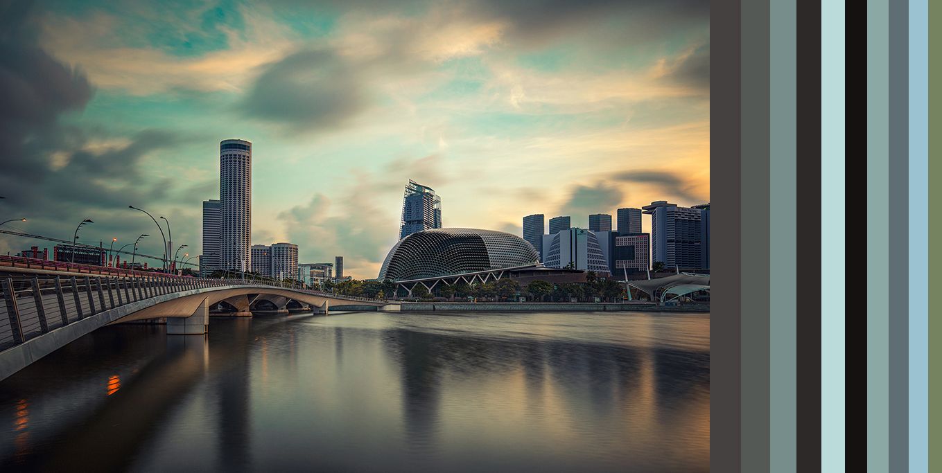
Let's take a look at this image I took in Singapore. What colors do you see? Which are the most common ones? For us, humans, this is pretty easy. At first instance, we might say several tones of gray, blue, and a bit of orange. What does the algorithm say? Can we automate this? Sure, but before getting there, I want to project the red, green, blue channels using t-SNE to understand a bit better what is truly going on here.
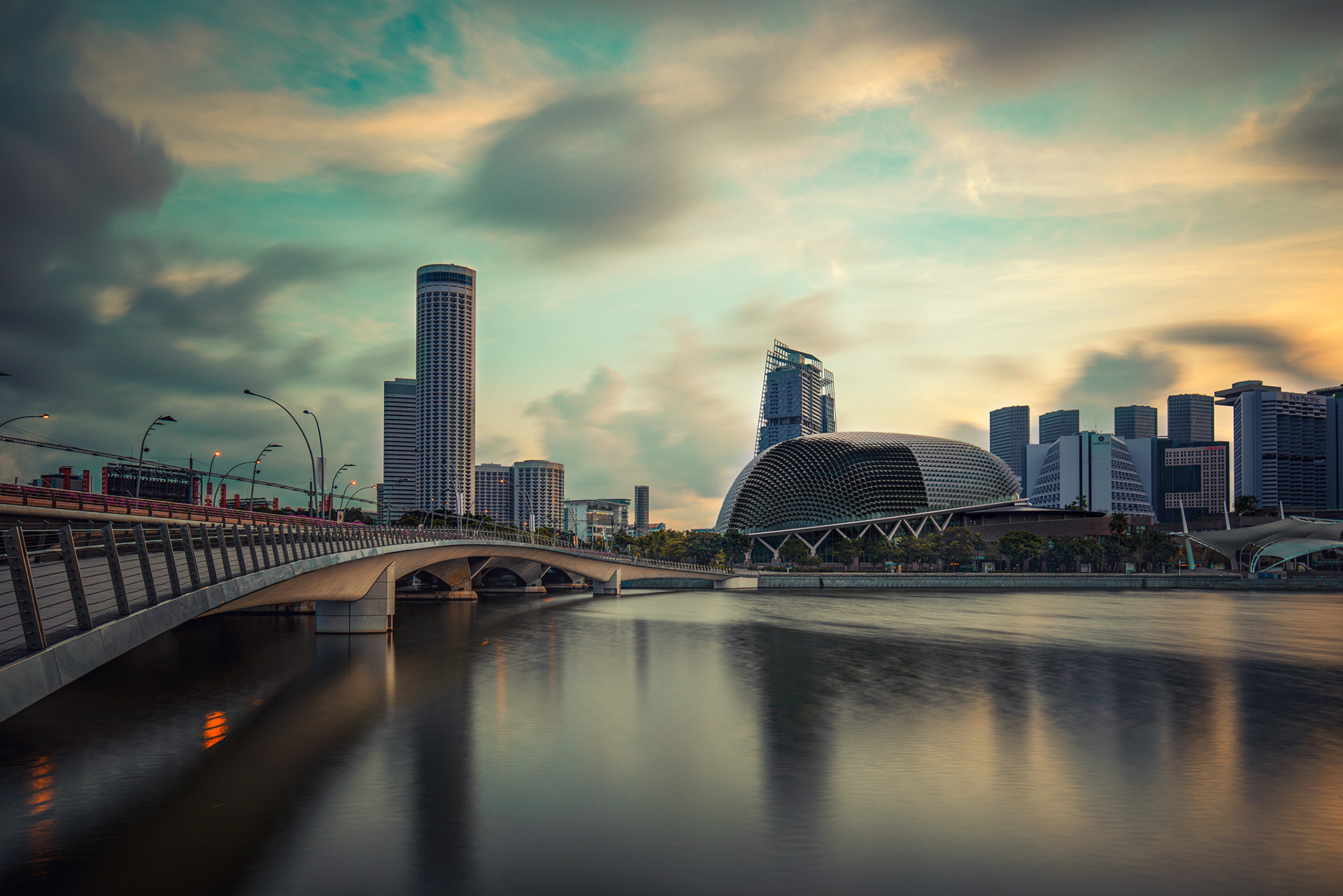
Esplanade – Theatres on the Bay. By me.
t-SNE is commonly used for embedding high-dimensional data into two or three dimensions by grouping similar objects and modeling them with nearby points, while "dissimilar objects are represented by distant points". This characteristic of the algorithm makes it suitable for "clustering" data, even if it is already low-dimensional, such as in this case.
The following three images are the t-SNE representation of the different color channels of the previous picture.

2D t-SNE projection of the red color channel.

2D t-SNE projection of the green color channel.

2D t-SNE projection of the blue color channel.
On each of these images, we can see different groups of pixels. My interpretation of these snakes-like groups is that each one describes similar tones within that color channel. For example, the red channel plot has five different groups, and they might represent different tones of red, such as light tones and saturated tones. However, are these groups the leading colors? Let's find out.
Before fitting the model, I had to reshape the image data. By default, a colored image is a 3D matrix consisting of the picture's width, length, and three color channels. For this application, we are going to transform this vector space into a 2D dataframe made of width*lenght rows and 3 columns (one for each color). Then, we can cluster.
The experiment's clustering algorithm is k-means, an unsupervised learning algorithm that clusters data observations in such a way that each point is grouped with others that are similar to it. For this project, I went with k=10, meaning that we'll obtain 10 dominant colors.
The following piece of code shows the process.
import cv2
import numpy as np
import matplotlib.pyplot as plt
import hypertools as hyp
import numpy as np
from sklearn.cluster import KMeans
from os import listdir

def get_leading_colors(directory):
    for filename in listdir(directory):
        img = cv2.imread(directory + filename)

        # by default, cv2 uses BGR so we need to change it to RGB
        img_data = cv2.cvtColor(img, cv2.COLOR_BGR2RGB)
        r, g, b = cv2.split(img_data)

        # plot a t-SNE projection of each color channel
        hyp.plot(r, '.', reduce='TSNE', ndims=2, color='red',
                 title='2D t-SNE projection of the red channel',
                 size=[14, 8])
        hyp.plot(g, '.', reduce='TSNE', ndims=2, color='green',
                 title='2D t-SNE projection of the green channel',
                 size=[14, 8])
        hyp.plot(b, '.', reduce='TSNE', ndims=2, color='blue',
                 title='2D t-SNE projection of the blue channel',
                 size=[14, 8])

        # row * column, and number of color channels (3 because of RGB)
        img = img.reshape((img_data.shape[0] * img_data.shape[1], 3))

        # the number of clusters indicate how many leading colors we want
        model = KMeans(n_clusters=k, init='random', random_state=88)
        model.fit(img)

        hist = compute_histogram(model)
        rect = draw_leading_color_plot(hist, model.cluster_centers_)

        plt.axis('off')
        plt.imshow(rect)
        plt.show()
Once we have clustered the data, we need to find a way to extract this information and visualize it. So, I built a histogram using as input the result of the clustering, and k as my number of bins. The result is a frequency count list that indicates how many pixels fell under each label. Then, we normalize the list to obtain a list of the percentage of pixels under each label. In short, in this part, we are summarizing how many pixels belong to each cluster.
This is the function.
def compute_histogram(model):
    labels_list = np.arange(0, k + 1)
    # this histogram says how many pixels fall into one of the bins
    (hist, _) = np.histogram(model.labels_, bins=labels_list)
    hist = hist.astype('float')
    hist /= hist.sum()

    return hist
Lastly, we'll draw a rectangle made of the leading colors, in which the length of each color chunk is proportional to the percentages calculated above.
def draw_leading_color_plot(hist, centroids):
    # the first two values of np.zeros(...) represent the size of the rectangle
    # the 3 is because of RGB
    plot_width = 700
    plot_length = 150
    plot = np.zeros((plot_length, plot_width, 3), dtype='uint8')
    start = 0

    for (percent, color) in sorted(zip(hist, centroids), key=lambda x: x[0], reverse=True):
        end = start + (percent * plot_width)
        # append the leading colors to the rectangle
        cv2.rectangle(plot, (int(start), 0), (int(end), plot_length),
                      color.astype('uint8').tolist(), -1)
        print(color)
        start = end

    # return the rectangle chart
    return plot
Now, let's see the result. These are the leading colors of the Singapore image.

The bars on the right side represent the leading colors learned by the algorithm.
The bars on the right side of the image are the leading colors found by the algorithm. The first two colors, which are tones of gray, mostly appear in the clouds, water, and within the shadows of the image. Next, we have the blues, which are present in the sky and water. Lastly, there's the green from the trees.
Do you agree with the algorithm's findings?
Let's see other examples of images and their leading colors. The first four photographs are from Singapore and the rest from Austria. Can you find any peculiarity in my choice of colors depending on the region?

A nice building. Notice how white is one of the dominant colors.

The amazing Rain Vortex at Changi Airport. Not 50 shades of gray, but almost there.

The Merlion. This one is made of blues and greens.

Marina Bay Sands. The algorithm found that earthy tones are the most common colors.

Mountain and reflection. The dominant colors of this one seems to come from the sky and the woods.

Innsbruck. This one has a sepia-ish vibe.

Another mountain and its reflection. Honestly, I'm quite surprised the algorithm didn't find the blue.

Natural frame. Whites, blacks and blues.
Conclusion and recap
In this article, I showed a technique to find an image's leading colors using k-means and Python. Personally, I'm happy and satisfied with the results. Even though the outcome was not perfect – some obvious leading colors weren't detected – I'd say that it was able to capture the essence the colors I typically use in my images – grays, dark blues, and browns.
When working with unsupervised learning, there's no right or wrong answer, as there are many variables involved in the process, with the most critical one being the initial location of the centroids. This problem results in the algorithm learning something we don't want, and in this particular use case, this means producing a leading color, which in reality isn't one of the most common ones. An alternative to the method described in this article (and honestly, one that might produce more accurate results), would be a more programmatic and direct approach in which we'd have to iterate over the picture to build a frequency count.
Thanks for reading. If you have any questions, doubts, or just want to chat, leave me a comment, and I’ll be happy to answer.
This experiment's source code is available at my GitHub, here: Wander Data - Images
This article is part of my Wander Data series, in which I’m telling and reliving my travel stories with data. To see more of the project, visit wanderdata.com.