I’ve tracked my mood for over 1000 days—a data analysis
Using data to better understand what I did and how I felt

I've been using a mood tracking app for over 1000 days. It started as you might expect: I browsed the app store, downloaded it, and tried it. I liked it. It was fun, trendy, and a perfect addition to my ever-growing collection of time sinks. But it developed into more than that (which I realized when I moved it to my phone's home screen and bought the premium version). The five to ten seconds I need each night to track my mood became my daily meditation; my time to recap the day's moments, be genuine with myself, and ask, "how am I feeling?"
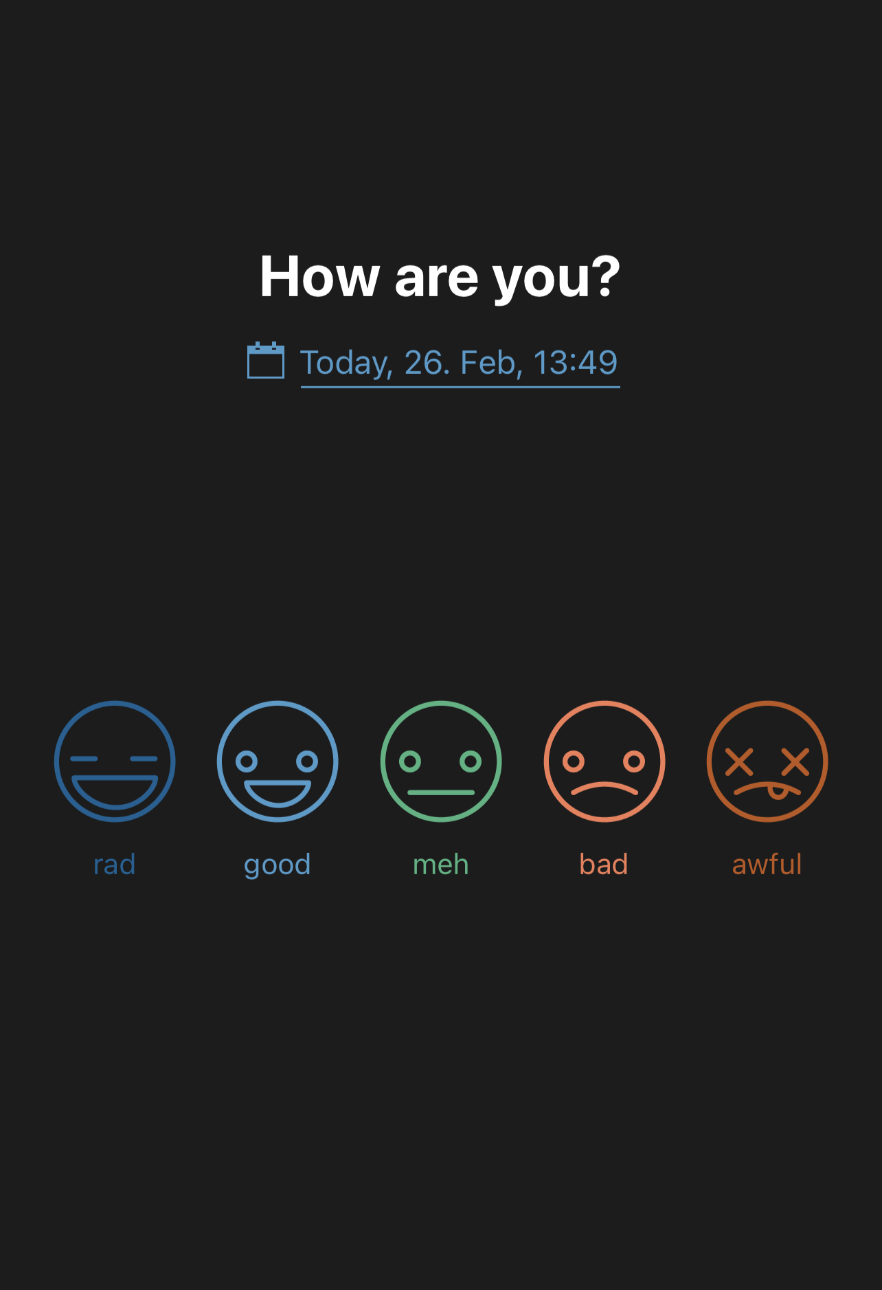
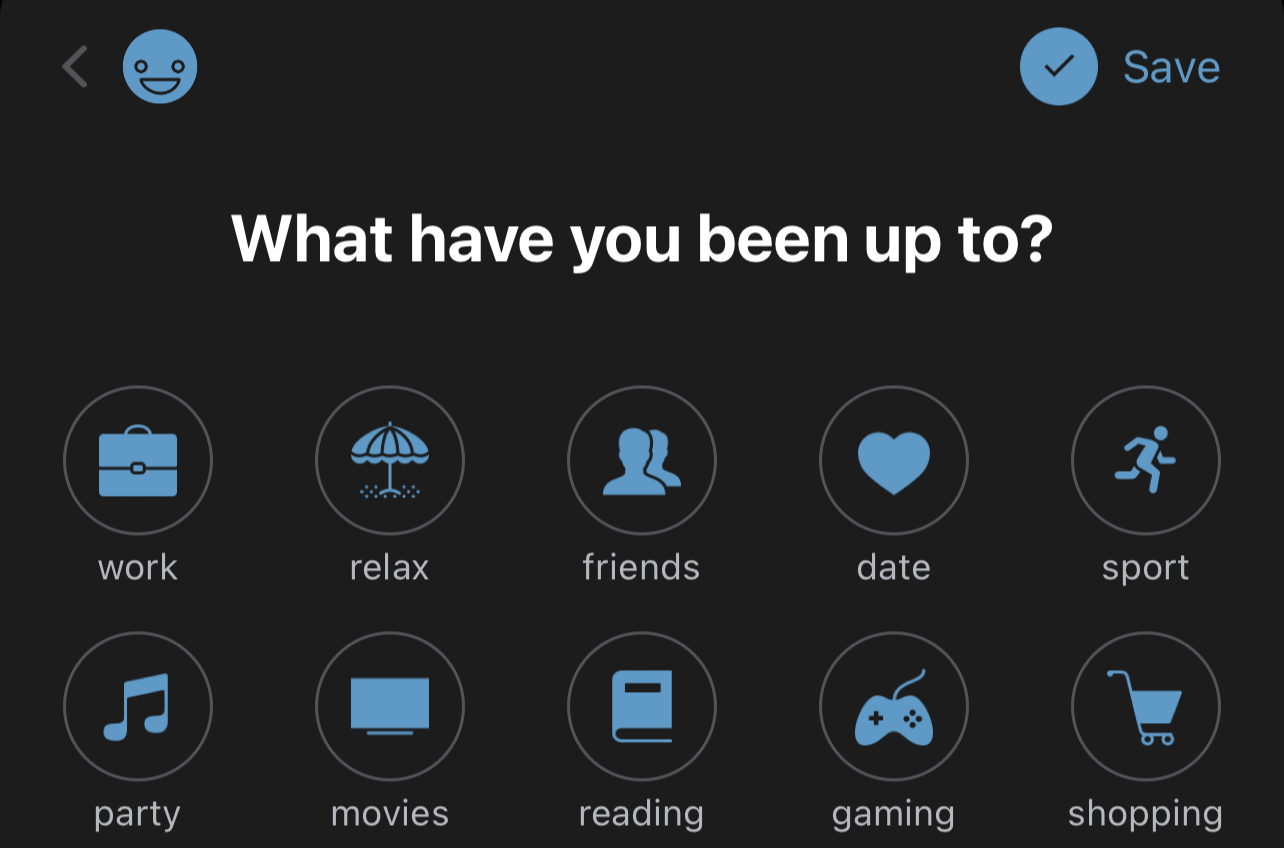
I use an app called Daylio. Every day, at a set time, it sends me a notification asking how I am doing, and I answer by clicking one of the five faces ranging from somber to ecstatic. After choosing one, the app asks what I did today and shows a predefined list of activities like "drinking," "friends," and "shopping" to choose from. It also allows you to add a custom activity to this existing list. For example, one of my custom activities is "Pokémon!" (including the exclamation mark) and "baking."
This article will present what I found after analyzing the Daylio's data I've amassed throughout these years. My investigation features statistical methods that include time series analysis and correlations and focuses on the relationship between moods and activities, the mood check-in times, and how my mood score has changed. But wait, don't go yet! I know the terms "statistics" and "correlation" are scary. That's why I promise I'll hide the nasty details and complexities. Instead, I'll disguise them as 21 charming little charts that are easier to digest.
For the tech-savvies reading this, you'll find at the end of the article a link to my GitHub repo containing the R notebook I wrote to analyze the data and another to the library I used to extract the data.
Now, to the analysis.
A lengthy summary
I’ve been tracking my mood for at least 1017 consecutive days. The first entry was on January 4, 2019—hooray for New Year’s resolutions—and the last one, October 19, 2021. I said at least because, as I’m writing this sentence, I’m still using the app, but the analysis won’t contain data past October 19, 2021.
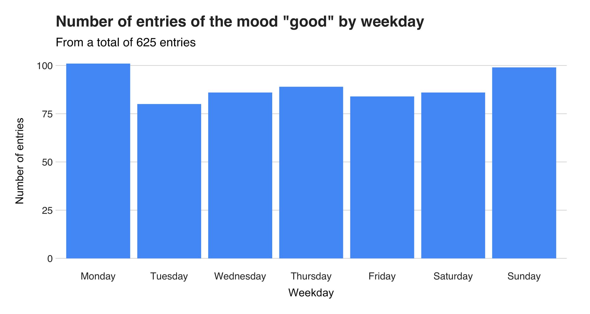
In these 1017 days, I’ve logged my mood 1031 times (initially, I wanted two records per day but ended up with just one). So, we can say that on average, I have one mood per day. Figure 1, the first chart of the article, shows these 1031 records, grouped by the four moods "rad," "good," "meh," and "bad."
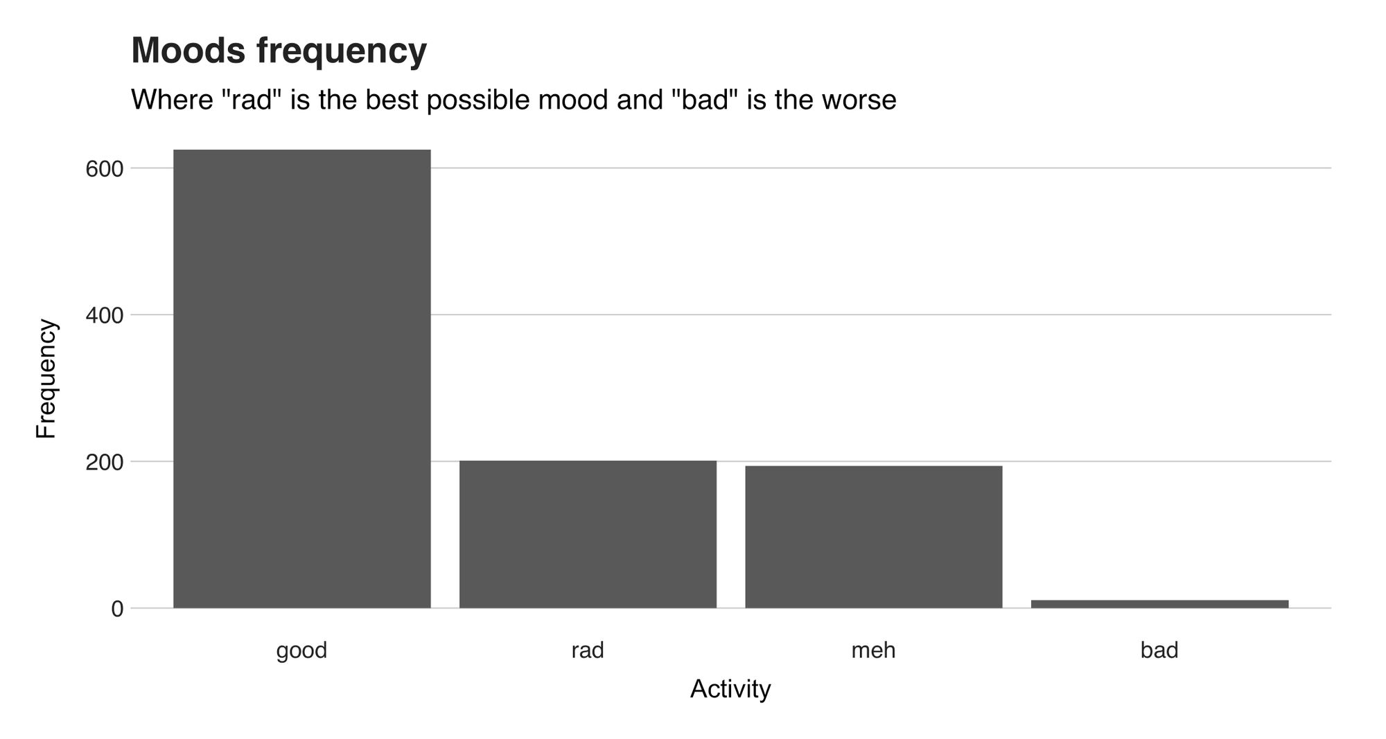
With 625 appearances out of 1031 entries (61% of them), "good," the fourth-best mood, leads the chart. Next is "rad," the app's best mood, and one that I agreed with on different 201 (19%) occasions. On the sadder end, we have 194 (19%) "meh" and 11 "bad" (1%). Furthermore, there's a fifth and even sadder mood named "awful" that's absent from the article because I've never had to use it. Hopefully, it will stay that way.
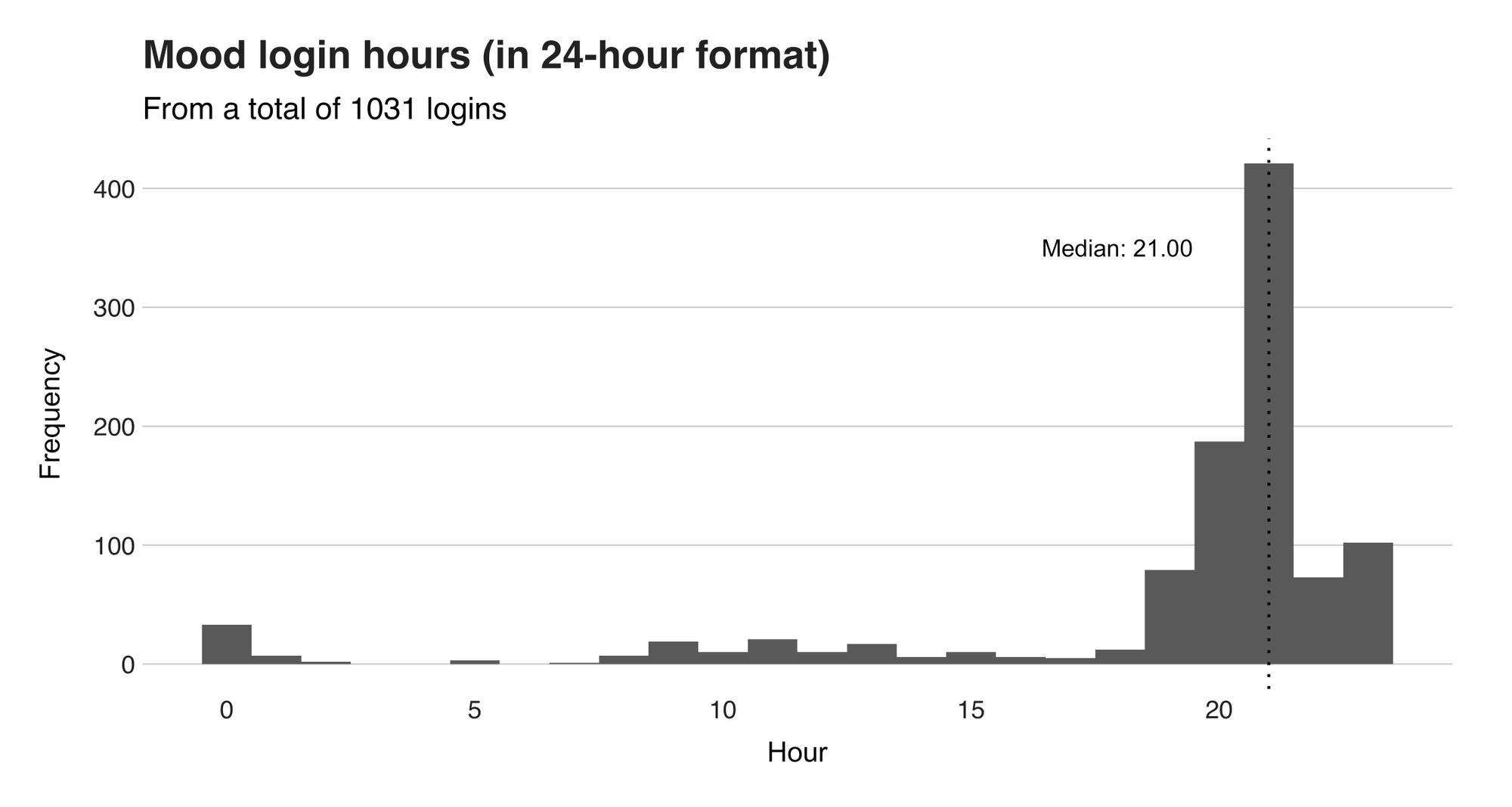
You can add a list of activities describing that day's actions to each mood record. In my case, I usually register the day's most memorable activities or those I did around the mood's check-in time, which is around 9 pm (as seen in Figure 2). An example of an activity I often ignore is “gym.” I do so because I go there almost every day (so it’s not so memorable) in the early hours of the morning (nowhere near 9 pm).
I've reported 44 different activities in these 1031 mood records. Furthermore, I describe some of them as funny or boring, happy or sad, exceptional or unpleasant. But they are me—they portray who I am and what I do.
As we go through the article, you might see several activities whose meaning is unclear, and you may wonder what they mean. So, to avoid any doubt, I’ll sporadically describe them as they appear. Now, follow me to Figure 3, where I’ll introduce my 44 activities and how often I chose them.
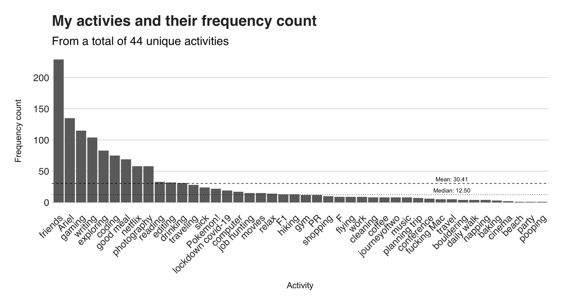
"Friends" (and no, I'm not referring to the TV show) is the number one activity. This activity, used to describe a fun day spent with friends, pops up 229 times in the dataset. That's 17.11% when compared to the grand total of 1338 activities I've added across my 1031 check-ins. Such top activity, say that—and I'll be cheesy here—at a day's end, friends are what stay in my mind. It doesn't matter whether I did X or Y. That's secondary. What matters is that, if I spent that day with friends, that evening, I'll click the "friends" icon and say, "today was a good day."
Since we're talking about people, I'll take this opportunity to introduce a person who played an important role in my life. Her name is Ariel and she is my ex-girlfriend. Well, that's not her name, but a pseudonym I chose because I saw a Little Mermaid meme while analyzing the data. But before that, even before writing the analysis' first line of code, I knew her name would pop up many, many times— and indeed it happened. As the chart shows, she's the second top most-mentioned activity. That’s 135 entries of 10.09% of the total. Quite a lot, right? After all, we shared many years and experiences together.

If there’s an activity from Figure 5 that made you laugh or frown, I’ll bet it was “pooping.” We all poop, even several times on a good day. Yet, I only recorded once. Was it a thrilling or horrendous trip to the bathroom? I don’t remember. Nonetheless, it certainly marked January 6, 2019.
Assigning a numeric value to the moods, where "1" is "awful" and "5" is "rad," produces a mean and median score of 3.99 and 4. Thus, we could conclude that my typical mood is "good." But that's a boring approach to condense three years of data, particularly since a mood record includes a list of activities. So, what if I use the activities to discover how they influence the mood? Figure 4 has the answer.
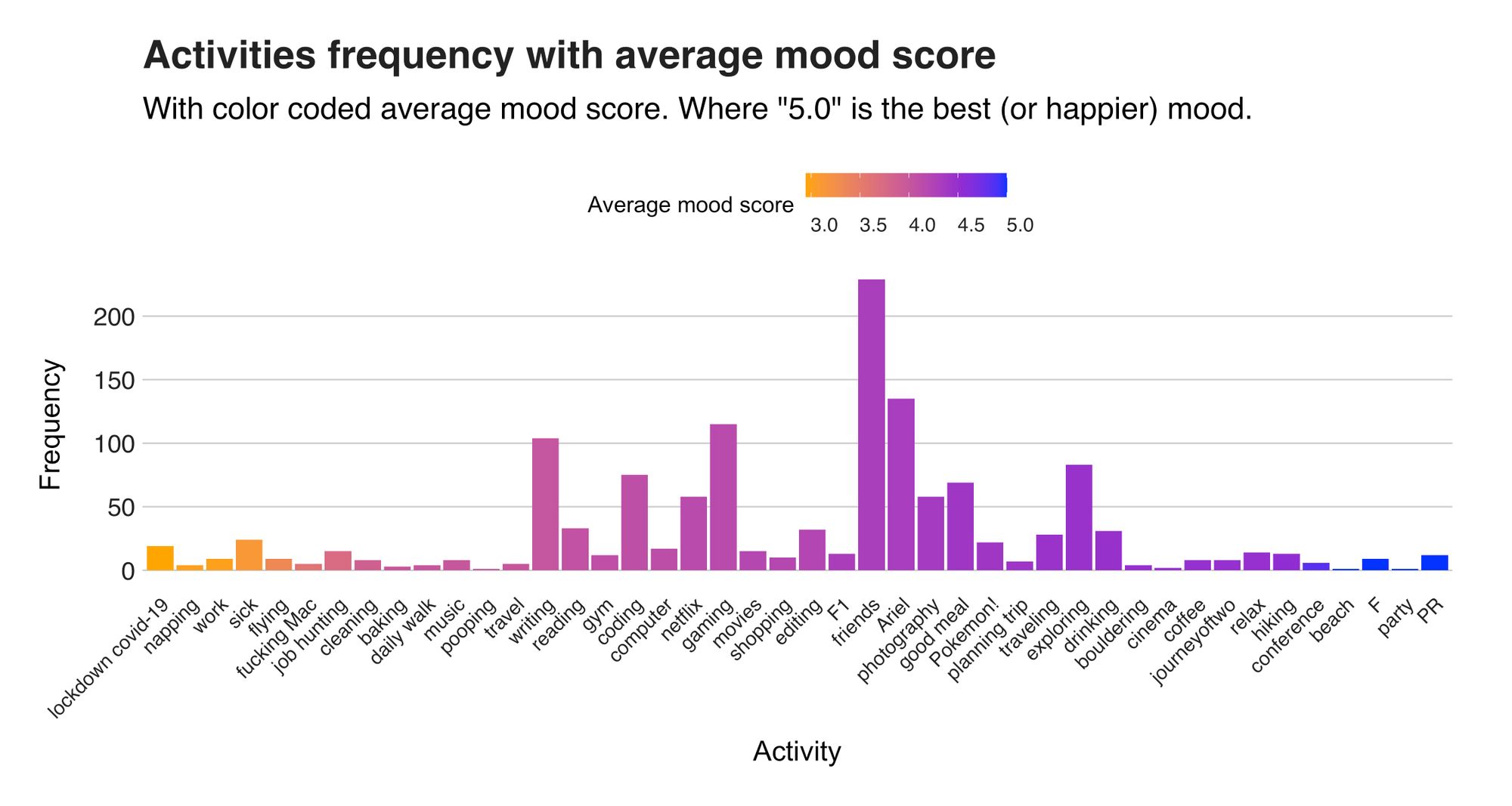
Colorful Figure 4 shows the activities (X-axis) and their frequency count (Y-axis), sorted by the mean mood score taken from days when said activity is present. On the left side, in orange, we have the sad activities that produce the lower average mood score, and on the right, the happiest ones with a high score. The first of these, with an average mood score of 2.94, is "lockdown COVID-19," and it references the days spent at home because of the restrictions. Next is "napping," and yes, I'm talking about naps. Do you remember when you were a kid and ran away from naps? I'm still not a fan of them—unless I'm feeling unwell ("sick" is also one of the worst activities) or moody and don't know how to proceed with my day.
Another negative activity is "fucking Mac." Before jinxing it, I need to say I love my Mac. It's been with me for about four years and in many adventures. But wow, isn't it problematic? I've sent it in for repair five times in those four years. Usually, I don't care because, whatever, things break. But not when it stops working two weeks before my book's first draft deadline and the nearest Mac store is four hours away.
Another noteworthy negative activity is "job hunting." Let me give context. In early 2020 I was in New Zealand, the 11th (and final) country I visited a part of my year-long backpacking adventure. At the same time, as I hiked, drove (on the left side), and ate pies, something larger was unfolding in New Zealand and the rest of the world: the COVID-19 pandemic. What's bizarre is that since I was away in the wilderness, I didn't realize the gravity of the situation until I reached the city of Christchurch. Soon after, the lockdown started. And just like that, I was alone in an apartment in Christchurch. Amid my confusion and not knowing what was next, I declared my trip was over and went job hunting. But finding a job back then was rough, not only because companies stopped hiring, but also because I was far from countries where I could potentially get one. So, instead of a job, I amassed a collection of emails starting with the words "thanks for your interest."
What interests me, though, is everything in the chart's central region and after, for this is what makes me feel good. Each purple item has at least an average score of 4, which equals a "good" mood. One of these is "friends," covered earlier; others I want to highlight are "Pokémon," "photography," "good meal," "editing" (pictures in Photoshop), and "writing." After “good” comes “rad,” the perfect mood and represented by four blue-colored activities at the chart's end. The activity "F" refers to F, one of my closest friends, who's in my data because of how happy I was when he flew from Puerto Rico (my home country) to Germany (where I currently live) to have a week of adventures involving trains, countless ugly selfies, and beers. Last is "PR," and it references a summer break in Puerto Rico, where among other things, I visited F (and we did more ugly selfies).
Besides the average, there's a second statistic called the standard deviation that I applied to the lists of moods per activity. The standard deviation is a number describing how dispersed the values of the list are. (A formal and more mathematical definition would be a number expressing by how much the values of the list differ from that list's mean value). So, for example, the standard deviation of the list 1, 3, 6 is 2.52, and that of the list 1, 5, 10 is 4.51—the latter is greater because there's more "space" between that list's values. An example related to this experiment is Ariel's activity list of mood scores. This activity's average mood is 4.33. But, since I know that many of the activity's moods are either 3 or 5—and not 4—I would expect a significant standard deviation because 3 and 5 are far from 4 (in this context). So, how dispersed (larger standard deviation) or condensed (smaller standard deviation) are my moods per activity? Figure 5 has the answer.
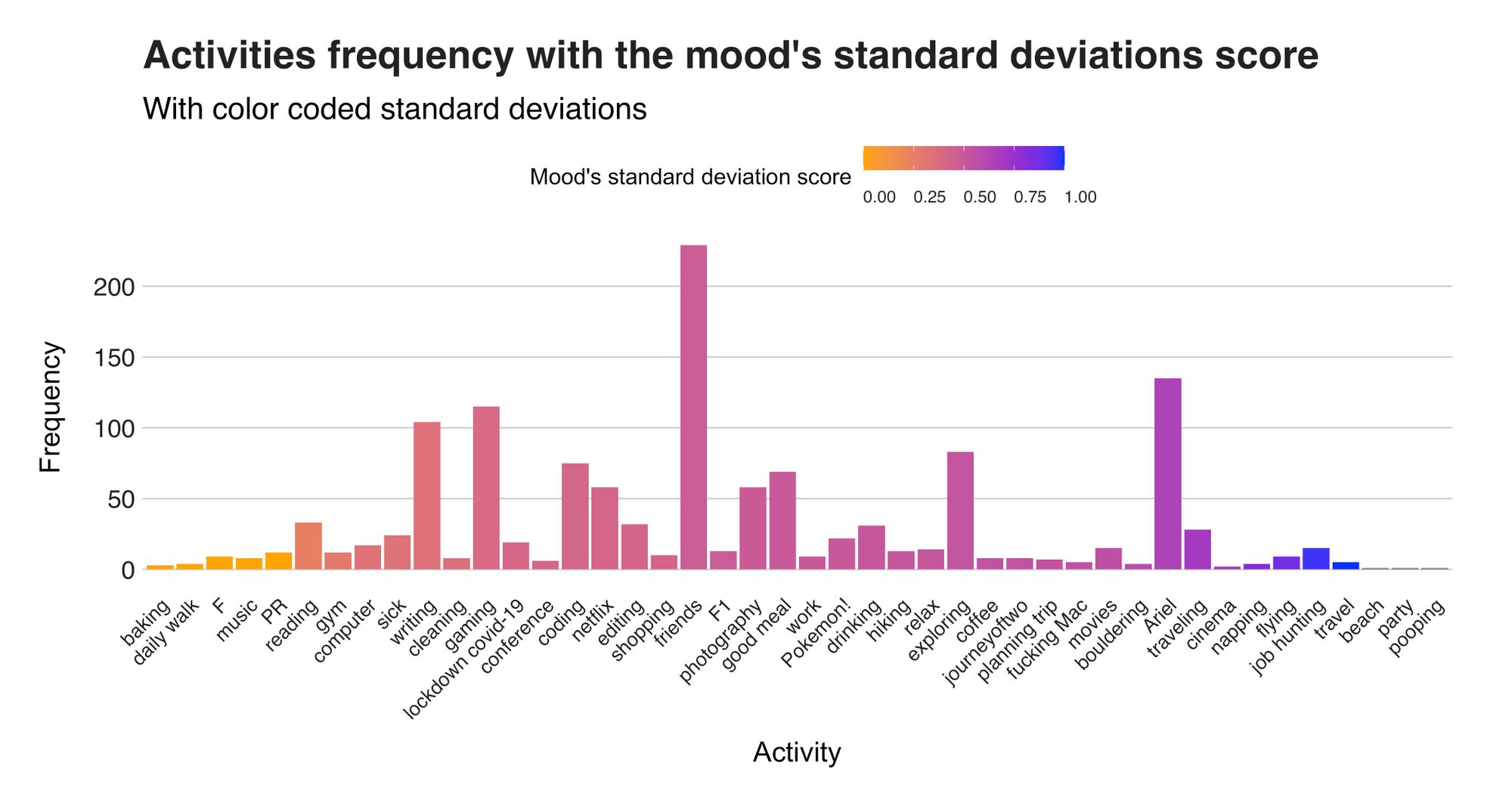
The chart above presents the sorted standard deviation score per activity and tells what activities produced a stable or diverse mood score. The first five standard deviations are 0.0, which means that those categories' moods were always the same, e.g., the activity "PR" is always "rad." Conversely, there are categories with a high standard deviation. These include “Ariel,” (because we had both normal and great days) "travel" (spending hours sitting in a tube frustrates, but it can also be fun), "traveling" (I dislike the act of traveling so much that I have two activities), and napping (so not all the napping breaks were awful).
Figures 6 and 7 explained how activity affects a mood score, but now, I want to analyze the inverse: the score when it is missing. Since I have the average moods when the activity is present, the remaining step is calculating the average when it is missing and subtracting both numbers, which produces a number expressing how the mood differs when they are present and when they aren't. Figure 6 the differences and Table 1 the raw data (I omitted most activities deliberately).
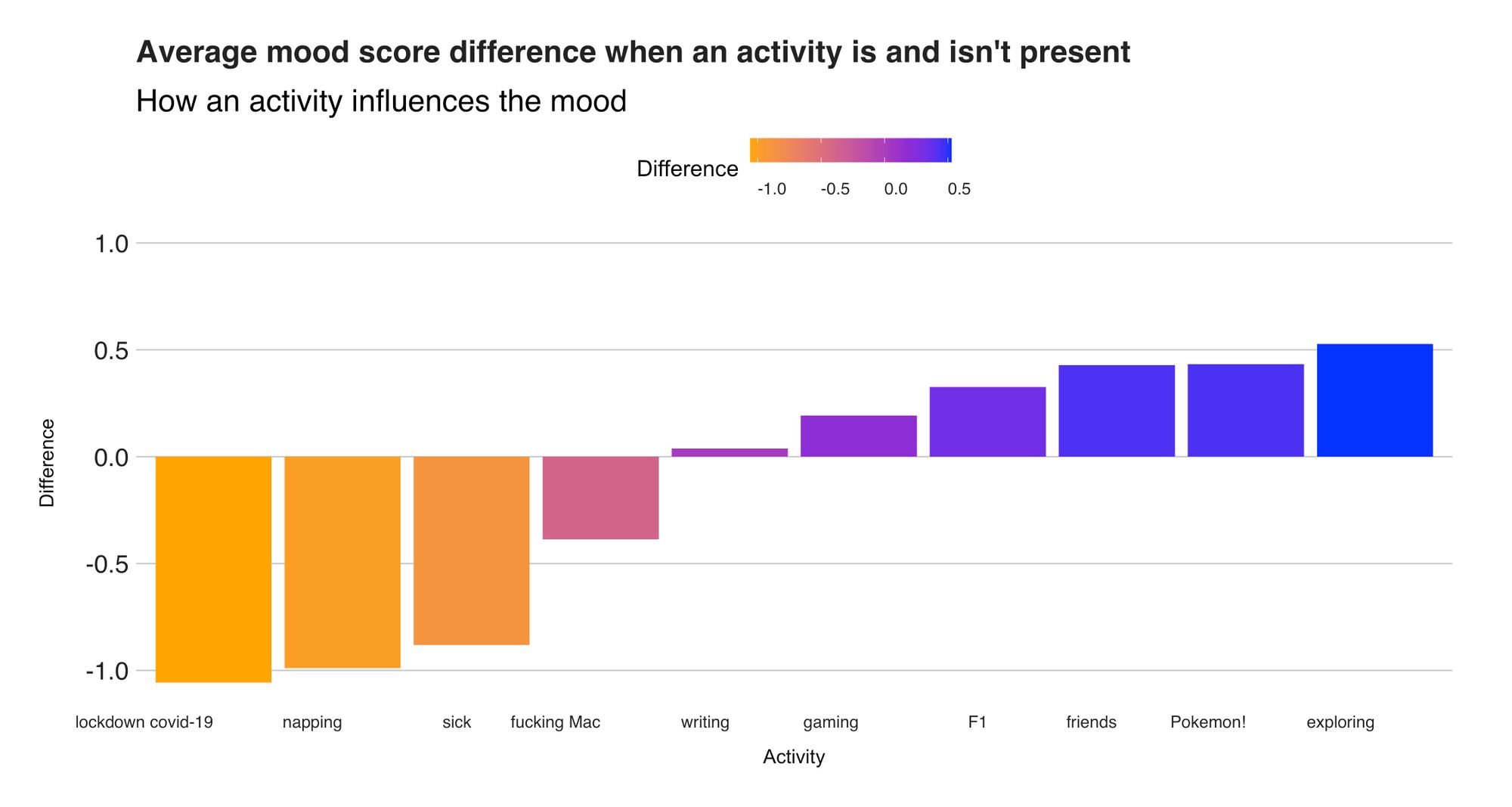
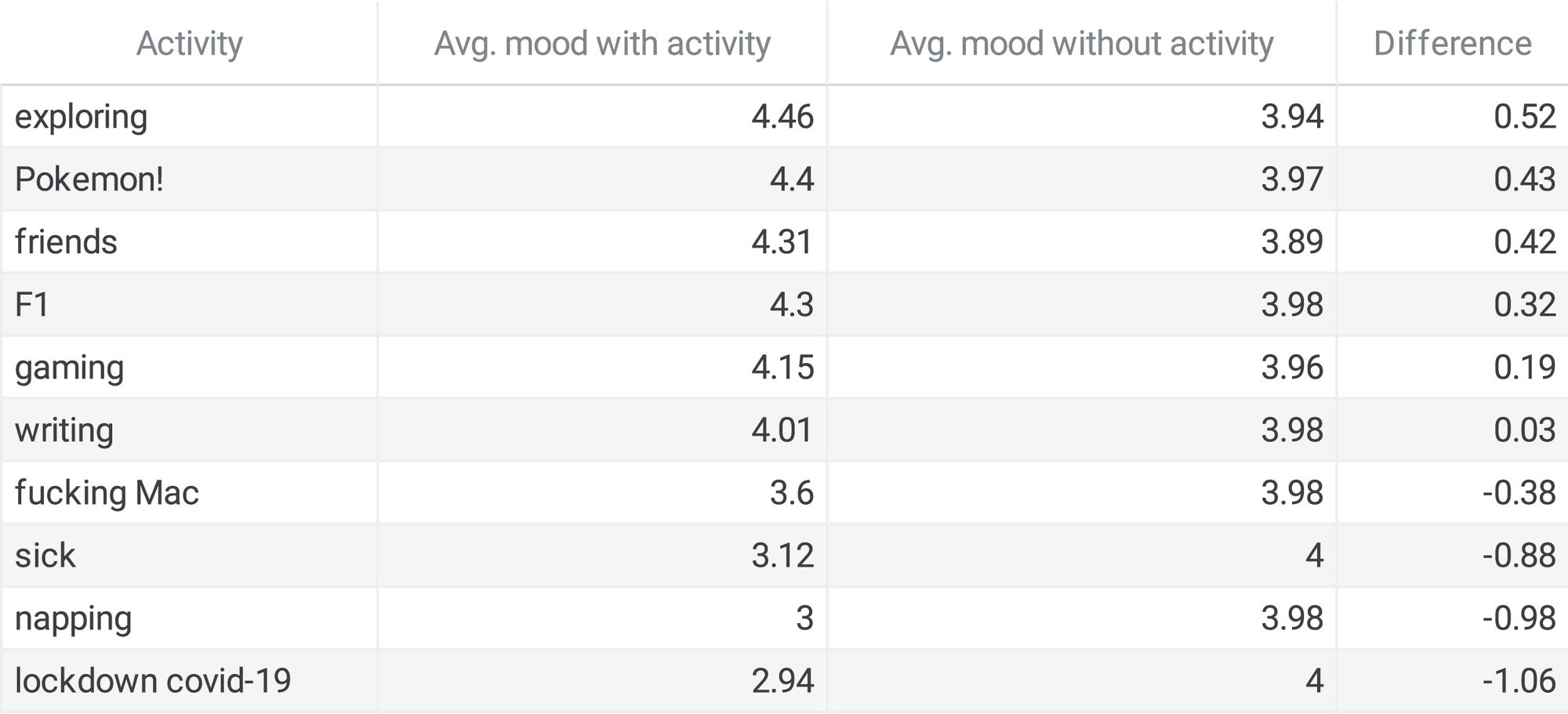
I wasn't that happy during the lockdown, and these diagrams know it. On those days when being stuck-at-home was the highlight, the average mood score was 2.94. But look how it increases to 4 when the activity is missing. A difference of 1.06. That’s an entire mood! In contrast, mood-lifting activities include several I've previously presented, i.e., “friends,” “Pokémon,” and others, i.e., “F1” (Formula 1), and “exploring” (referring to walking around, usually with my camera).
Combinations of activities, calendars, and correlations
The number of activities I reported each day varies. For example, on 318 occasions (that's 31% of the days), I entered none; on 325 occasions (31%), one; and on 388 (38%), more than one. From this more-than-one group, I found out the top combinations were the sets "good meal" and "friends," which appeared 23 times, "writing" and "reading" (11 appearances), and "friends" and "drinking" (10 appearances). Table 2 presents the top 10.
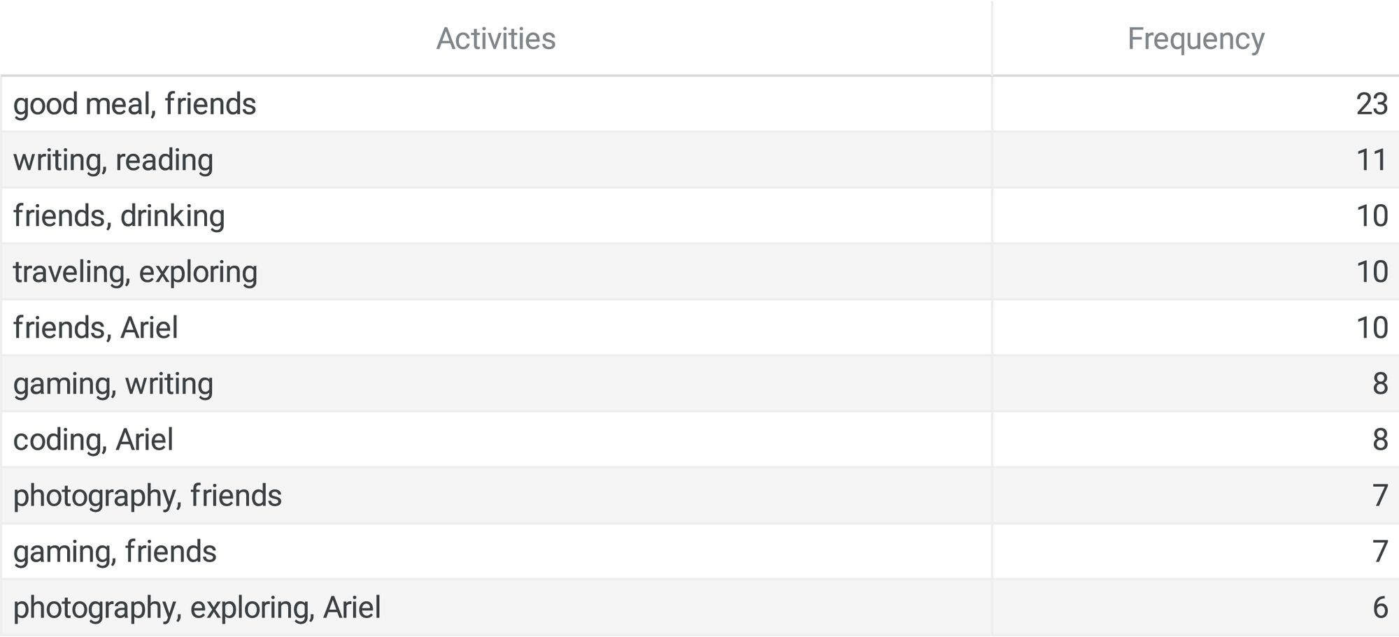
Half of the combinations have “friends.” For example, “friends” and “drinking,” “friends” and “gaming,” and “friends” and “photography.” So, I guess the cliché quote “friends make everything better” isn’t that wrong.
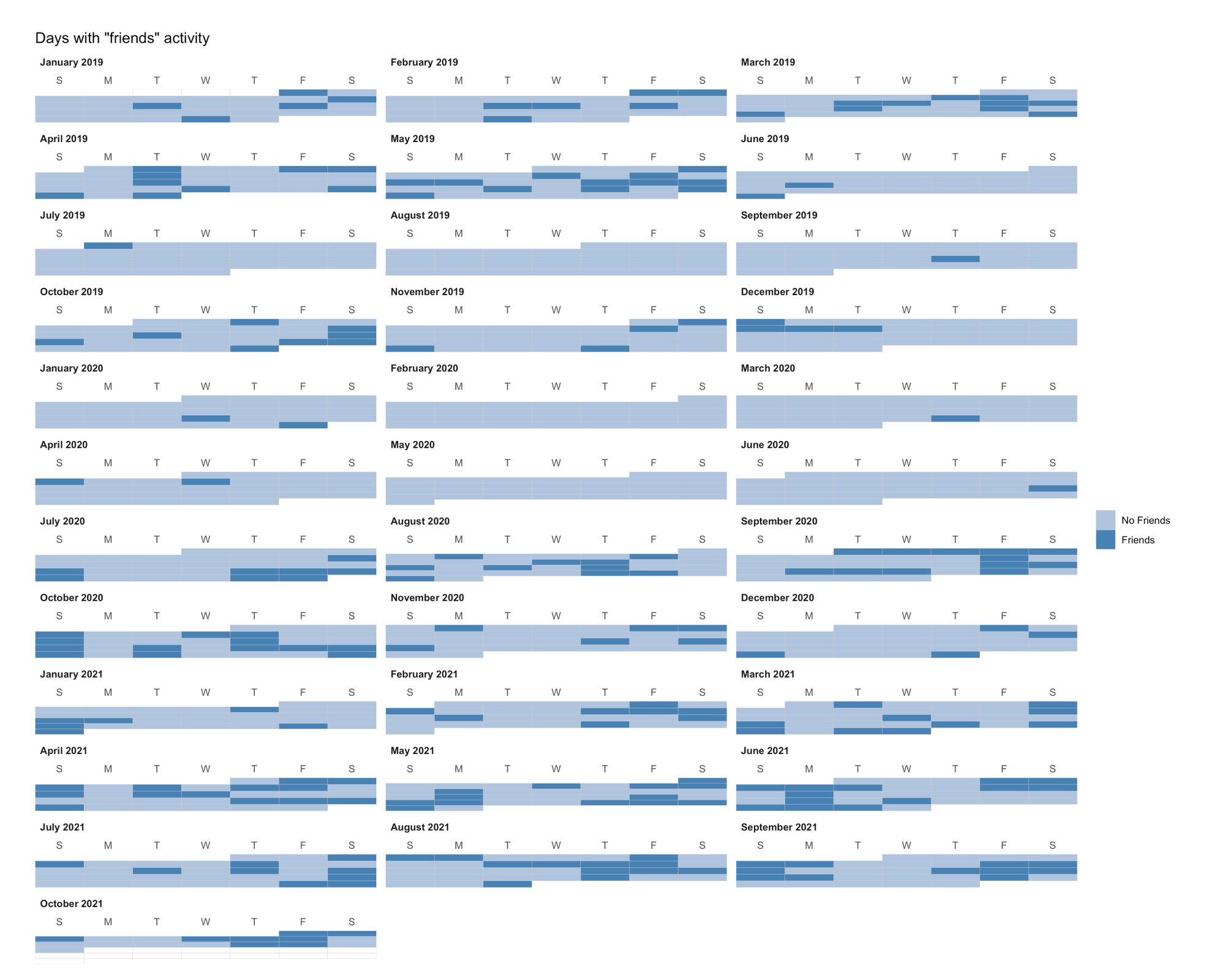
Besides taking over my activities, my lovely friends also take over my weekends. While analyzing the days when the activity shows up, I found out that most "friends" entries happened on the weekend—46 on Fridays, 45 on Saturdays, and 40 on Sundays. Figure 7 shows these days.
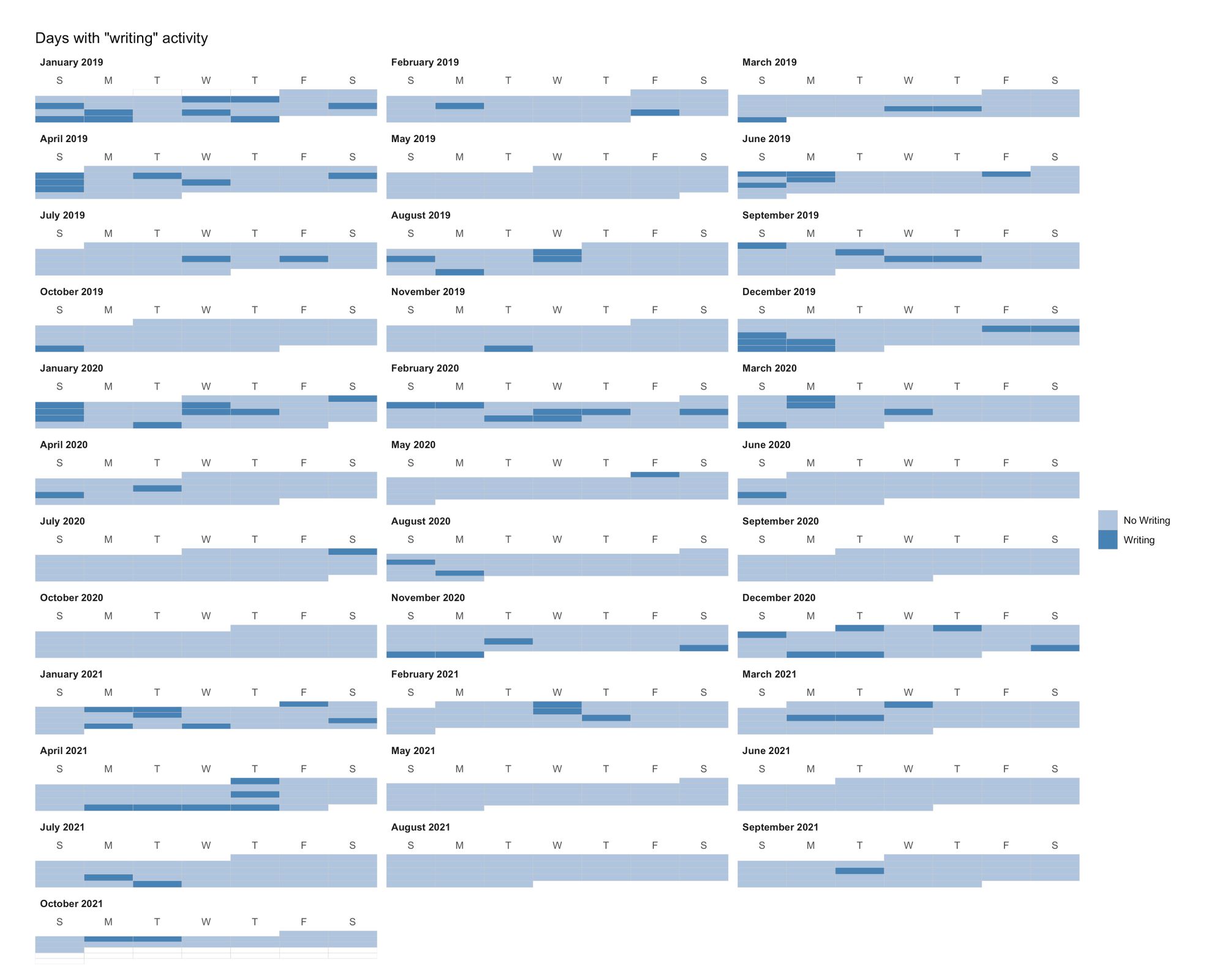
An activity that contrasts "friends" is "writing" (Figure 8). Spending the weekends with friends gives little time to write on these days, which explains why there are only six entries for "writing" on Fridays and nine on Saturdays. Conversely, the best days for writing are Sundays (24), Mondays (20), and Wednesdays (18). On a side note, notice the writer's block I had from May 2021 to September 2021, a block I smashed when I started working on this investigation you're reading.
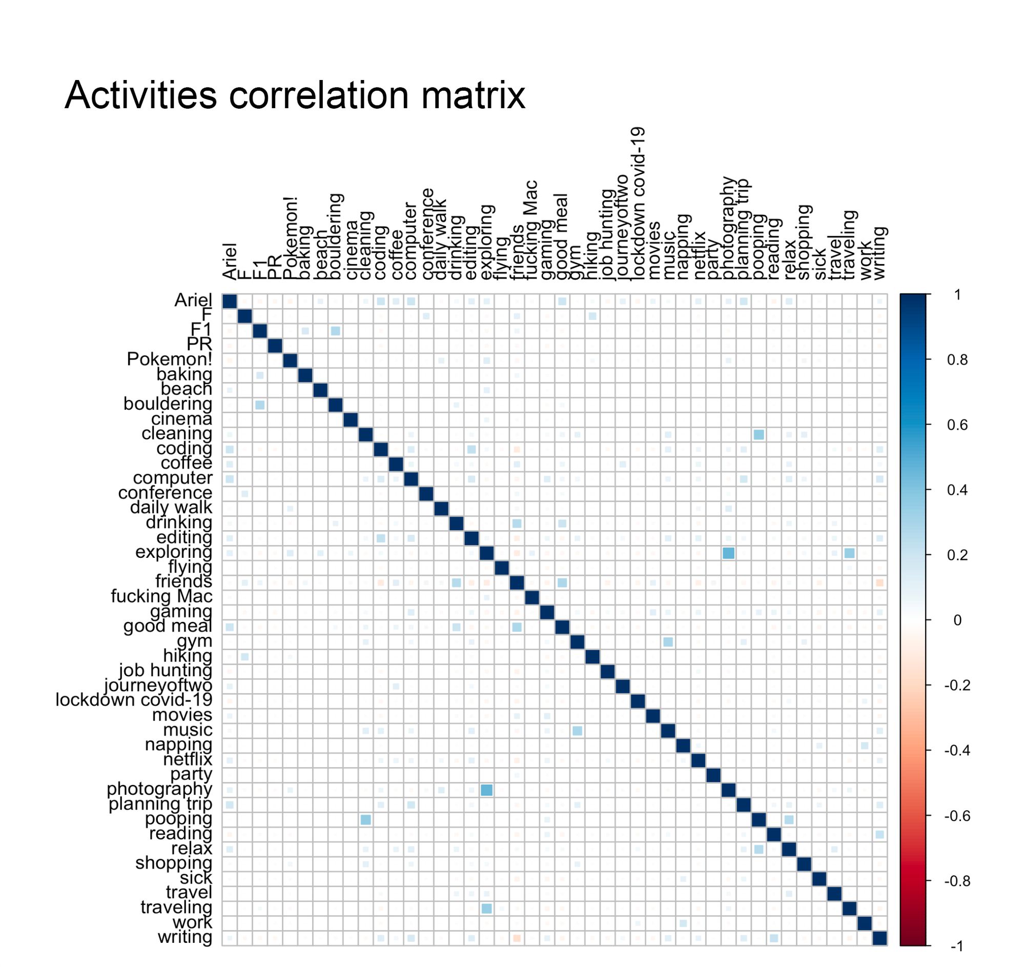
A frequented combination does not imply that one of its activities is often present and another one is. The "friends" activity is a good example. Table 2 showed I don't do one, but various things with friends. But can we say that I only eat or drink with friends? The correlation could help to answer that. In statistics, correlation is a number that describes "the degree to which two variables move in coordination with one another" (source). Here, the correlation between activities is a number between -1 and 1 that measures how often two activities appear on the same day. For instance, a high correlation means that two activities are frequently together, while a low one indicates they don’t appear frequently together. Of the 1892 pairs of activities we can create from the data, the highest correlation (Figure 9) came from the "exploring/photography" pair and the lowest from "friends/writing"—because I rarely write on days when I meet my friends. Yet, my favorite correlations are the "F1/bouldering" and "F1/baking"; to me, the ideal Sunday involves bouldering in the morning, baking a cake in the evening, and devouring said cake while I watch a Formula 1 race (which takes place on Sundays).
How my mood changed over time
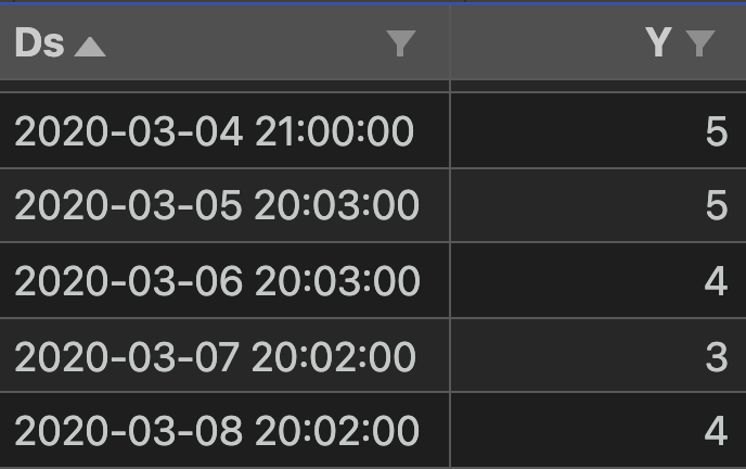
A daily entry in Daylio has a third data point: the record's creation timestamp (which you can either choose or use the current time). This time data is ordered (by date) and recorded at regular intervals (one per day), two attributes required to create a type of data named a time series. Besides time, a time series has a second value that measures what happened at that timestamp. The time series I'll introduce here tracks my mood score from January 4, 2019, to October 19, 2021. In the image below, you can see a sample of the dataset containing the record's timestamp and the mood score I selected.
Once you transform the data into a time series, you can apply algorithms to summarize the data and discover how time influences the value. An example of a summary is the trend, which observes the data's increasing or decreasing behavior over time. The first of this section's visualizations is the trend line (Figure 10) that describes my mood's literal ups and down from day one.
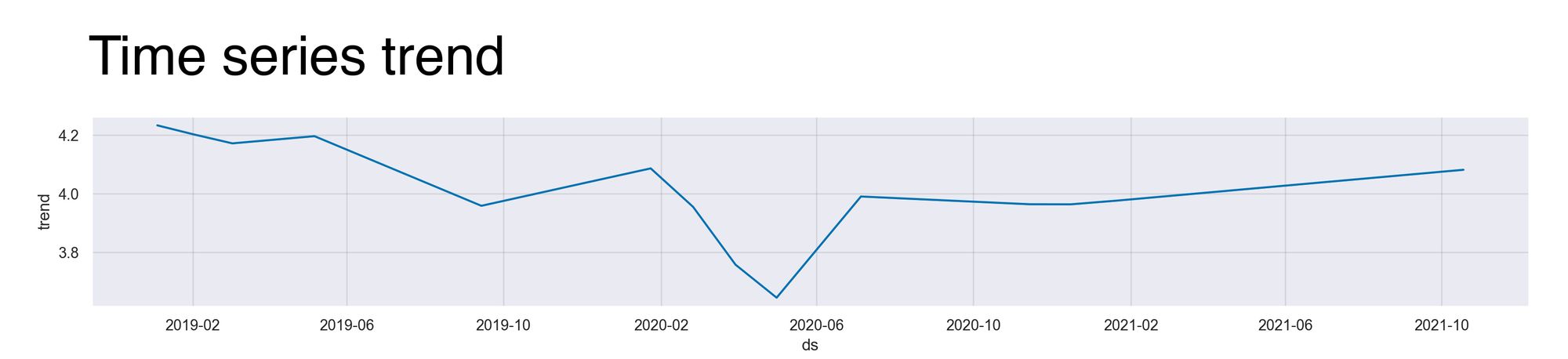
The time series trend portrays an insignificant downward trend with an initial score of 4.2 that ends at 4.1. What's significant, however, is how the chart changes as time advances, notably the lowest point around April and May 2020—that's when I was job hunting in New Zealand. But then, after I got a job offer and resumed my life (July 2020), the score reached its usual and happier value.
A feature of a time series is its ability to decompose the data into regular intervals called components, allowing us to analyze it from a different time frame perspective. An example is the seasonal component, which finds seasonality within the data, or how a season influences the time series. The seasons I’ll investigate are: the daily, weekly, and yearly seasonality. In layman’s terms, I want to find out how the hour of the day, day of the week, or month of the year of the check-in affects the mood score I’ll choose that day.
For each season, the algorithm calculates the trend observed in it. Let’s consider the weekly seasonality. Since my dataset covers 1017 days, which equals 145.3 weeks, the algorithm will aggregate the mood score at each moment of the week, e.g., Monday’s mood scores, and then averages them. (It’s actually more complicated than this, but the details are out of the scope of this article). I think it’s better if we see the images (Figures 11, 12, and 13).
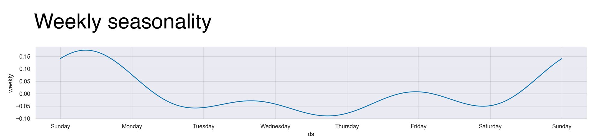
The chart above shows the weekly seasonality. Its X-axis has the ordered weekdays (starting from Sunday), and the Y-axis, the mood score variability influenced by the check-in time. For instance, my mood on Sunday is 0.15 points above the baseline (eating homemade cookies while watching Formula 1 is a pleasure) observed on Fridays and Thursdays’ mood is 0.10 points below. But overall, the time or day of the week barely influences my mood's check-in score, as represented by the Y-axis range that extends from -0.10 to 0.20; a mere difference of 0.30 points, or a third of a mood score.
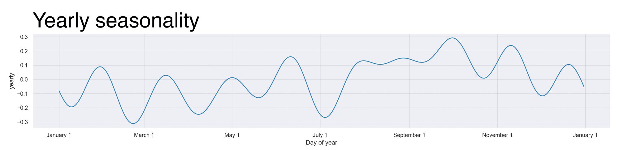
The time of the year has a larger influence than the week. In this seasonality, the mood score changes by at most 0.6 points, as observed by the Y-axis limits ranging from -0.3 to 0.3. During the year's first five months (except March), the mood is around the baseline of 0.0, but as the German summer begins (and the trips to Biergarten too), the mood raises like the thermometer. A noticeable exception to this pattern is the drop in July, which I attribute to the lockdown in New Zealand and the Southern Hemisphere's winter. Weeks later, when the leaves turn yellow, I replace the shorts with hoodies, the piña coladas with Pumpkin Spice Lattes, and long days with long nights as I prepare for another Christmas that I'll probably celebrate in Puerto Rico.
Last, we have the daily seasonality chart, shown below in Figure 14. The first time I saw this chart, I couldn't understand it. I looked at it left to right, top to bottom, and it didn't make any sense. So, I gave up and grabbed my phone. I checked the time, and it was 9 am; I checked the email and had no new messages; I saw the notifications and realized I didn't enter my mood the previous night. I did it then. “It was in this moment, when all hope had faded,” (props to whoever gets the reference) that I understood the chart.
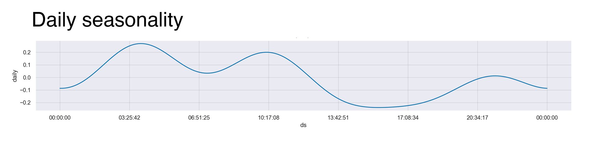
Early in the article, I mentioned that I usually record my mood at 7 or 9 pm. Logging it at those times implies I'm doing something casual, e.g., playing Pokémon, and can use Daylio to add today's data. But what if I'm not doing something casual? What if I'm doing something great, e.g., playing competitive Pokémon, and can't use my phone? If so, then I wait until later or the morning after to record the mood, which explains why the mood score is higher at those times.
Exploring the moods
I want to dedicate the article’s last part to each mood—after all, Daylio is about them. For each mood, I’ll discuss its longest streak, top activities, and the days of the week when I chose it. Let’s start with the best one, “rad,” and finish with the worst one, “bad.”
Rad
"Rad" is the best mood. It's what I strive for: a perfect day that entices the best feelings, actions, and people. I've had a fair share of them; 201 exactly. That's one out of five days, or 19%. But that one-out-of-five is an average, for there are exceptions, like the longest streak that lasted 14 days.
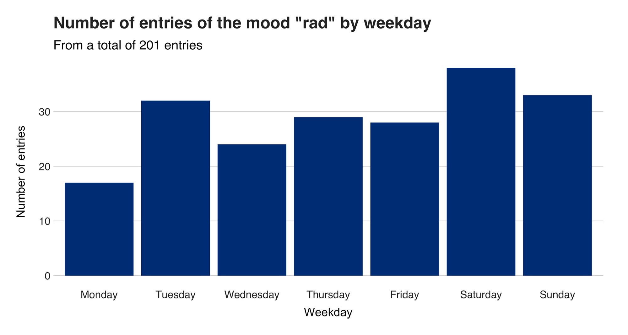
My weekends are rad (Figure 14). Thirty-eight of the aforementioned 201 days were Saturdays, the quintessential day we love, and 33 fell on Sundays. What surprised me were those 32 Tuesdays, a day we often relegate, and people consider the worst of them (Google "why are Tuesdays so irrelevant" and laugh).
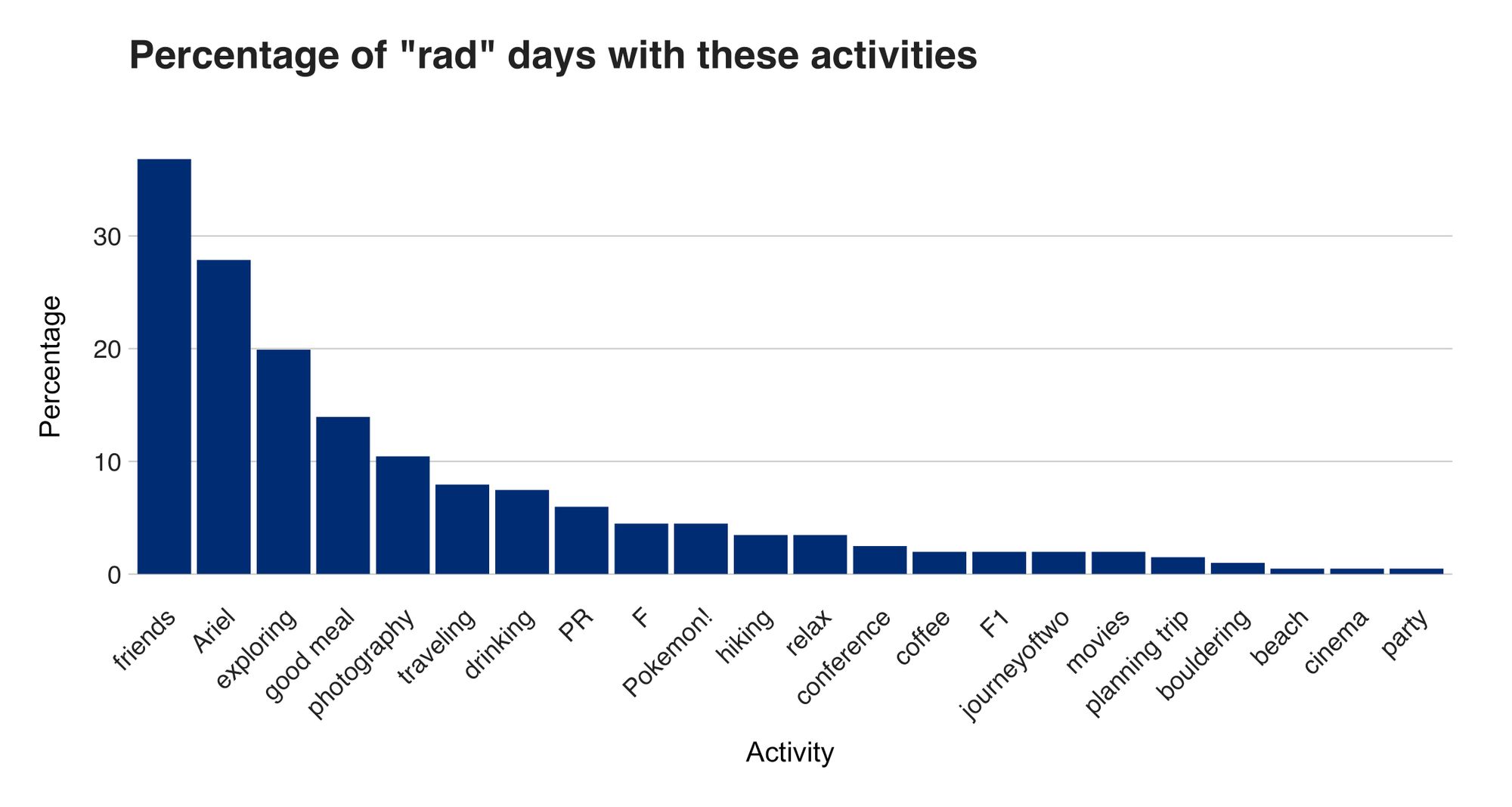
The activities that radify my days are those I’ve presented several times (Figure 15). Leading the list is “friends,” appearing in 36% of my rad days, and “Ariel” in 28% of them. A highlight of the chart is the activity “conference” (2.49%), referring to attending, or even better, speaking at a conference, something I love but haven’t done lately because of the world’s current state. (If someone reading this article hosts or knows of an online or in-person conference suitable for this work, please contact me and help me raise this low percentage.)
Good old good mood—my default emotion, as proved by the 625 times (61%) I chose it over the other fours. Its most impressive streak started on March 11, 2021, and ended on April 2, 2021. Twenty-four days, in which the only highlight was me eating McDonald’s Happy Meals to collect the Pokémon cards that came with them. I caught them all.
Monday’s Blues are non-existent in my life—in fact, it is my goodest day (Figure 16). This scandalous day, hated by some and loved by others, gave me the most good days (101), a number not so far from the runner-up Sunday, and its 99 enjoyable moments.
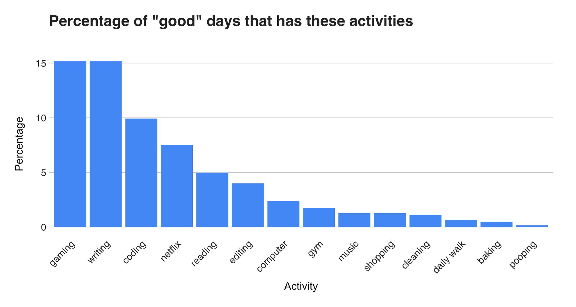
My good days and for lonely activities. Contrary to the social activities of the rad days, good days feature activities I prefer to do alone (Figure 17). Examples are "writing" (as Stephen King said, "writing is a lonely job "), "reading, "and, needless to say, "pooping." Only my phone is allowed to join me in the latter one.
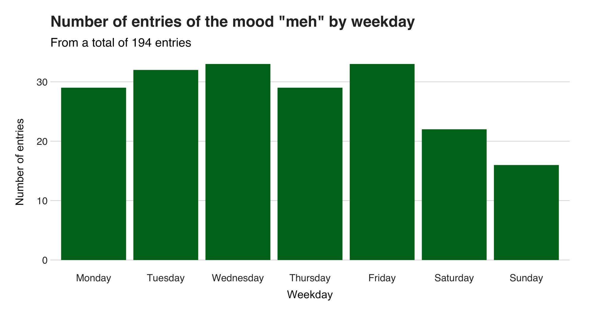
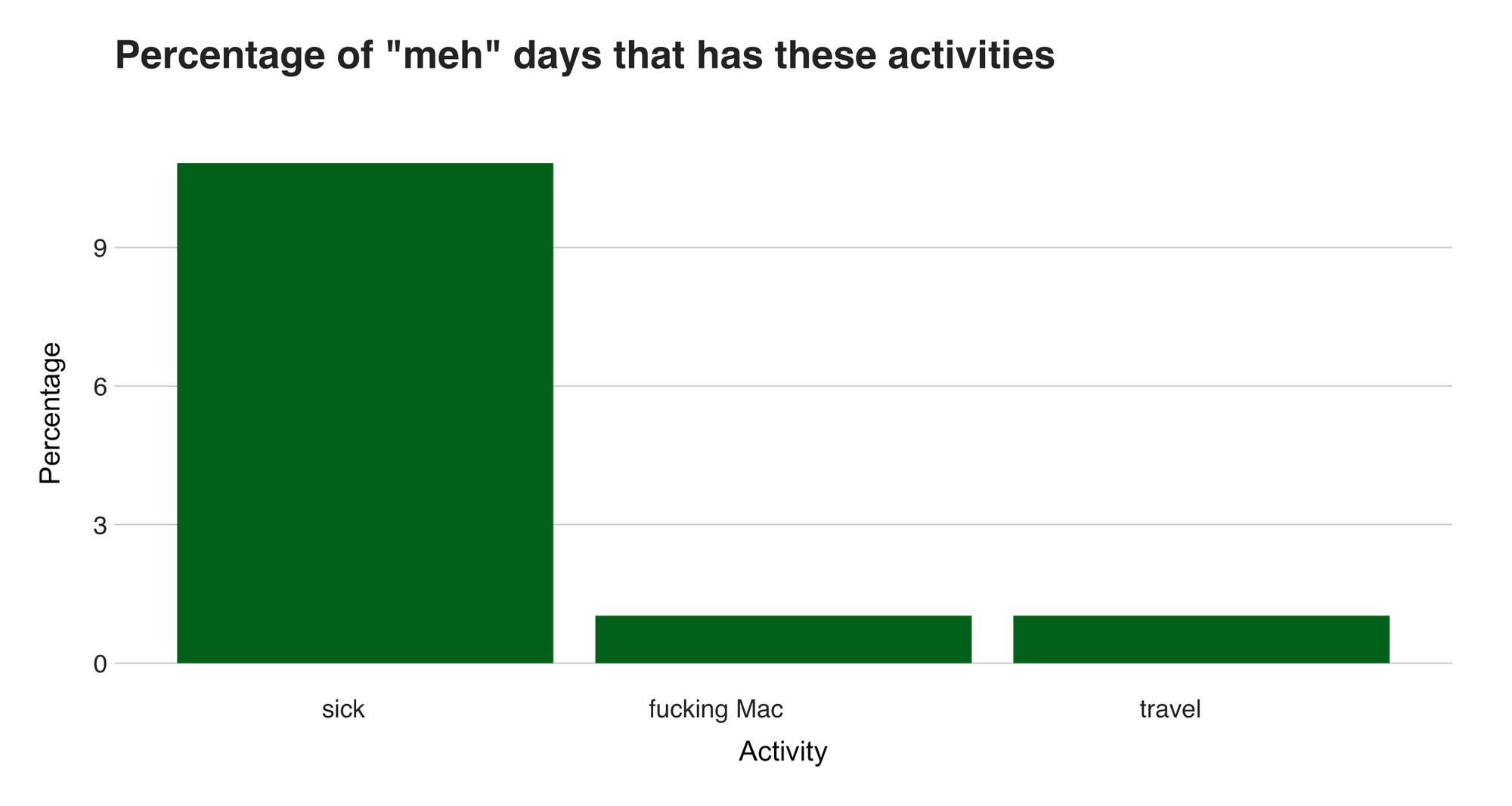
Oxford defines “meh” as an exclamation expressing a lack of interest—I agree. A meh day is an uninteresting day. You aren’t happy or sad; you are meh. I had 194 of these days. That’s 19% of my days, the same percentage I had of rad days. Fortunately, I haven’t experienced a long streak of uninteresting days. The longest persisted of seven days attributed to the days before the first lockdown in New Zealand (March 19, 2020, until March 25).
Sunday is the least meh day. (How could it be after all the beautiful things I’ve said about this day?). But I can’t say the same about Wednesday, and to my surprise, Friday. Figure 18 shows the numbers.
As for the activities, only three often appear on meh days (Figure 19).
Bad
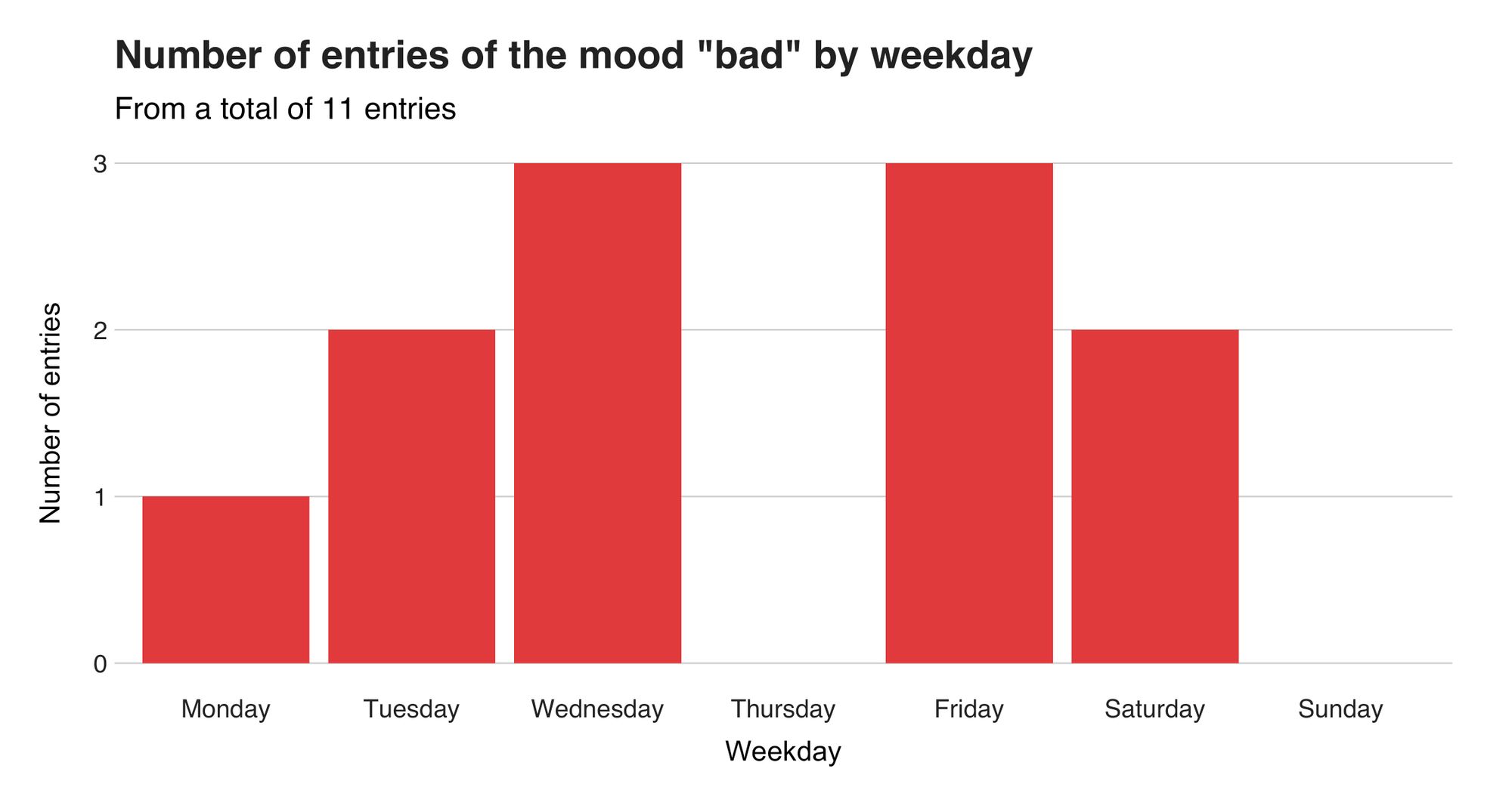
We can all agree that a bad day sucks. To me, a bad day implies I'm anxious, frantic, or overthinking. And these are not pleasant feelings. Days like these are rare, though. So far, I've used this classification 11 times out of 1031 days (1%). And they go as they come. The longest “streak” lasted just two days: April 4-5, 2020, and July 9-10, 2021. And even better: they don't come on Sundays (Figure 20). Because once again, and I promise this the last time I'll bring this, what's bad about hiking, bouldering, Formula 1, and baking?
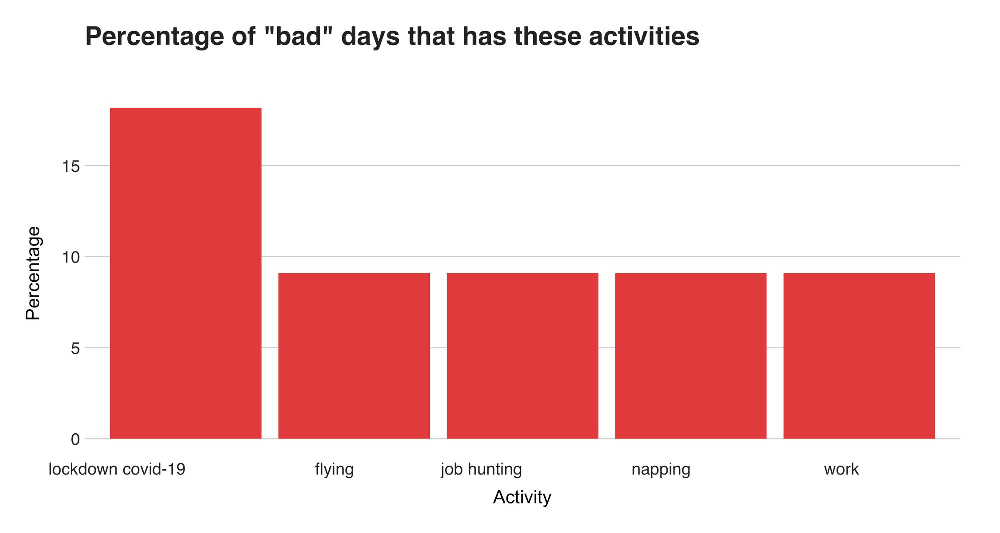
I still find it funny that "napping" is an activity associated with bad days (Figure 21). But napping itself isn't bad. What's wrong are the reasons why I head to Nap City (as a friend likes to say). Am I evading a situation? Sleep, and maybe it'll go away. Am I confused? Sleep, and maybe you'll find an answer. But I know it's not that simple. Sometimes I need to accept the situation and go through the day because, as the data showed, I'll feel better tomorrow.
Final words
The past three years brought me many changes. It all started with me having a normal, stable, and good life in a foreign country. Then my priorities changed. Things that used to be important were not that important anymore; fears I had were no longer there; and dreams I had became my priority. So, I did something drastic. I quit the job I loved, said goodbye to my dear friends, sold my belongings, and boarded an airplane with my camera, laptop, and Ariel. And there was I living out of a backpack, writing a book, and improving my photography. Living the dream!
But it ended prematurely when a virus got out of control. Thus, I had to replace my nights in the forest with nights within four walls in a beautiful country where winter is in June and being a Hobbit is not far from reality.
And it was within those walls that I pondered about what was next. The greedy part of me wanted to stay and prolong the adventure, even though it wasn't sustainable anymore. I was depleting my savings, wasting my days away, and without a plan. Until an opportunity showed up, and I boarded an airplane.
The airplane brought me to the same city I left 416 days ago. While I was happy to be back, I couldn't ignore how distinct and strange the new conditions were. I was missing 7 kg., several shirts, had to wear a mask and be home early, and most people I knew were gone.
A year later, I sat down and thought of these moments and how I felt. Knowing I had documented my moods and activities for a long time, I wanted to confirm if what I remembered was accurate or if I was just feeling nostalgic. It was a mix of both.
Writing this piece made me think of many moments. It reminded me of my backpacker year, my trips to Puerto Rico, the countless dinners with friends, my Sundays' afternoons of cake and Formula 1, and the release of a new Pokémon game. It brought back unsavory memories too, including the lonely days, sick times, when my Mac died, and when my email was flooded by automatic rejections from companies worldwide. Writing this also brought many surprises. For instance, I didn't expect such a noticeable decrease in the mood score during my last days in New Zealand, the correlation among Sunday's activities, or that, according to the data, I've pooped just once in three years.
If there's something from this I'll take with me is how great it was seeing from another perspective those things that improve my days—friends, exploring, photography, writing, and Pokémon. Of course, I already knew this. I love my friends, arriving at a new place with my camera, spending a quiet evening writing, and ending it by playing the latest Pokémon game. But that's what I remembered, and sometimes our memory can be biased towards what we like—and yet, witnessing and confirming these facts with data made those seconds spent clicking my phone at 9 pm a worthy investment.
You can find the source code I wrote to analyze and visualize the data in my GitHub at https://github.com/juandes/daylio-mood-analysis and the library code used to transform the data at https://github.com/MichaelCurrin/daylio-csv-parser. I omitted the dataset on purpose.