Interpreting 135 nights of sleep with data, anomaly detection, and time series


Three things are certain in life: death, taxes, and sleeping. Here, we’ll talk about the latest.
Every night*, us humans, after a long day of roaming this Earth, are greeted with Hypnos’ kiss and slowly fall asleep. While doing so, our bodies and mind restore, heals, and if we’re lucky, we might even have a dream to tell the morning after or a nightmare we wish to forget. But do you know what else happens? We generate data, or at least I do.
*This doesn’t apply to students nor people who work third shift.

Have you ever thought about your sleeping patterns? No, I don’t mean when you go to bed, or the various times your alarm is supposed to go off (admit it). I’m talking about something more precise, more granular. For example, how many times, unconsciously, do we wake up? On which day I sleep more? These are questions that kept me up at night (ha!).
To give you some context, at the time of writing this sentence, it has been 150 days since I started my backpacking adventure. I’m bringing this up because, unlike the old days when I had a “normal” life, nowadays, I’m not bound to a daily routine. You know what I’m talking about; wake up at X, get to the office at Y, go to sleep at Z (unless you want to feel like horrible the day after). However, still, every night, I tuck myself into a sweet and comfy (depending on the hostel) bed. But do I have a routine? I got no clue, but we can find out.
As the data-curious-person I am, I embarked on an adventure to discover my new sleeping routine and patterns (if there’s any). In this article, I’ll present the results.

Introduction
This experiment is all about sleeping. Here, I want to investigate how I’ve been sleeping ever since I commenced my adventure almost six months ago. In particular, I’m interested to learn my sleep times, its trend, and the nightly restless time, while applying techniques such as descriptive statistics, time series analysis, and anomaly detection. So, I came up with the following key questions I’ll try to answer.
- At what time do I go to bed? When do I wake up?
- How much time do I spend sleeping?
- Is there a correlation between time in bed and time sleeping?
- On average, how many “restless” moments I suffer per night?
- How much time do I spend up each night?
- How has my sleep pattern evolved? What’s my weekly routine? What’s the overall trend?
- What starting and ending times are outliers?
Let’s tackle them!
The Data
All of the data I’m using to answer these existential questions come from my Fitbit device. This fantastic device, which I wear 24/7, spends every single night restlessly tracking the information I’m about to dissect. In total, my dataset consists of 135 rows, or sleep sessions, celebrated after May 28 (the day when I started to backpack). The dataset’s features contain information such as the sleeping start time, end time, and minutes after wakeup. Notwithstanding, I want to clarify that many of the metrics Fitbit calculates aren’t, in my opinion, well documented, so I’ve no idea how the device derives them. Still, I won’t question the values and will assume that they are correct and accurate.
Lastly, I have to mention that there are some missing dates due to technical issues, aka. Android sync fails, or because I had the device charging overnight. Also, each row corresponds to the day’s “principal” sleep meaning that I do not include the naps.
The Tools
The experiment employs both R and Python. With R, I performed the exploratory data analysis and drew most of the plots. Python, on the other hand, took care of the time series analysis with the Prophet package, and the anomaly detection using the popular scikit-learn.
Getting the Data
As with most data-related problems, this one also starts with gathering the data. To get it, I used Fitbit’s API through the Python package python-fitbit. To be more specific, I used the “Get Sleep Logs by Date” endpoint, a method that takes a date as input and returns that day’s sleeping sessions and all the information that comes with them. The following code presents how I did it.
The script takes as argument the “base date” or the day from which we wish to gather data. Then, we create the Fitbit client, which requires a Fitbit key, secret, access token, and refresh token. To obtain these, you must create a Fitbit dev account and register an app. While creating the client, you can also specify the language (some API responses include text that may be suitable to display), and the locale (or country; the list is quite limited, though). Changing this parameter affects the language of some text fields included in various API responses, and also the unit system. In my case, I’m using “en_DE” since I want the text in English and my units in the metric system.
Now that we have the data, it’s time to learn from it!
Sleep Times
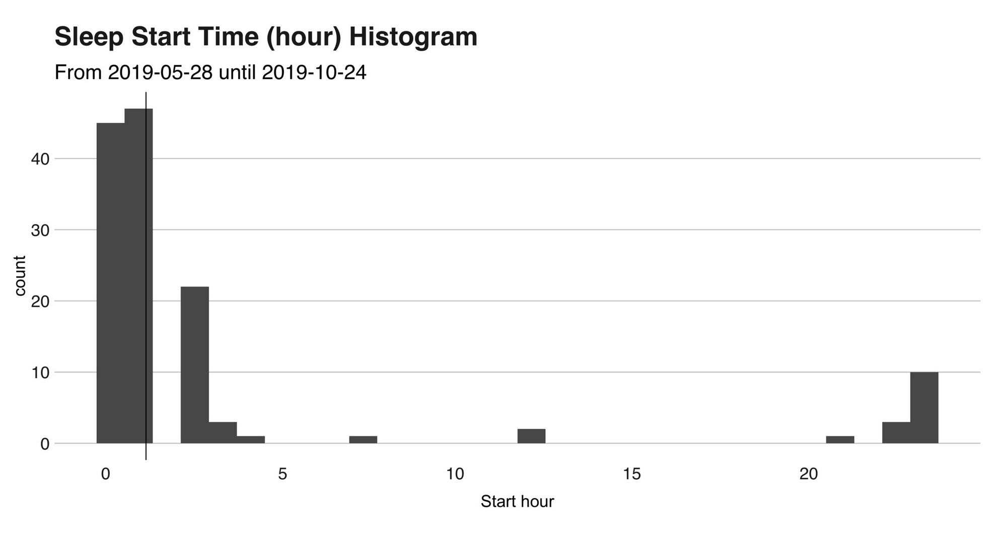
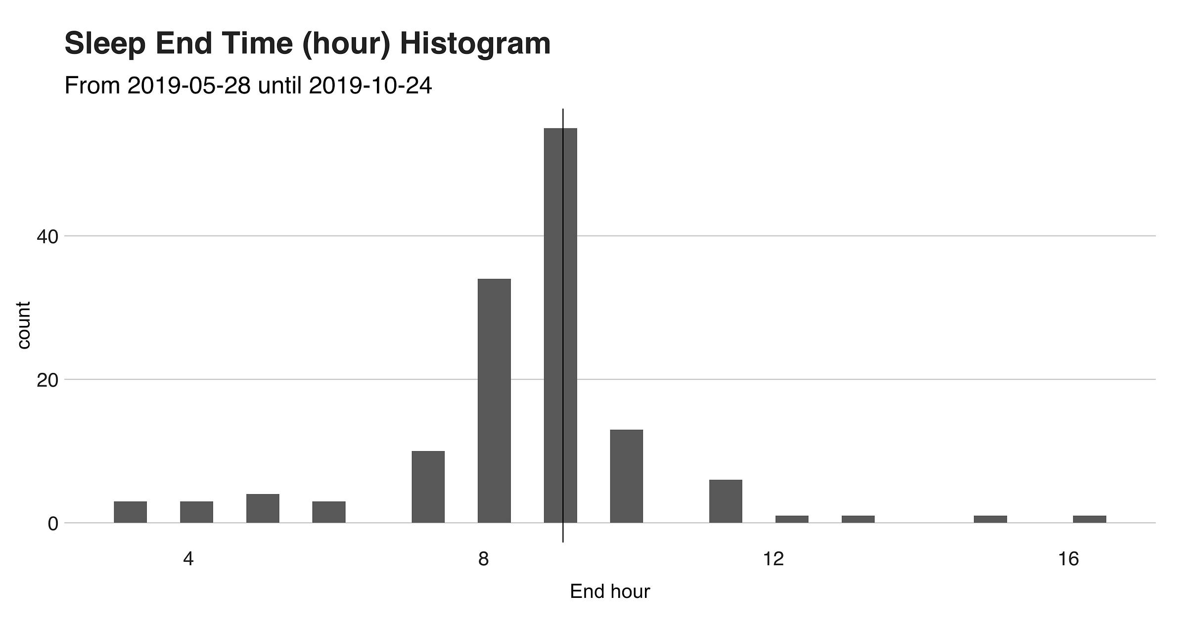
I’ll open the discussion with a look at my sleep start and end times. On average (using the median), I usually go to sleep at 1 am. and wake up at 9 am., giving me precisely the eight recommended hours (according to the metric). However, we’ll soon see that this is not that correct. The next two histograms show the hours’ distribution (the black vertical line indicates the median).
Now, to get a precise look, I’ll present another plot with the actual times.
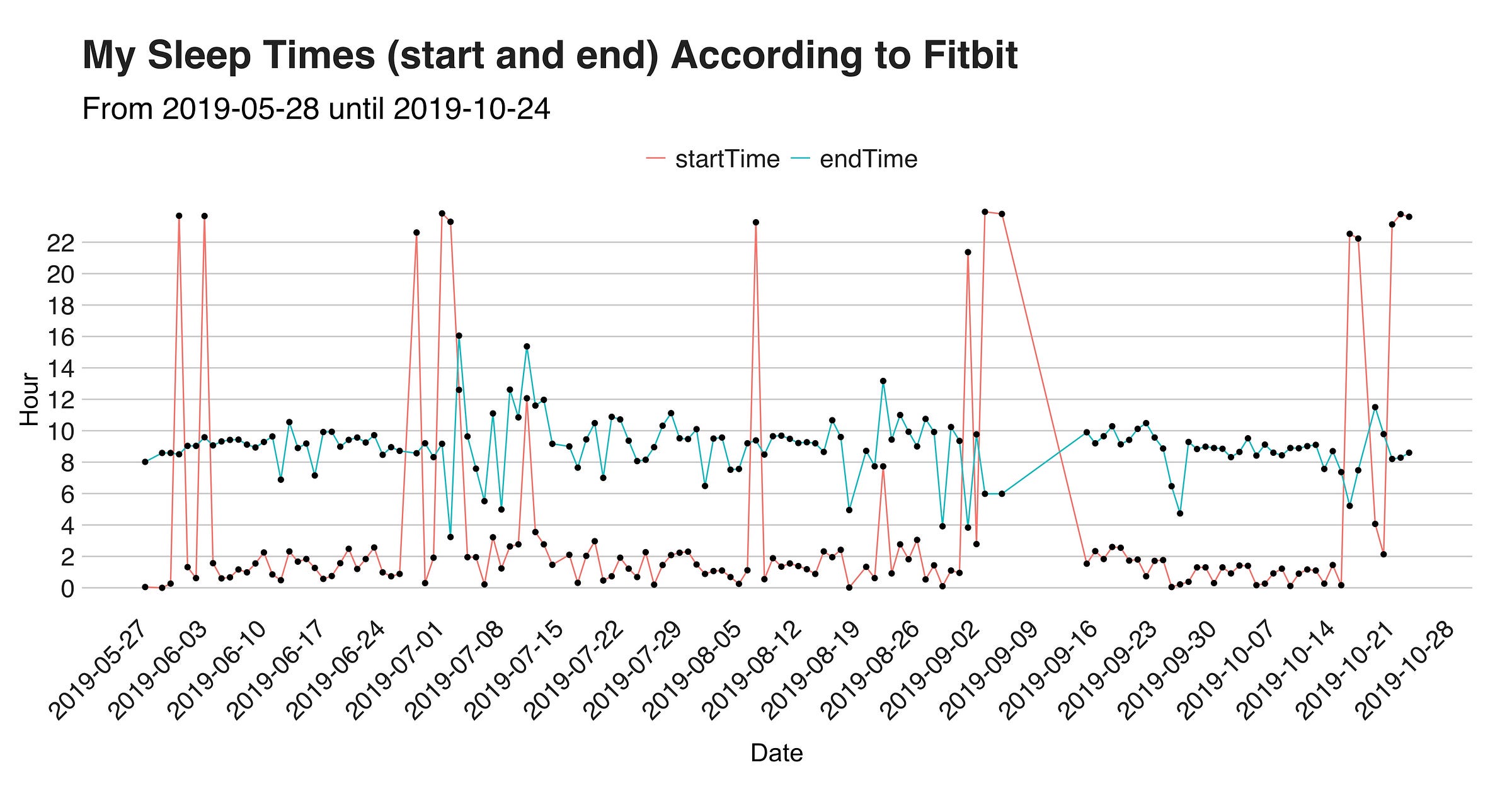
The red line indicates the starting time, and the blue one, the sad end of what was a blissful sleep. As previously stated, the median of both “startTime” and “endTime” are respectively 1 am. and 9 am., a fact we can see in the lines.
Besides this, the graph reveals that that out of the 135 nights, in only 17 (13%), I went to bed before midnight, with the most extreme case being on August 23, when I went to sleep at 7:44 am. (after an 11 hours train ride from Chiang Mai in Thailand to Ayutthaya). To complement this information, I’ll present two visualizations that show my time asleep stat.
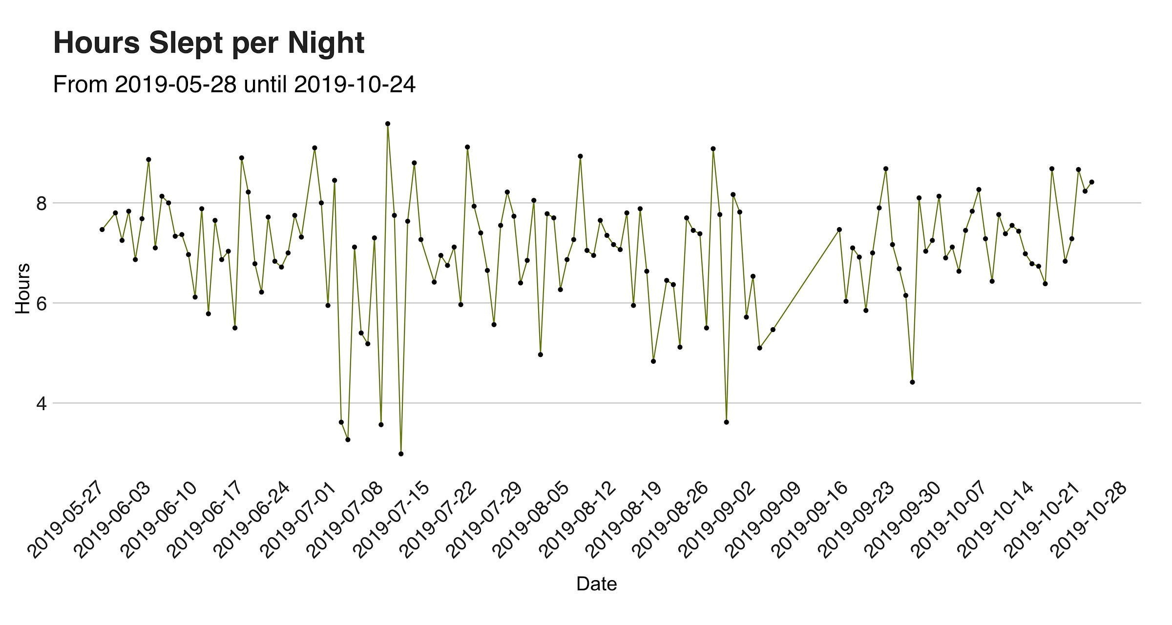
The one below is a line chart with the hours slept per night, in which you’ll better appreciate (I didn’t) those days in which I barely rested; those are probably the nights where I moved to a new location (thanks night buses!).
Then, there’s the second visualization, which displays the “timeAsleep” variable’s (in minutes) distribution. Thus distribution is left-skewed, meaning that the variable’s mean — 422.61 minutes (the vertical dotted line) or 7.04 hours — is less than the median — 430 or 7.16 hours — and less than the mode, which in the case of a continuous random variable, such as this one, is the values’ maximum number — 575 minutes or 9.58 hours. But what is the precise and humane meaning of this? All this fancy talk mean that those nights in which I didn’t sleep, are bringing down the average value.
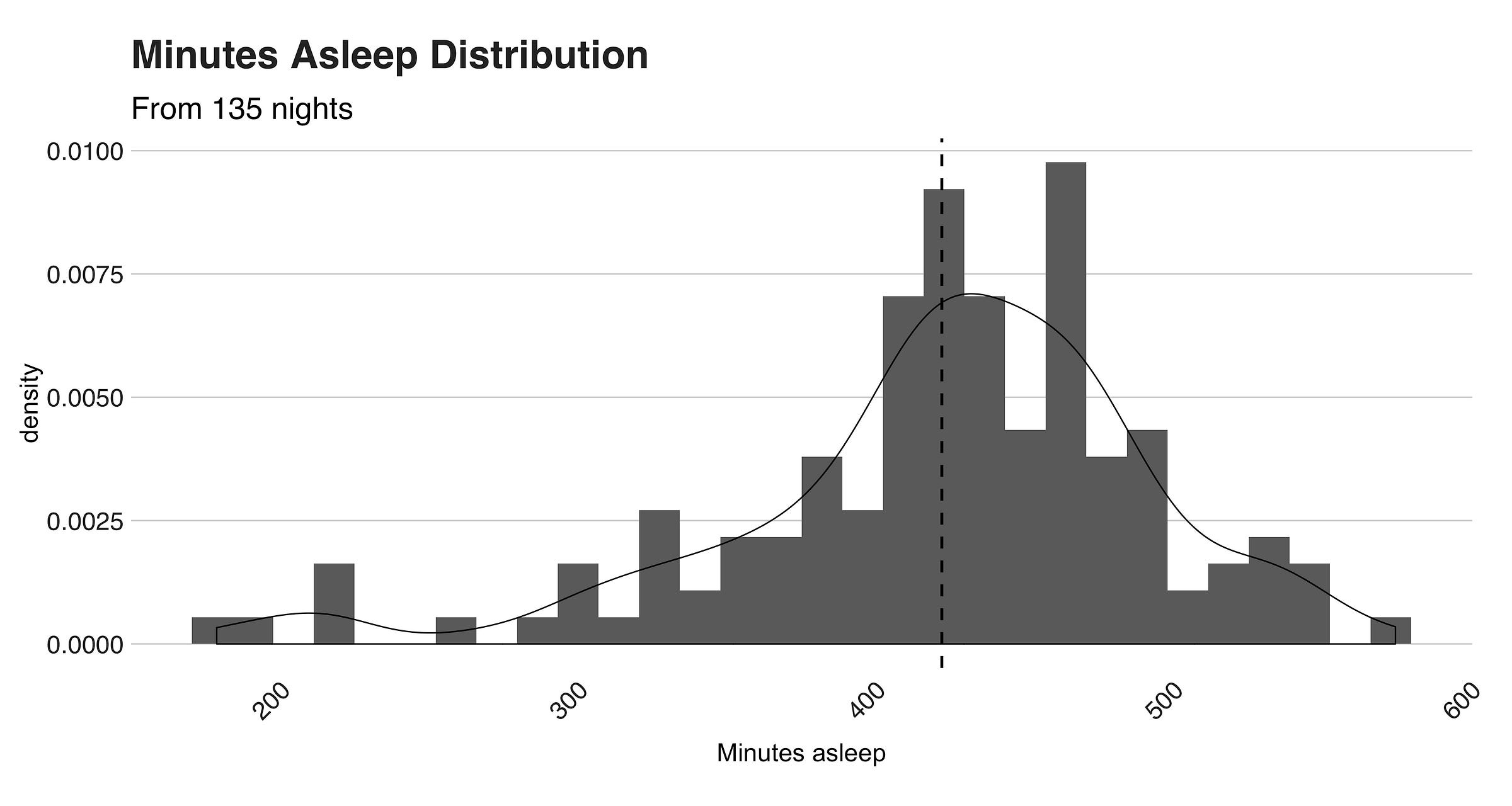
Thus, to summarize this whole “time asleep” business, I’ll conclude that on average, or on “median,” I typically sleep 7 hours per week, a score that lies on the low-end of the recommended time per night.
But hold on a second! Everything I’ve shown here is just the time I spent holding hands with Hypnos. However, what about the total time spent on the bed? In particular, those awkward minutes — mostly used to think about life’s meaning and tomorrow’s breakfast — before we finally fall asleep?
Restless Time
Admit it. You never fall asleep the minute your body touches the bed. In the period between laying down and falling asleep, we’re just there, in limbo, trying to cross the gates to Sleepytown (or Napcity like a friend likes to say). Fitbit calculates this “wandering” time, and here I’ll present mine.
The metric I’m about to introduce is Fitbit’s “minutesAwake” stat. As its names indicate, this metric measures how much time you spent up during the night, including the time before finally falling asleep. According to my observations, Fitbit starts calculating the latter when you’re in bed trying to fall asleep (it probably uses your heart’s bpm and movement) and not the overall time you spend in bed. Otherwise, mine would be in the range of a billion minutes since the bed is my preferred place for writing, coding, and of course, Netflix. Below, you’ll find the stat’s histogram.
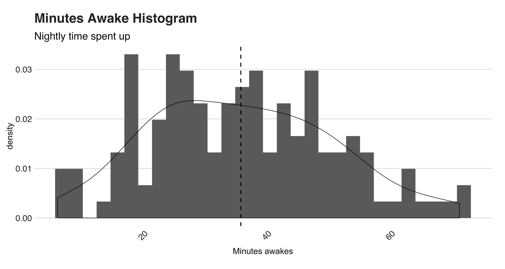
What a funny-looking distribution! Several things are happening here. For starters, the mean is 35.64 (minutes, remember), the median 35, and the standard deviation 14.79; nothing strange here. However, look at the curve’s shape. In particular, at how thin the tails are and how wide the bell is. These two particularities are characteristics of a platykurtic distribution, a statistical distribution with a low kurtosis (less than 3) value. Distributions like contain little to none extreme outliers (more about outliers and anomalies later), and in this case, this holds. Check out the following boxplot.
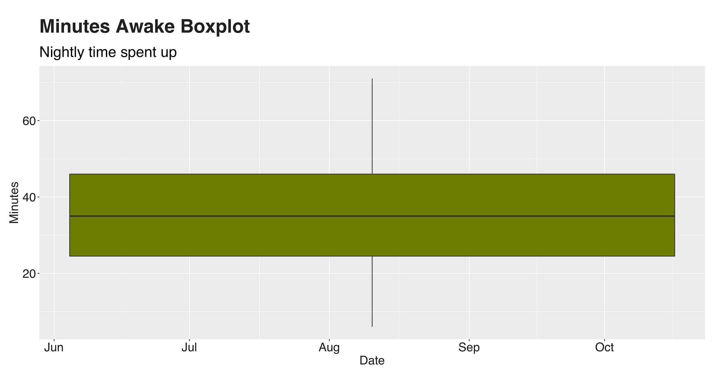
See? No values outside the box. So we could say there’re no extreme outliers. Now, to conclude this and answer the question, “how much time do I spend up during one night?” I’ll state that on a typical night, I spend around 20 to 45 up, and this boundary rarely changes.
Fitbit’s data provides another feature to measure one’s nightly restless behavior, called “restlessCount,” a counter that tracks how many moments of this kind you suffered in a given night. These events can be as long as a visit to the toilet, or so short that you won’t remember them the next morning.
On average, I have 19.53 restless moments per night. However, this number doesn’t say much, since my nights' lengths are not constants. But, I can say that these unwanted episodes are proportional to the whole sleep session. For instance, the correlation between “restlessCount” and “minutesAsleep” is 0.55, while the one between “restlessCount” and “minutesAwake” is 0.82. In hindsight, these statistics are somehow evident since it is expected to have more restless moments, the more you sleep. Nonetheless, I was curious about this :).

Start and End Times with Anomaly Detection
Back when I showed the “start sleep” and “end sleep” graphs, I didn’t point out many of its peculiarities except for that fateful day when I went to bed at 7 am. That point is an outlier, a data observation that significantly varies from the rest. But was that the only outlier in these two graphs? I don’t know (ok, I do, but I’m not going to spoil!), but hey, we can find out!
The easiest way to detect these data points would be by plotting them in a boxplot and categorizing the points outside the box as outliers; a solution that works if your data is one-dimensional. However, for this case, I wanted to add an extra feature, the day of the week, and use it alongside “start sleep” to find out those nights in which I went to bed at an abnormal time. This inquiry calls for anomaly detection.
The algorithm I chose to detect my anomalous nights is One-Class SVM, a variation of the well-known supervised learning method, Support Vector Machine (SVM). Unlike its famous counterpart, One-Class SVM follows an unsupervised approach to learn a decision boundary that separates our dataset into non-outliers and outliers. It’s called “one class” because everything that’s inside the barrier should (in theory) belong to the same class as the rest or at least be very similar, while the data points outside the border are dissimilar, also known as outliers. Before jumping right at the algorithm’s output, I want first to show an image of the dataset to see if you can point out the outliers, and then the one with the learned boundary.

On the X-axis, there are the days of the week, and on the Y-axis, the time. What do you see? Notice anything out of order? Now compare your result against the algorithm’s response.
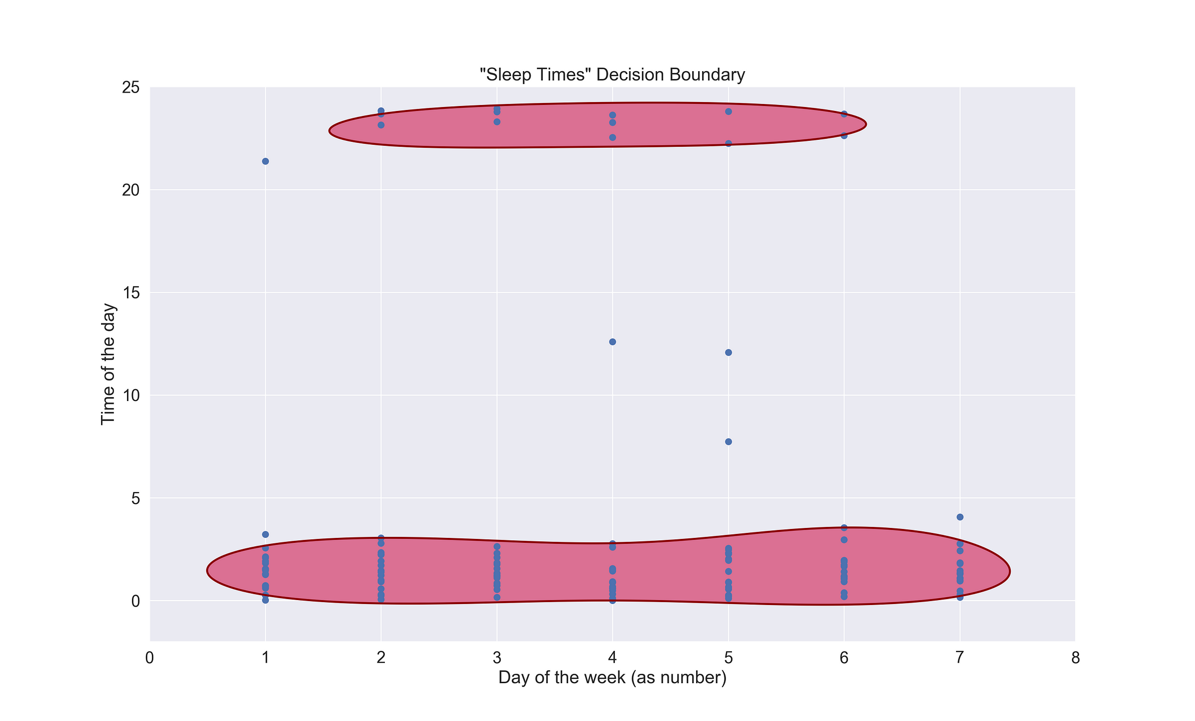
SVM has talked. The two red blobs represent the boundaries of what constitutes a “common” time I choose to go to sleep. The top one encompassed the few nights when I called it a day before midnight, while the second one at the bottom, are those in which the melatonin didn’t hit until very late.
Then there are six lonely records referring to the abnormal nights; one is at 9 pm., two at 12 pm., one at 7 am. and the last one, which almost made it in, at 4 am. So we could say that generally, going to sleep between before 10 pm. and after 3 am. is an anomaly. Regarding the day of the week component, there no significant correlation between the anomalous entries and the weekday. The following code snippet presents how I fit the model.
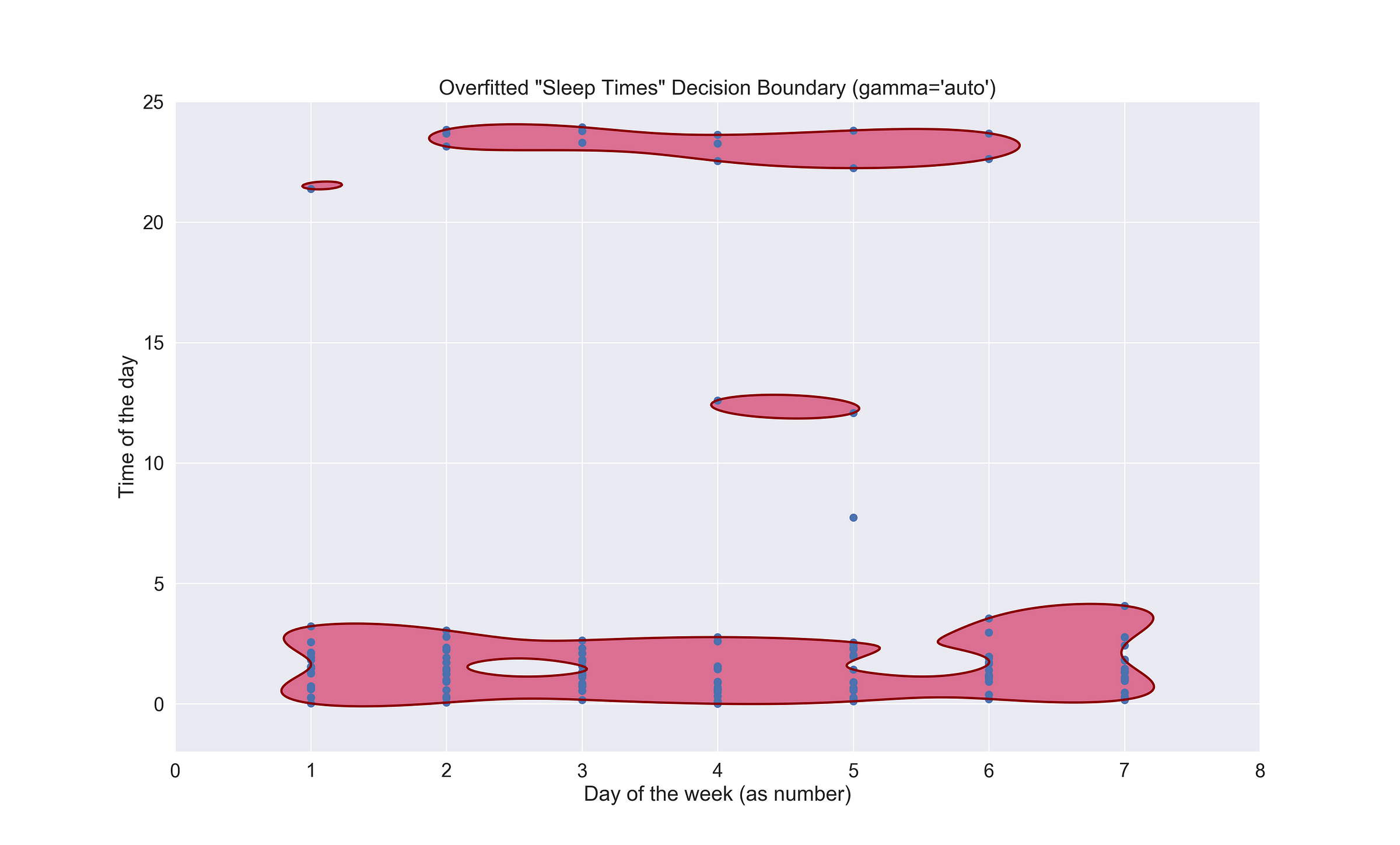
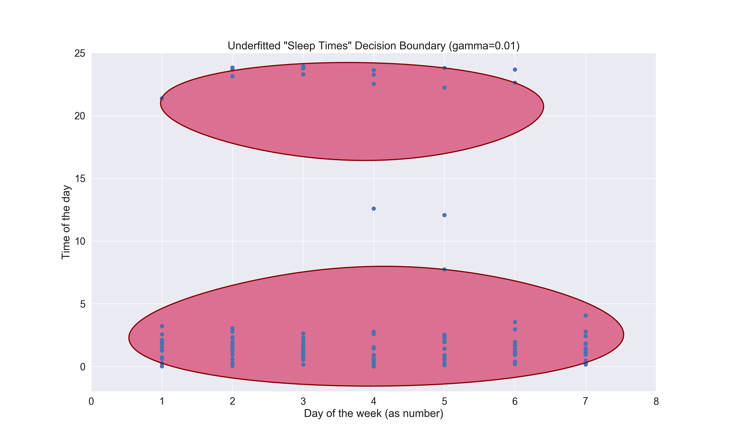
The first thing the code does is setting the Seaborn aesthetic to make the plots a bit prettier :). After it, we load the data, create the model, fit it, and finally, we plot the boundary. Notice the gamma hyperparameter in the model definition? By default, its value is 1/num_features. If I’d have kept that way, my model would be way too overfitted to my liking, so you might need to tweak it until you reach that sweet and perfect spot. But beware! Because you could also underfit it. Below, you’ll find an example of an overfitted model (with gamma set to auto) and an underfitted one (gamma set to 0.01)
Time Asleep Trend with Time Series
I had the impression that my time in bed has changed since I started my backpack days. In the beginning, I spent around a month in the mountains of Austria. There, I didn’t do much; just hiking, playing Switch, and resting (a lot!). But then, I arrived in Asia, and here the story has been a different one. On those first days, I barely slept; the excitement and desire to see, and eat everything had me up until the wee hours. Then, a month later, the weariness finally reached me, and there, at the northern beaches of Malaysia and the southern ones of Thailand, I rested (a bit). But not for long.

The point I want to illustrate is that, over these five months, my sleeping pattern has changed, or so I believe. To confirm this idea, I resorted to time series analysis, and the library Prophet to fit my sleeping times and see if there’s indeed a noticeable change. In particular, I wanted to know the general trend and the weekly seasonality.
Before jumping right into the plots, I want to explain a bit of what will happen here, as well as the code I wrote to analyze the series. The general trend I mentioned above describes the overall evolution of the series, while the weekly seasonality explains the time series’ behavior over the seven days of the week.
Fitting a time series in Prophet can be done in four lines of code. First, we have to call the Prophet() function using as a parameter the desired dataset. This input has to be a data frame with two columns: ds and y. The ds column, which stands for a datestamp, should either be a date (YYYY-MM-DD) or a timestamp (YYYY-MM-DD HH:MM:SS). The second column, y, is the numeric value we want to forecast — the time slept (in minutes). Now, armed with a tidy dataset, let’s proceed to fit our model, predict the forecast, and draw the seasonalities. The following code snippet shows how you can do it in Python.
Similar to the previous code, here we are also starting with setting the Seaborn plots style, and loading the dataset. Then, we create the Prophet object and fit the model. Once that’s done, we’ll call model.predict(df) to obtain our forecast, and following this, we need to call model.plot_components(forecast) using the newly acquired forecast as the parameter to create the trend and seasonalities components plots. Lastly, we need plt.show() to draw them. They look like this:
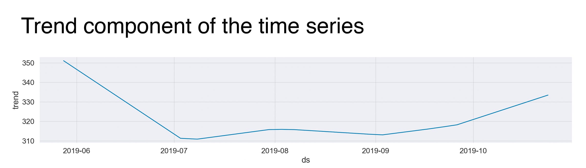
This graph is the fitted trend line that describes the evolution of my minutes asleep. However, before discussing it, I want to quickly explain the meaning behind the numbers you’ll see on the y-axis of the plots. These values aren’t, I repeat, they are not, the actual number of minutes I slept that day. Instead, we can interpret them as the incremental effect on y of that seasonal component (as stated here). For example, without spoiling too much, if you take a look at the following graph, you’ll find that the value of the first day, is around 350, meaning that this day has an effect of +350 on y. Back at it.
Just as I suspected, the variable started strong, with lots of sweet sleep. Then, in July, after arriving at the beautiful and out-of-this-world Singapore, my time spent under the blankets dropped significantly, and it remained that way for almost a month (fun times!) until I reached my next destination. It was there, at a cute red hammock in Koh Lanta, Thailand, where I rested, and rested, and regained the very needed sleep my body so much craved. Thus, that’s the small bump you see around the beginning of August.
Ah, but my newly hammock-found life didn’t last long! Nope. After waving goodbye to the cozy cabin that sheltered me, I went to the buzzing city of Chiang Mai, and weeks after I was in busy Bangkok. As a result, once again, the trend decreased.
By that point, I was feeling a bit weary after having visited five cities within three weeks. And so, from the second week of August, my daily routine became playing Fire Emblem: Three Houses, writing, coding, and making sure I slept at least 7 hours per day. The increase at the end of the trend line is definitive proof.

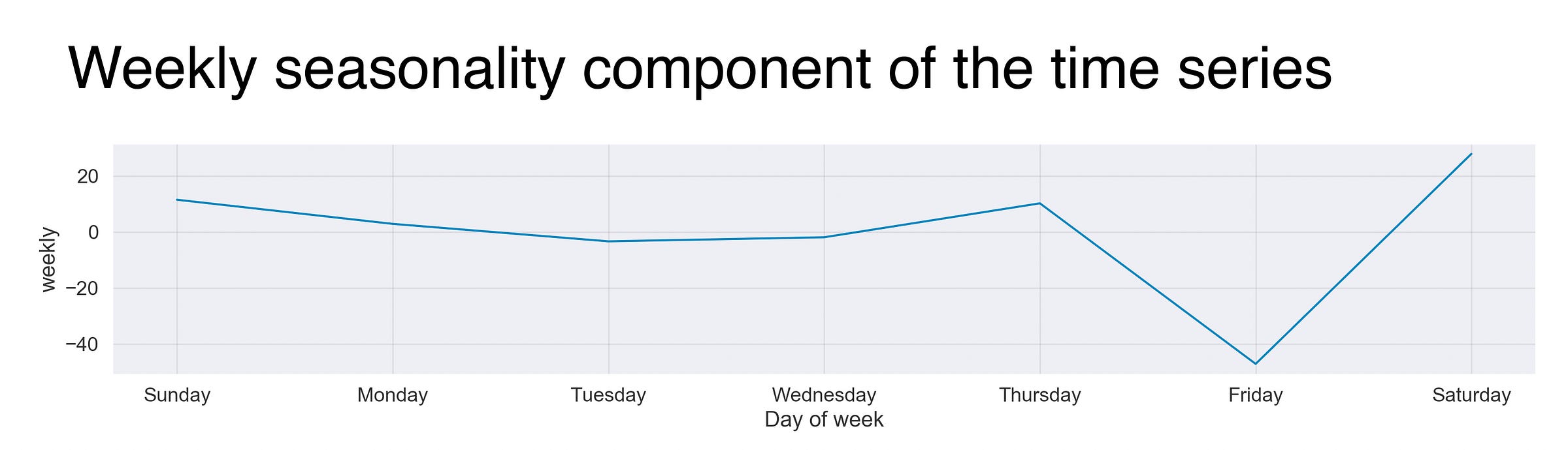
The next second component I’ll present is the time series’ weekly seasonality or the weekly sleeping patterns. The graph illustrates that on the first four days of the week (or the last one and the first three, depending on where you are :P), my sleeping times are mostly the same. Notwithstanding, coming Friday, the whole thing turns around, meaning that my sleep gets affected on this acclaimed day, which is a genuine surprise considering that in some sense, all my days are “Fridays”; I guess some things never change. Moreover, and I’m pretty sure this applies to most of us, Saturday night is the longest one.
Recap and conclusion
Sleep. The fantastic state of mind that brings up closer to our dreams, re-energies our bodies, and takes us to a new day. Yet, as natural and recurrent as it is, I barely know anything about how I perform this soothing activity. In this article, I showed how I turned to my trusty Fitbit’s sleep data to learn about my sleep patterns.
During this woke experiment, we learn that my favored time to go to bed is 1 am., that I spent about 20 to 45 minutes up at night, and sleep around 7 hours. Besides this, we witnessed how anomaly detection serves to expose those wild nights where we go to bed later (or earlier) than usual due to traveling or because it’s Friday. Lastly, we took the sleep start times to perform a time series analysis to discover that after a month of shorter sleep sessions, I’m now trying to recover all those lost zzz’s.
As for future work, I’d like to explore my stages of sleep and correlate the data with other sources, such as weather data or my Netflix or Nintendo Switch activity. But first, I need to find a way to get that data (any ideas?).
That’s it! Thanks for reading. Enjoy one of my favorite sleep-related (not really) songs!
So, how do you sleep?
The complete code is available at https://github.com/juandes/wanderdata-scripts/tree/master/fitbit-sleep
This article is part of my Wander Data series, in which I’m telling and reliving my travel stories with data. To see more of the project, visit wanderdata.com.