100 days of travels - a data recap
Summarizing and recapping with data the first 100 days of my backpacking adventure.


On May 28, I embarked on an adventure that so far has taken me to the breathtaking mountains of Austria, the shining city of Singapore, the wonders of Angkor Wat and more. As part of this adventure, I’ve been collecting, logging, and documenting all sort of data about many facets of my trip so I can later relive my days and learn more about it. Also, as a data practitioner, I thought this was the perfect opportunity to tell travels stories from another perspective. (Plus I realized I needed a good reason to have some lazy days and play with lovely data). Now, as of today, it’s been a little over 100 days on the road. To celebrate this milestone, I gathered some of the collected data to analyze it and recap what was going on during these first 100 days. In this article, I’ll share my findings with you.
Of the plethora of data I’ve gathered, in this experiment, I’ll focus on that that relates to everything day things that we all know or use. With this, I hope that besides informing you of my travels shenanigans, I’ll be able to make you curious about the things you could learn if you would study your data. Also, I want to clarify that to make this report brief and to keep you focused, I’ll just scratch the surface (aka. applying exploratory data analysis and descriptive statistics) of the datasets while avoiding delving too deep into them. Otherwise, I’d probably never finish. Now, without further ado, these are the topics I’ll explore.
- Visited countries
- Number of steps
- Distance walked
- The altitude of visited places
- The weather of visited places
- Foursquare’s Swarm (an app) check-ins
- My top Spotify songs and artists
- Time sleeping
Let’s begin.
Visited Countries
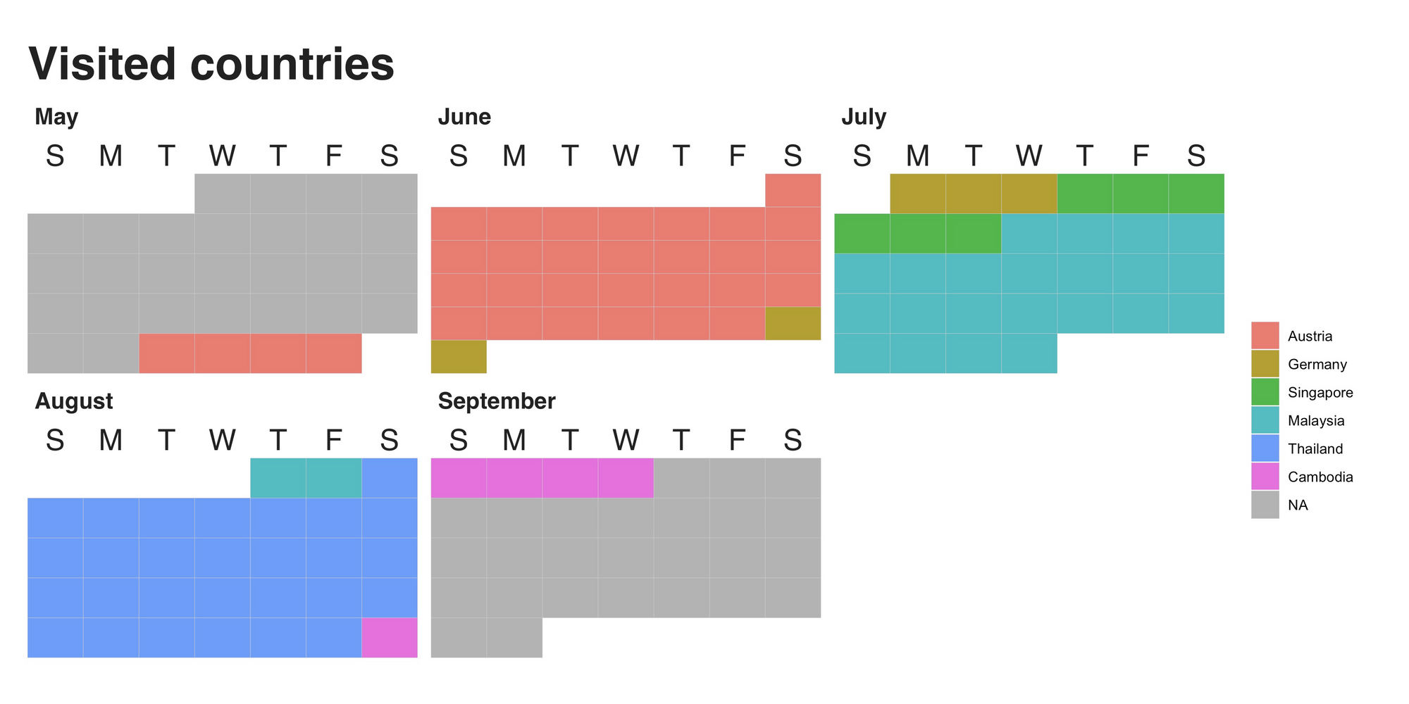
My first stop was Austria. There, amid the mountains and the early summer breeze of the Tyrolean landscape, I spent a total of 32 days. Right after it, I went back to Germany (where I was previously living) to say my goodbyes, visit my old colleagues (who baked me a fantastic cake, by the way), and to take care of some details I left hanging. Then, after 5 days of reminiscing and envisioning the upcoming adventure, I boarded an airplane bound to Singapore, where I spent 6 fantastic days. After Singapore, the next destination was Malaysia (24 days), Thailand (28 days), and then Cambodia (5 days). It was there, in the beautiful city of Siem Reap, where I reached the 100 days mark.
Footsteps
If you ask me what’s the activity I’ve done the most during these days, my answer is walking. A lot. Walk to the train, walk to the hostel, to the park and so on. Which is great, you know. Besides being good for your health (I helps me burning all the chocolate and noodles I consume), it can also save you much money in the long run (which I’ll probably spend on chocolates and noodles). So, according to my trusty Fitbit, during these 100 days, I’ve taken a total of 939756 steps, an average of 9397.56 steps per day, which is more than the average number of steps for the U.S population (it’s between 4k to 5k, source). The following line chart shows the number of steps per day, grouped by country.
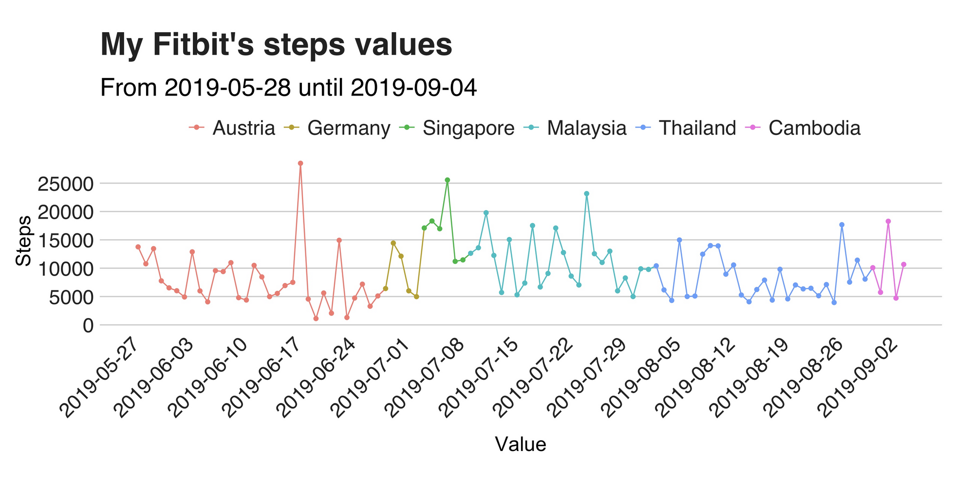
The first noticeable part of the visualization is the peak on June 18. On this day I achieved a total of 28514 steps as a result of a hike that took me 2239 meters above sea level. Notwithstanding, right after this arduous day, I had the two extremely lazy days (so far), in which I moved my legs 1112 and 1299 times. This pattern of one lazy day after an active one seems to be a repetitive pattern that can be seen in the graph’s line. For example, in Malaysia, it shows up several times. So, to summarize, I’d say the general trend is quite stable. However, is the daily number of steps also stable? Well, of course not Juan, we just saw that. Still, to better assess this I plotted a histogram to see how they are distributed (also, histograms are nice).
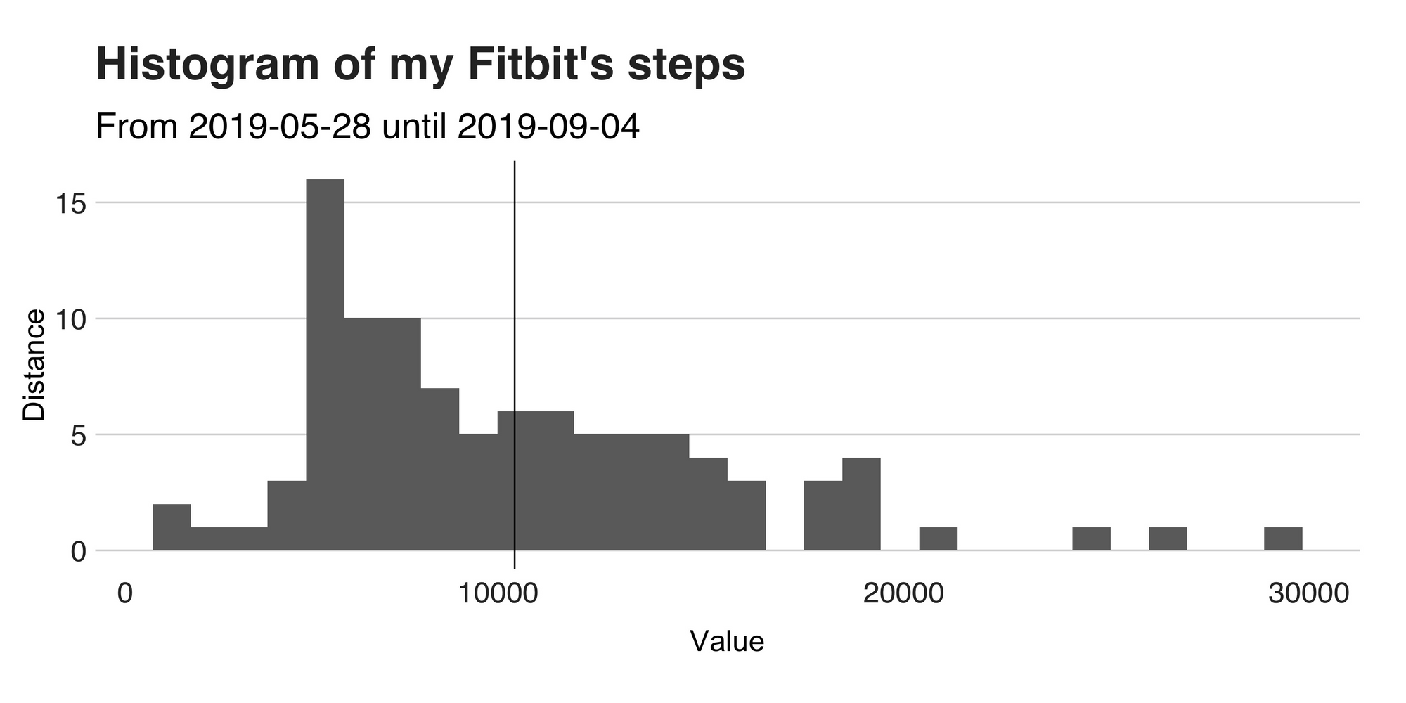
This histogram shows the steps’ distribution, and honestly, it isn’t attractive at all. For starters, the mean value (the vertical black line) is far from the peak. Meaning two things: my steps are all over the place, and second, my actual average is a bit far from being 9k steps per day (I should’ve considered the median, oh well).
Distance walked
Now, let’s take a step (ha!) away, and move on to a similar topic: distance. To complete the walking story, I wanted to complement these facts with the total distance traversed because the steps by themselves don’t tell that much. So, as before, I went to my Fitbit data, took a look around, and produced this graph.
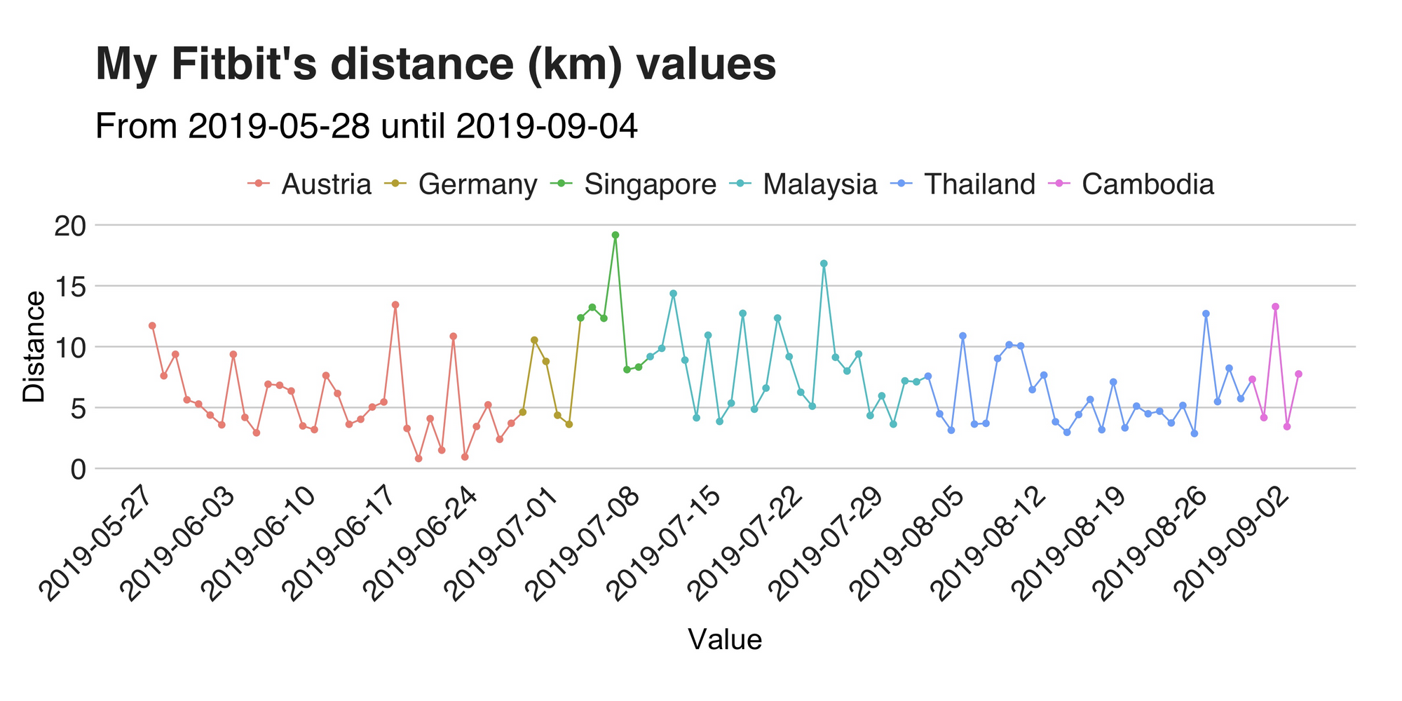
No, this is not a mistake, nor you see double. This graph’s line is very similar to the previous one (scroll back a bit and take a quick look). See? So why’s that?. The explanation behind this is that my walk stride is entirely consistent (it’s not like I’m growing or shrinking every other day), so there’s bound to be a strong correlation between my steps and distance walked. And indeed there is one, and its value is 0.978.
Weather data
Now please, take a seat because I’m done speaking about walking and steps. For this section I want you to take your eyes off the ground, and turn them upwards because I’ll be talking about the weather, in particular, about the temperature and the barometric pressure of the places I’ve been. As part of my data odyssey, I wrote and deployed a script that is regularly reading the weather of the city I’m currently at and writes the output to a database. Thus, somewhere, in some computer in the cloud, there’s one table with a vast collection of weather data that has been following all my steps (ok, sorry, no more steps talk). The dataset is enormous, by the way. It includes numerous features that I’d love to explore and dissect one by one. But not today. On this occasion, I’ll focus on just the temperature. Let’s take a look.
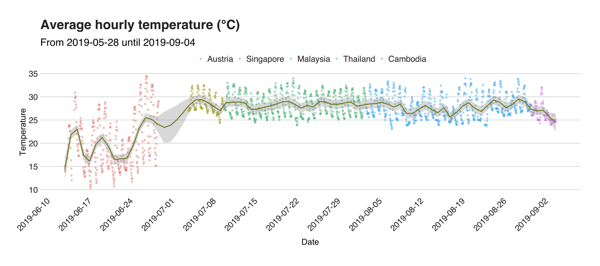
This visualization represents the temperature (in °C) of the city I was on that given day. Each dot you see there marks the average hourly temperature calculated from a total of four readings (one every 15 minutes), and for better readability, I added a smoothed line that helps us follow the trend. As before, the first country on the plot is Austria, and its data unveil a significantly lower temperature (including the global minimum at 10.76 °C) when compared to the rest of the places. After Austria, I went to back to Germany, but, my time there was a bit rush, and unfortunately, I forgot to update my weather script (it’s not fully automated yet :/). Then, after shedding one or two tears and hugging my good friends, I went to the airport and a couple of hours later, I greeted the tropical and humid weather of South East Asia.
Now, the weather in South East Asia, or at least of the places I’ve been is quite the same. From the alien-looking Singaporean parks to the northern temples of Chiang Mai, I’ve been bathed and praised by the radiant sun these parts of the world has to offer. Without having to focus that much, we can quickly notice how most of the max temperatures are around 33 degrees (add an extra couple of them if you consider the humidity) forcing me to cover myself with sunblock on those long outdoors days. On the colder side, the lowest temperatures are around 25 degrees.

Let’s shift our attention from temperature to another weather-related value, the barometric pressure. I’m truly aware that this is a strange and honestly, a bit unimportant metric worthy of tracking. However, for a previous experiment of mine, I required this data and thus, ended up writing (and publishing) an Android app that reads the device’s barometer (your phone probably has one) every couple of minutes and stores it internally. Thus, since the app is there, then sure, why not use it. So, here is the median hourly pressure value as read by my phone.
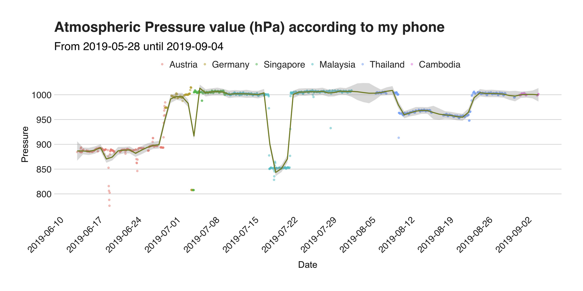
See, not so exciting. However, let me turn that (literally around) and try to impress you (yeah, right) with something better. The barometric pressure metric presented here is inversely proportional to the location’s altitude, meaning that as the altitude (where 0 is the sea level) increases, the pressure decreases (that’s why we feel funny when we’re on top of mountains). Armed with such knowledge, I found out the equation that turns the table around and calculated the approximated elevations of my adventures. The next graph presents this.
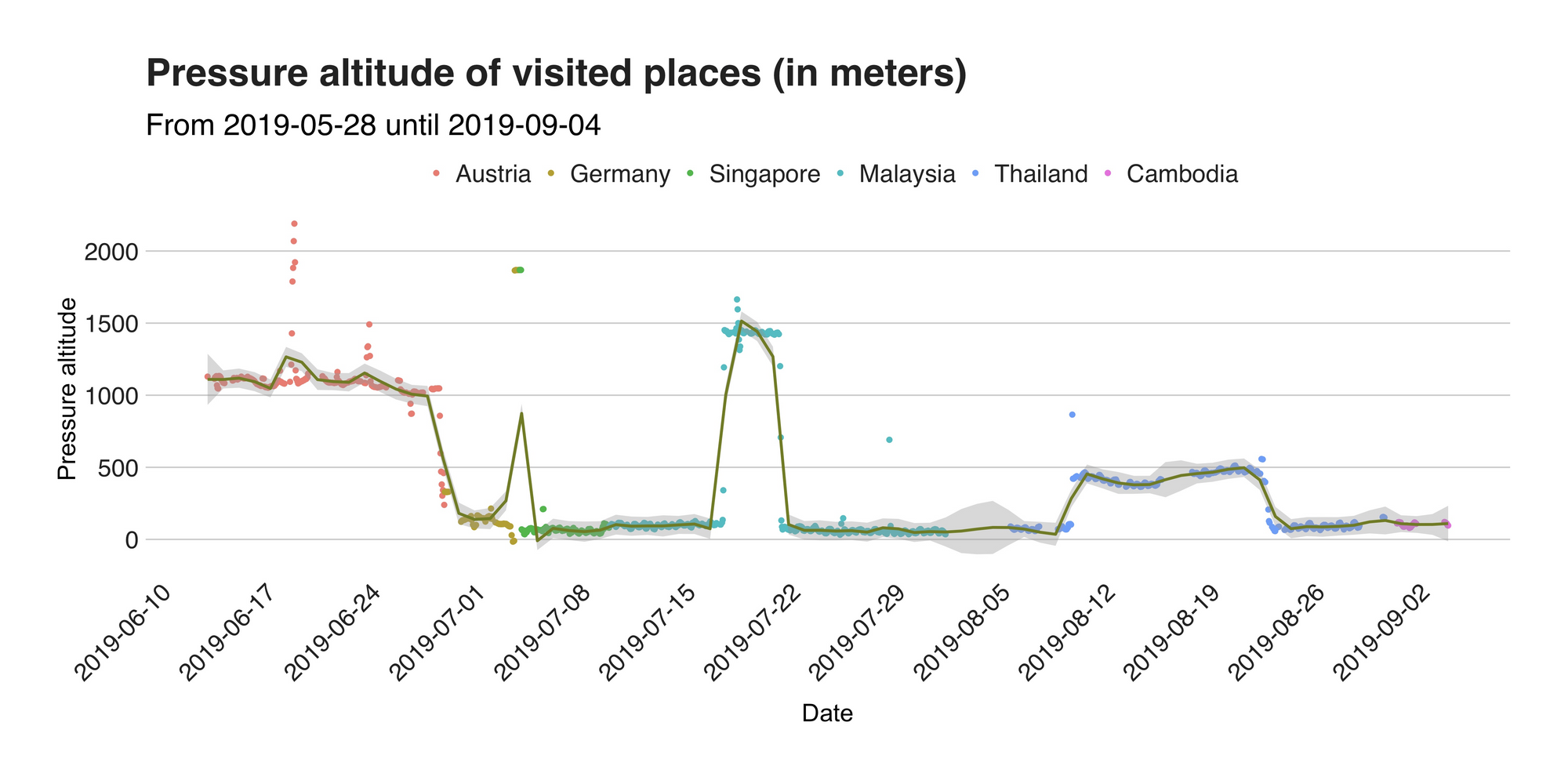
To corroborate that my results are correct, I double-checked some of the numbers with those of Google and concluded that indeed they are very accurate. For example, according to the values, in Austria, I was typically at around 1100 -1200 meters above sea level, which is correct if I use as a reference the altitude of Seefeld (1180 m.), the nearest town to my location back then. On the same note, the graph’s highest point at 2189.81 m. comes from the Nördlinger Hutte, a cabin located at the height of 2239 m. on the summit of the Reither Spitze. But my biggest surprise came from Malaysia. What at first I thought was a mistake is actually the altitude of Tanah Rata, a town situated at 1440 meters above sea level I visited during my stay in Cameron Highlands. To summarize, the median (not mean!) altitude per country was 1089.76 in Austria, 142.07 m. in Germany, 87.57 in Malaysia, 375.36 in Thailand, and 64.53 m. in Singapore. Besides this, the other relevant point I see is the reading on July 3, which is there due to the low pressure my phone registered during my flight to Singapore.
Spotify data
What’s life without a bit of music? Even though I got rid of almost all my belongings, subscriptions, and stuff before starting my journey, Spotify wasn’t one of them. Throughout my whole trip, this fantastic piece of technology has been my solace in those long train rides and lonely silent night. Thus, it deserves to be here, in this recap.
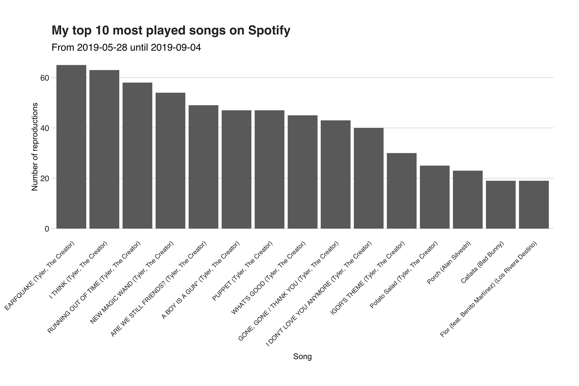
I’m no stranger to analyzing Spotify data. In the past, I’ve written several articles explaining the tidbits of my playlist and their characteristics. Nonetheless, I wanted to take this work further and make it bigger. So, I wrote yet another service that’s logging every played song I play. With this valuable data in hands (aka. BigQuery), breaking it down was only a matter of writing a query to get the data, and running it through one of my many already-prepared analyses pipelines. For this occasion, I’m only looking at the number of played songs, and the top songs and artists. The images down below present the result.
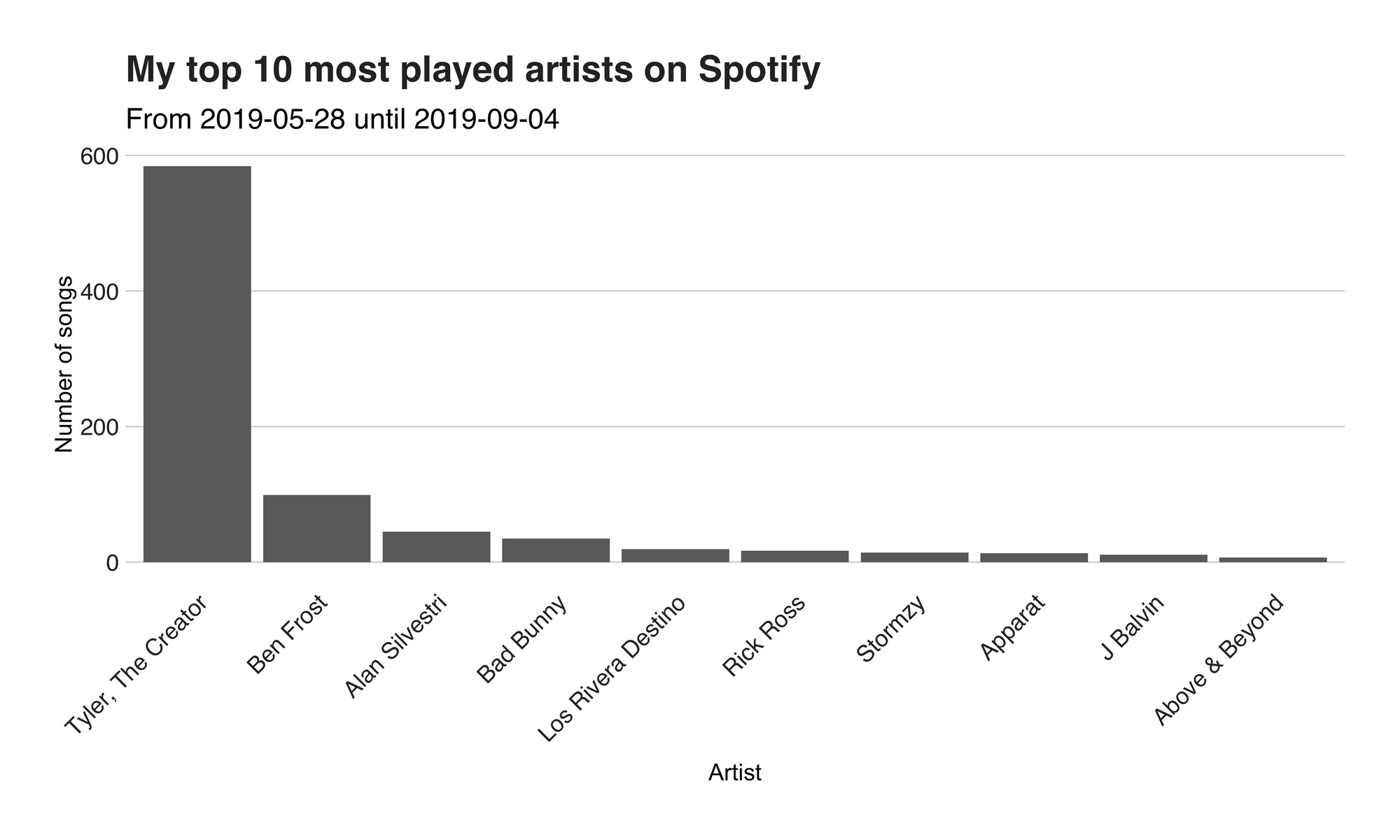
I’m not surprised at all. Ever since Tyler’s new album, IGOR, came out several months ago, I’ve been blasting his lyrical wisdom like there’s no tomorrow. In total from the 1208 songs I’ve played during this period, 584 (48.34%) had been from him. But rap is not the only thing I like. I’m also into instrumental and more easy-going kind of stuff, which is perfect for programming or for writing articles such as this one. That’s why in the second and third position we have Ben Frost, composer of the original soundtrack from the series Dark (have you watched it?), with 99 (8.19%) reproductions and Alan Silvestri, composer of both Avengers Infinity War and Endgame soundtrack. Then, there’s a bit Spanish (hola!) music by none other than Bad Bunny (35, 2.89%), followed by Los Rivera Destino with 19 (1.57%) songs streamed. While this graph looks at the artists, the second one (see down below) explores the top songs. As expected, most of them (12 [the complete IGOR album] out of the first top 15) are from Tyler.
Location’s check-in with Swarm
I like checking-in to places. What motivates me to get my phone, open an app and confirm that I’m at this specific location is the idea of going back to the map to revisit and remember all the great locales I’ve been. “Oh, I remember this place!” “The food here wasn’t that great,” or “here a bird pooped on me.” Besides, this works wonder when you want to go back to that hole-in-the-wall where you had an amazing Coconut Shake. The app in question is Foursquare’s Swarm, a platform that’s just doing check-ins. One of the main reasons why I particularly like this one is because it provides a way (an API for those tech-savvy out there) to download all the data one has entered. So, as you might already expect, I wrote another script for getting said data. The provided dataset is very rich in features, and I could write a billion words about it, but today, I’ll concentrate on the categories of the visited places, and the check-in times.
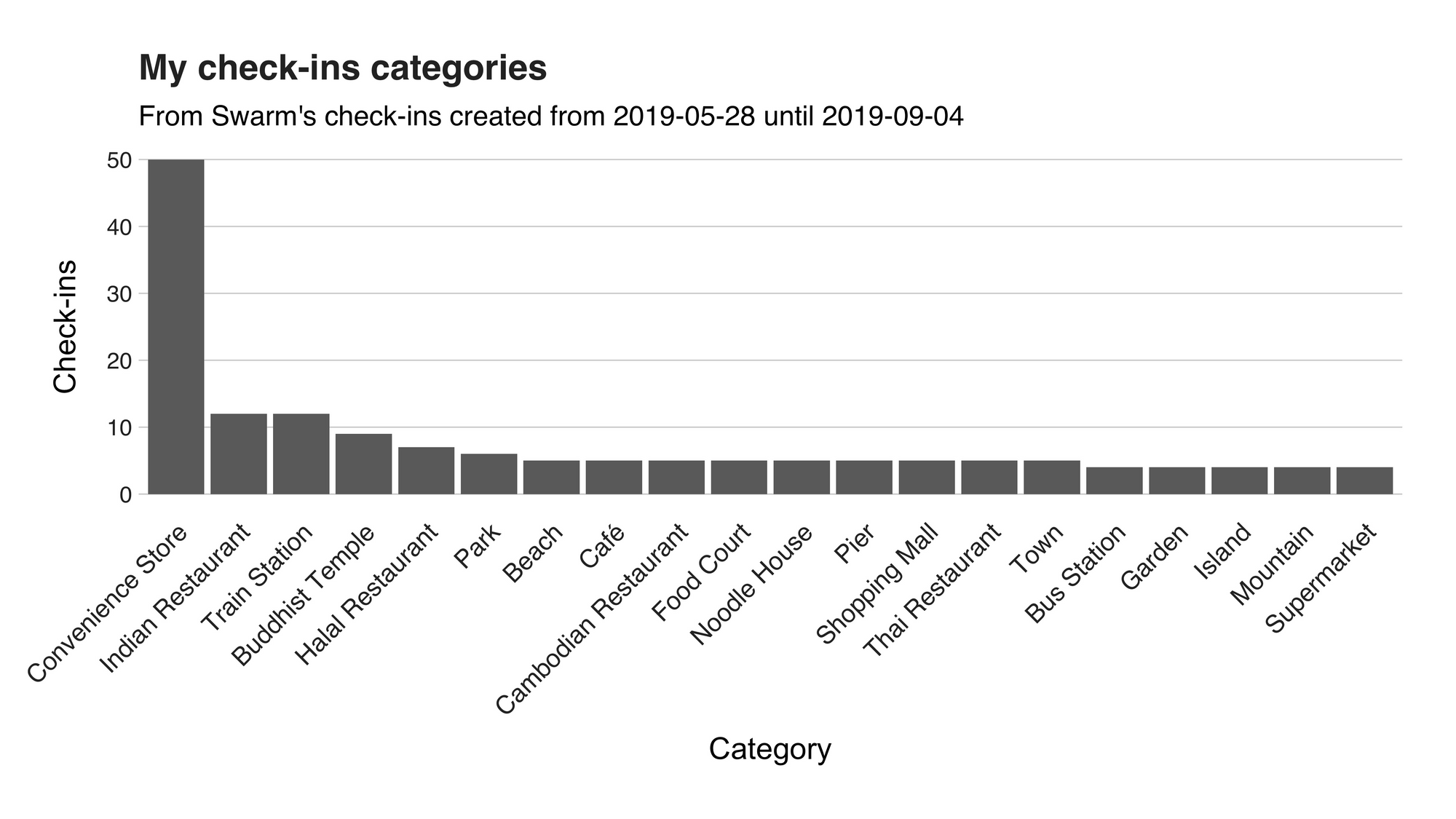
On the first spot, we have the “Convenience Store” category, namely the 7-Eleven’s, with 50 (55.55%) check-ins. As I briefly said in a previous article, South East Asia is synonym with 7-Eleven, an institution that has become my to-go place for those quick needs, for example, the chocolates mentioned above, water, cookies, Slurpees, grilled cheese and more! (I think I’m going there after finishing this article; edit: I went). Right after this category, we can find the delicious and abundant “Indian Restaurants” with 12 (13.33%) check-ins. Right after it, we have the “Train Stations,” (12, 13.33%) which I’m pretty sure it includes the metros/tubes/subways, and the impressive “Buddhist Temple,” (9, 10%) I visited during my stay in Thailand. Other worthy mentions are “Park,” “Noodle House,” (yummy!) “Town,” (?), and the four “Mountain” I visited. With this graph, I’ve answered the where, but what about when? Let’s take a look at the next one.
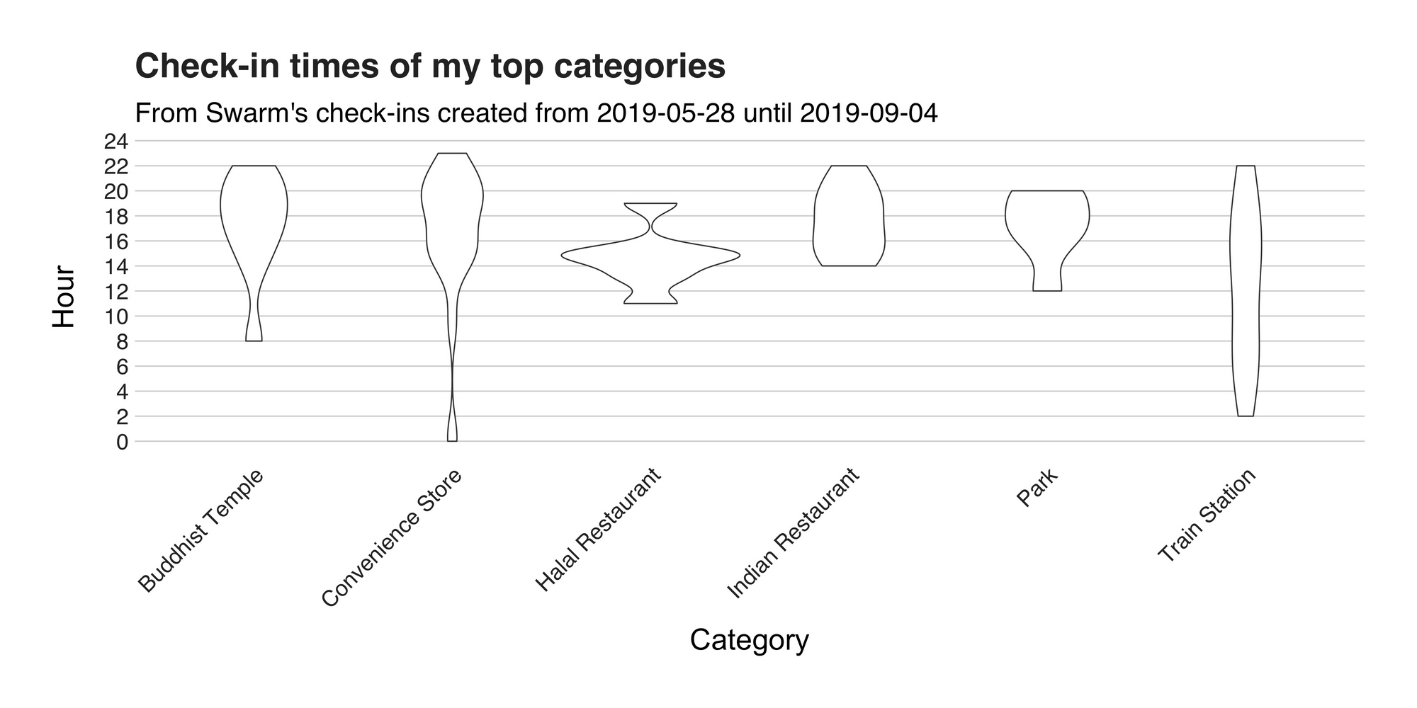
This is a violin plot, and it displays the check-in times of the places listed under these six top categories. The first of them, on the left, is “Buddhist Temple,” and here the violin is wider in the upper region, stating that I went to these holy places around the afternoon and early evenings. Then, on its right is the 7-Eleven category and interestingly enough, it reveals that my random trips to the store aren’t that random at all; it seems that my preferred times are definitely not in the mornings. The following two categories are restaurants, and according to this, I visit them mostly during lunch and dinner time. This pattern also shows up in “Parks,” which I like to visit in the afternoon because of that low and soft lights that are perfect for photography. Lastly, there’s “Train Stations,” and unlike the others, there’s no strict pattern here.
Sleeping data
To end this quite long article (I swear I was aiming for fewer words), I’ll present a single graph with the length (in hours) of my sleeping sections. This data comes from Fitbit, and while I’m not sure about how the device is determining this information, I’m going to say that it is pretty accurate. Also, to avoid possible confusions, the numbers here comes only from my “main” sleeping section, so it’s not counting the time spent napping.
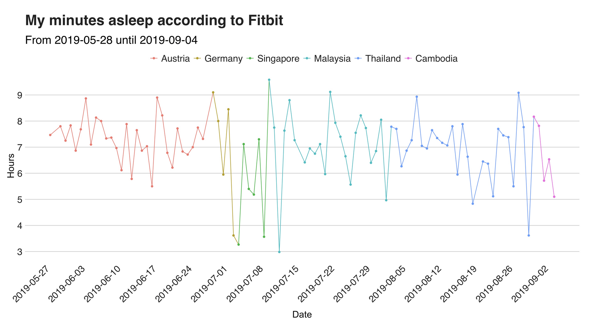
In Austria, I slept an average of 7.29 hours per night most, the highest value across all six different countries. The calm, chill, and silence of the mountains make it the perfect place to embrace the mighty touch of Hypnos and shut down until the morning after. Then, during the following couple of days in Germany, the pattern stayed the same. However, everything changed when I landed on the other side of the world because in Singapore the number dropped to 5.30 hours (the lowest); there are so many things to do in that city that I barely had time to relax. In Malaysia, especially in the last two weeks, I winded down a bit and had some good night sleep, increasing the average to 7.11 hours. Nonetheless, that didn’t last long, because, in Thailand, I was back in action (6.94 hours) and it followed me all the way to Cambodia (6.66 [!!!] hours).
Recap and conclusion
The phrase “data is everywhere” is becoming more and more common every single day, and I love it. Having a massive lake of data, out there, waiting to be explored makes me think of all the possible things I could learn about me, others, and the world. I, personally, enjoy my data, and moreover and like to give it a voice. So, when I started my backpacking adventures, I designed a whole collection of pipelines, scripts, and other moving parts to gather it with the purpose of studying it and drawing conclusions from it. In this article, I used this data to tell you about my first 100 days on the road. Through several visualizations, I explored topics such as how much I’ve walked, when do I visit 7-Eleven and my unhealthy sleeping pattern. I wonder how these numbers will look in another 100 days :) See you in three months.
Thanks for reading.
The repository containing the project’s code is available here: https://github.com/juandes/wanderdata-scripts/tree/master/recap