Interpreting my 7-Eleven visits with hierarchical clustering, anomaly detection, and time series
Learning more about me with Foursquare data


Name a better pair than 7-Eleven and Asia. I’ll wait…
Ok, fair enough. Food, culture, and surreal cities are also valid choices. But my point still stands. 7-Eleven is, in my opinion, a staple of the lifestyle of certain Asian countries. There, you can find (almost) anything you need. Did you just land and need a SIM card? Go to 7–11. Do you need water because security made you empty your bottle? Go to 7–11. Hungry and want a cheap (and tasty) breakfast? You already know.
During my traveling adventures in this beautiful continent, I’ve quite often found solace (and snacks) in this convenience store. In fact, I’ve been so many times there that I have enough data to study, and since I don’t like wasting data, well, I analyzed it.
In this article, I’ll show what I discovered after investigating my 7-Eleven check-in data collected during my time in Asia. My analysis consists of two sections: which, when. In which, the goal is to discover which 7-Eleven’s I visited and how many times. In this part, I’ll summarize the dataset and explore it with a series of visualizations, while trying to answer the question, “which 7–11 have I visited?”
Then comes the when part. In this segment, the objective is finding the trend or pattern of my visits (if there’s any!). To find this out, I’ll use hierarchical clustering, anomaly detection, and time series.
The data
This project’s dataset consists of 99 check-ins I logged using the Foursquare’s Swarm app during the period of July 7, 2019, to December 15, 2019. I collected the data in the following countries: Singapore, Malaysia, Thailand, Hong Kong, and Japan.
The tools
This experiment uses R and Python code. The primary analysis — visualizations, clustering, and data exploration — is done in R. With Python, I used the library foursquare, Prophet to perform the time series analysis, and scikit-learn to do the anomaly detection.
Let's begin!
Getting the data
Here, I’m getting all the check-ins I created between two dates. Since each API call retrieves a max of 250 check-ins, in each iteration, I had to increase the offset variable by 250 to get the subsequent 250.
import foursquare
import argparse
import datetime
import json
from pytz import timezone

parser = argparse.ArgumentParser()
parser.add_argument('--start_date', '-bd', help='Starting date', type=str,
                    default='2019-07-04')
parser.add_argument('--end_date', '-ed', help='End date', type=str,
                    default='2019-12-31')
parser.add_argument('--client_id', '-ci', help='Client id', type=str)
parser.add_argument('--client_secret', '-cs', help='Client secret', type=str)
parser.add_argument('--access_code', type=str)
args = parser.parse_args()
start_date = args.start_date
end_date = args.end_date
client_id = args.client_id
client_secret = args.client_secret
access_code = args.access_code

client = foursquare.Foursquare(client_id=client_id, client_secret=client_secret,
                               redirect_uri='https://{URL}/oauth/authorize')

# Get the user's access_token
access_token = client.oauth.get_token(access_code)

# Apply the returned access token to the client
client.set_access_token(access_token)

# Get the user's data
user = client.users()

# Change the given times to the corresponding time zone
start_ts = int(datetime.datetime.strptime(
    start_date, '%Y-%m-%d').replace(tzinfo=timezone('Asia/Singapore')).timestamp())
end_ts = int(datetime.datetime.strptime(
    end_date, '%Y-%m-%d').replace(tzinfo=timezone('Asia/Singapore')).timestamp())

offset = 0
data = []

while True:
    # Get the check-ins using afterTimestamp and beforeTimestamp to filter the result
    c = client.users.checkins(params={'afterTimestamp': start_ts,
                                      'beforeTimestamp': end_ts,
                                      'sort': 'newestfirst',
                                      'limit': 250,
                                      'offset': offset})
    # Break if there are no items
    if len(c['checkins']['items']) == 0:
        break

    for item in c['checkins']['items']:
        data.append(item)
    offset += 250

with open('data/checkins.json', 'a+') as fp:
    json.dump(data, fp)
Here, I’m getting all my check-ins created between two dates. Since each API call retrieves a max of 250 check-ins, in each iteration, I had to increase the offset variable by 250 to get the subsequent 250.
Which 7-Eleven?
From July 7 to December 15, 2019 (162 days), I had the pleasure of visiting the store 99 times on 78 different days. That’s 48% of the days — almost one visit every two days! However, and here comes the first pitfall of the analysis, I have to keep in mind that not every country I was at had 7-Elevens. For example, Cambodia has none. As a result, I need to remove those cases from my count. With that done, the total amount of days spent in countries with 7-Elevens reduces to 127, increasing the percentage to 61% — a bit more than once every two days. Figure 1 below presents the calendar. The days coded in red are those where I didn’t visit the shop, while those in blue are the days where I did visit.
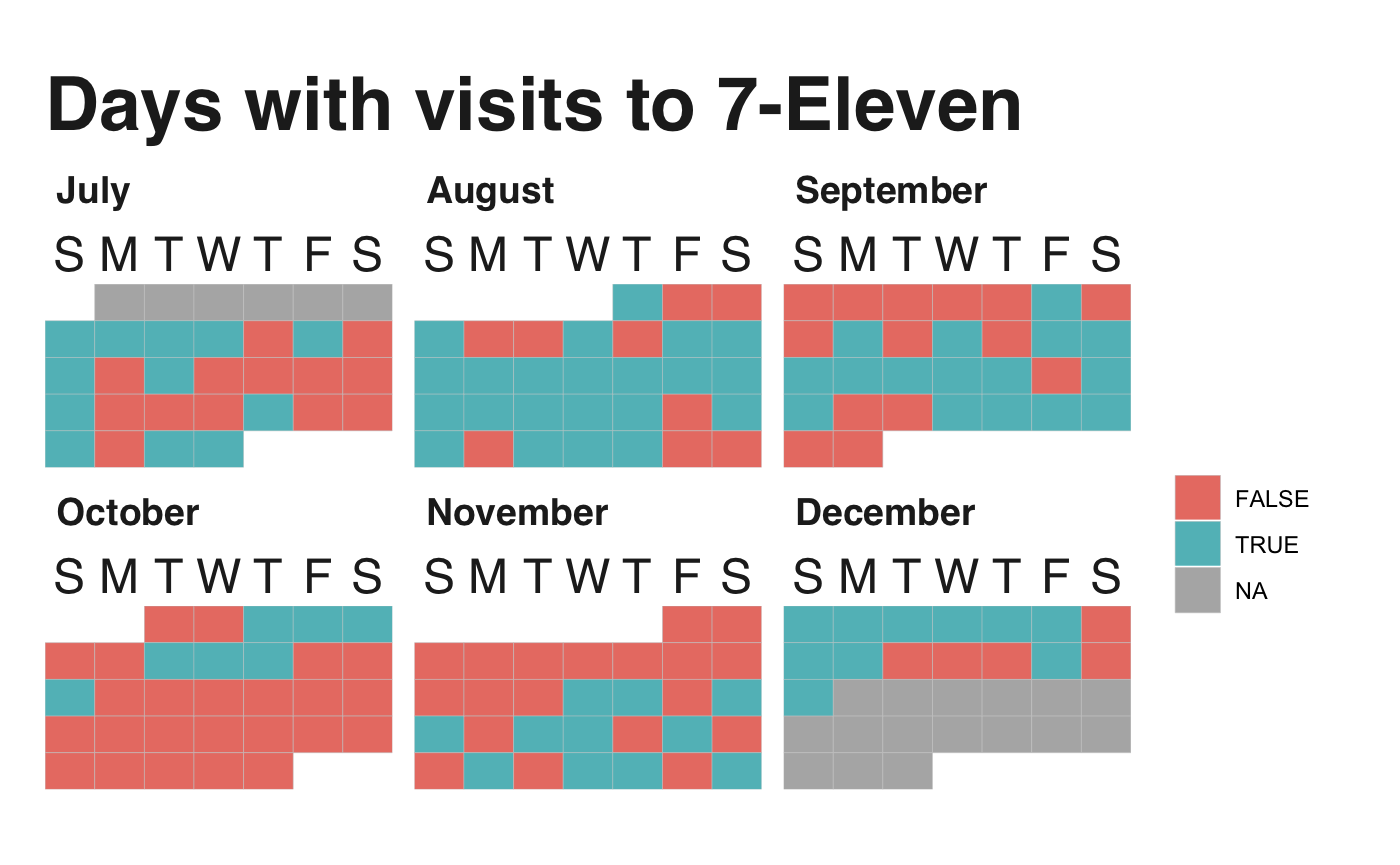
The calendar tells us that there’re a lot of visits, especially during August. I mean, look at that! On the other hand, most of October and early November are pretty empty because I was in Indonesia, a country with no 7–11s.
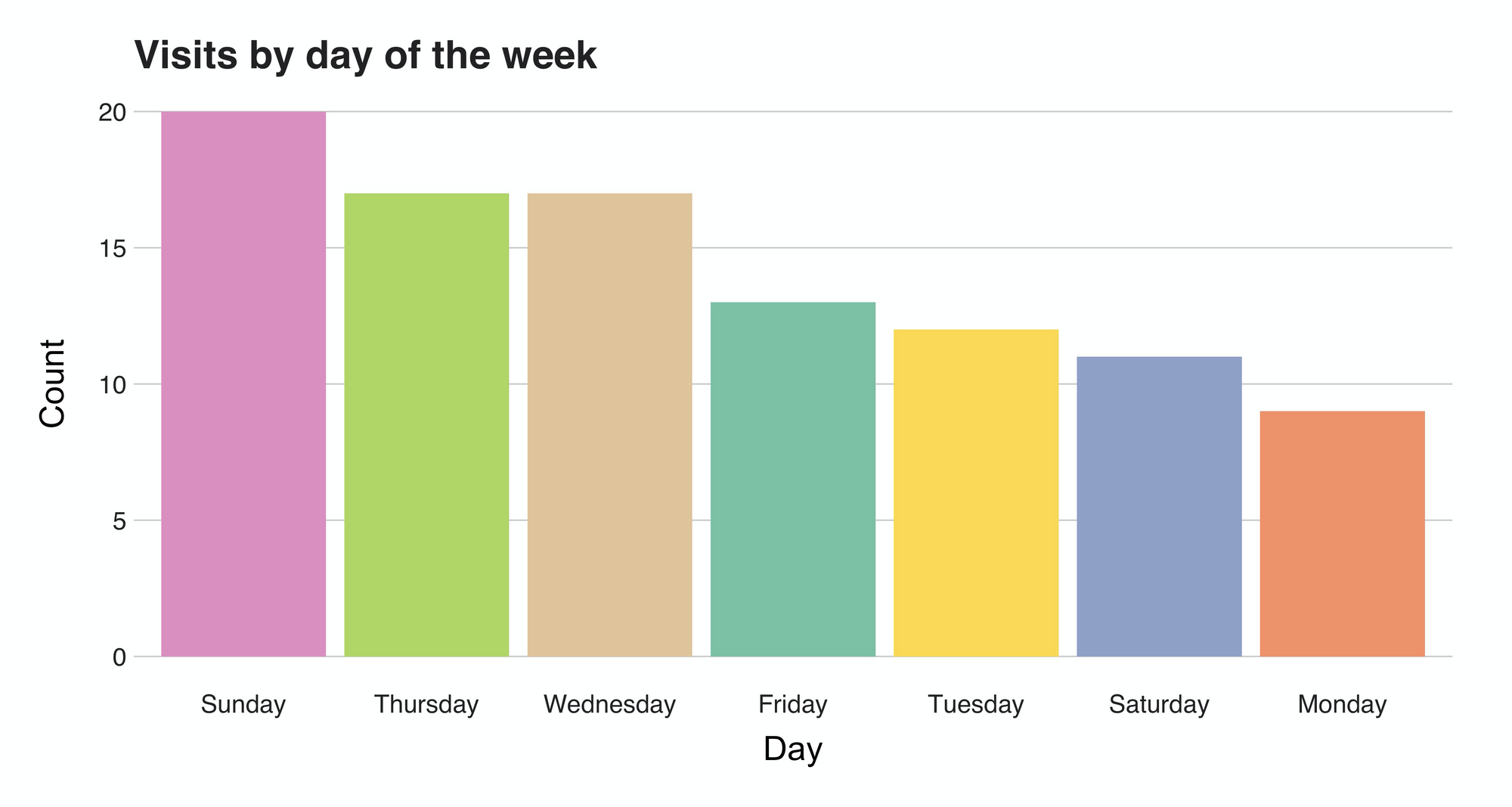
But what about the days? Do I have any preferred day? Well, there's an apparent inclination towards Sundays, the de facto lazy day of the week. Contrarily, on Mondays I probably said "ok, not today; you went yesterday," making this the day with fewer visits.
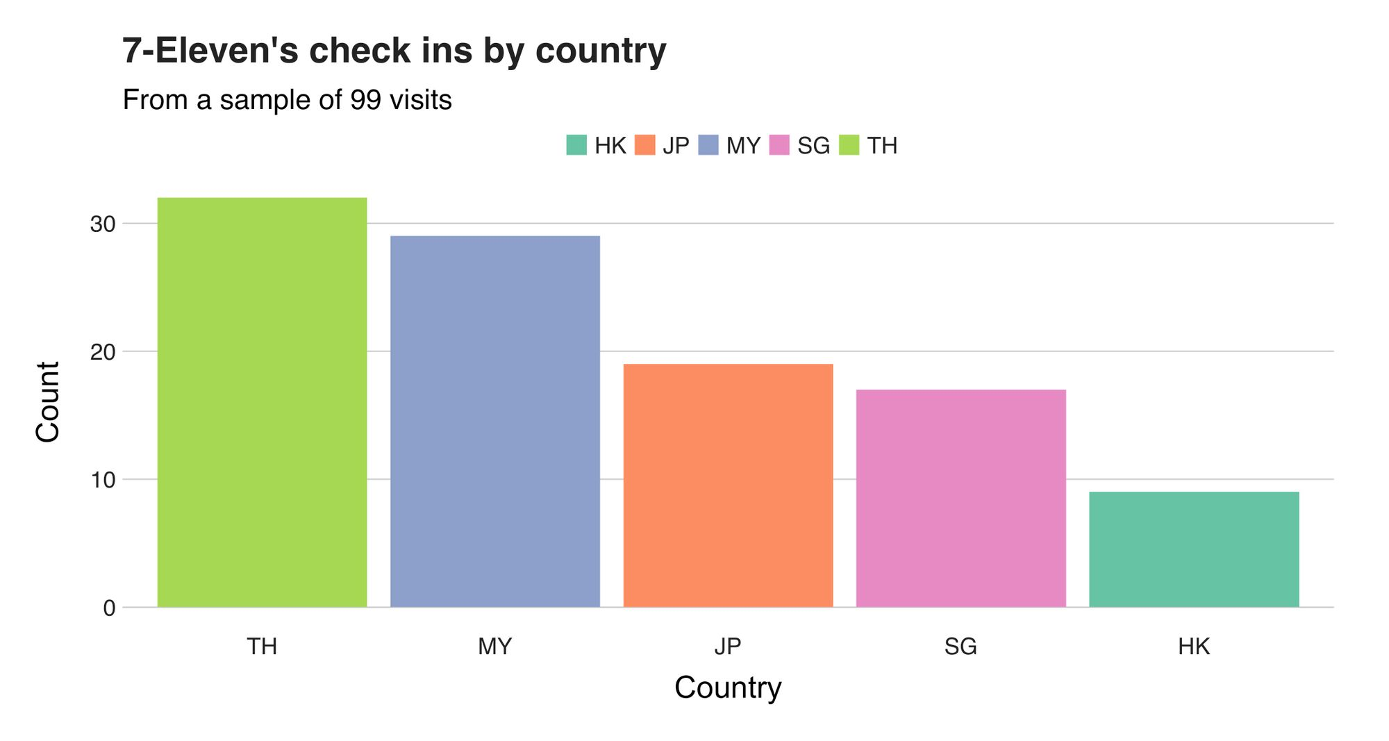
Now let's see some actual numbers. The following chart introduces the number of check-ins per country. It shows that most of the visits were registered during my time in Thailand (32) and Malaysia (29), a fact I expected since I spent a considerable amount of time in those countries.
Nonetheless, this raw number doesn’t say much about the actual visits behavior. To add extra weight to them, I computed the percentage when compared against the rest of the check-ins. These are the results:
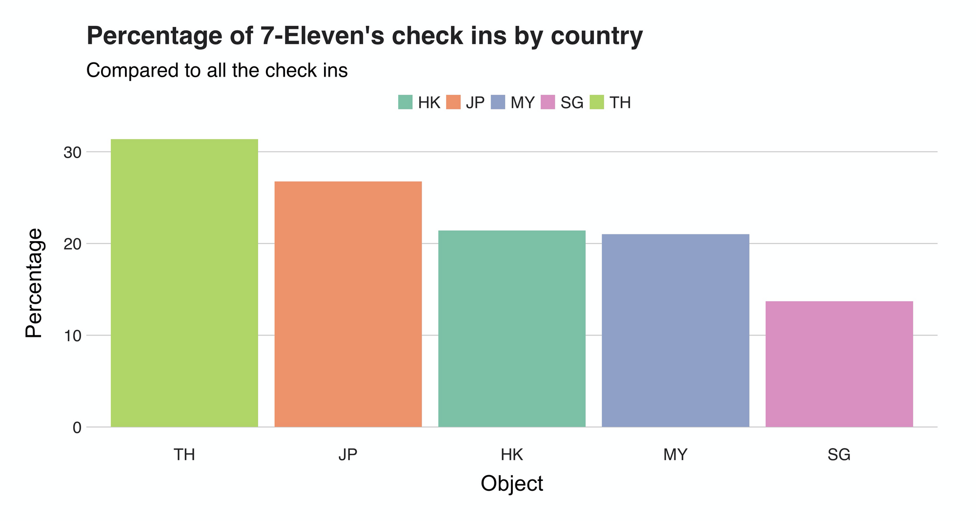
Leading the list with 31% percent, is Thailand, meaning that every third check-in I did there was from a 7-11.
Another way to further assess these visits is by mapping them. In the following visualizations, I’m presenting various maps pinpointing the exact locations and the visit frequencies.
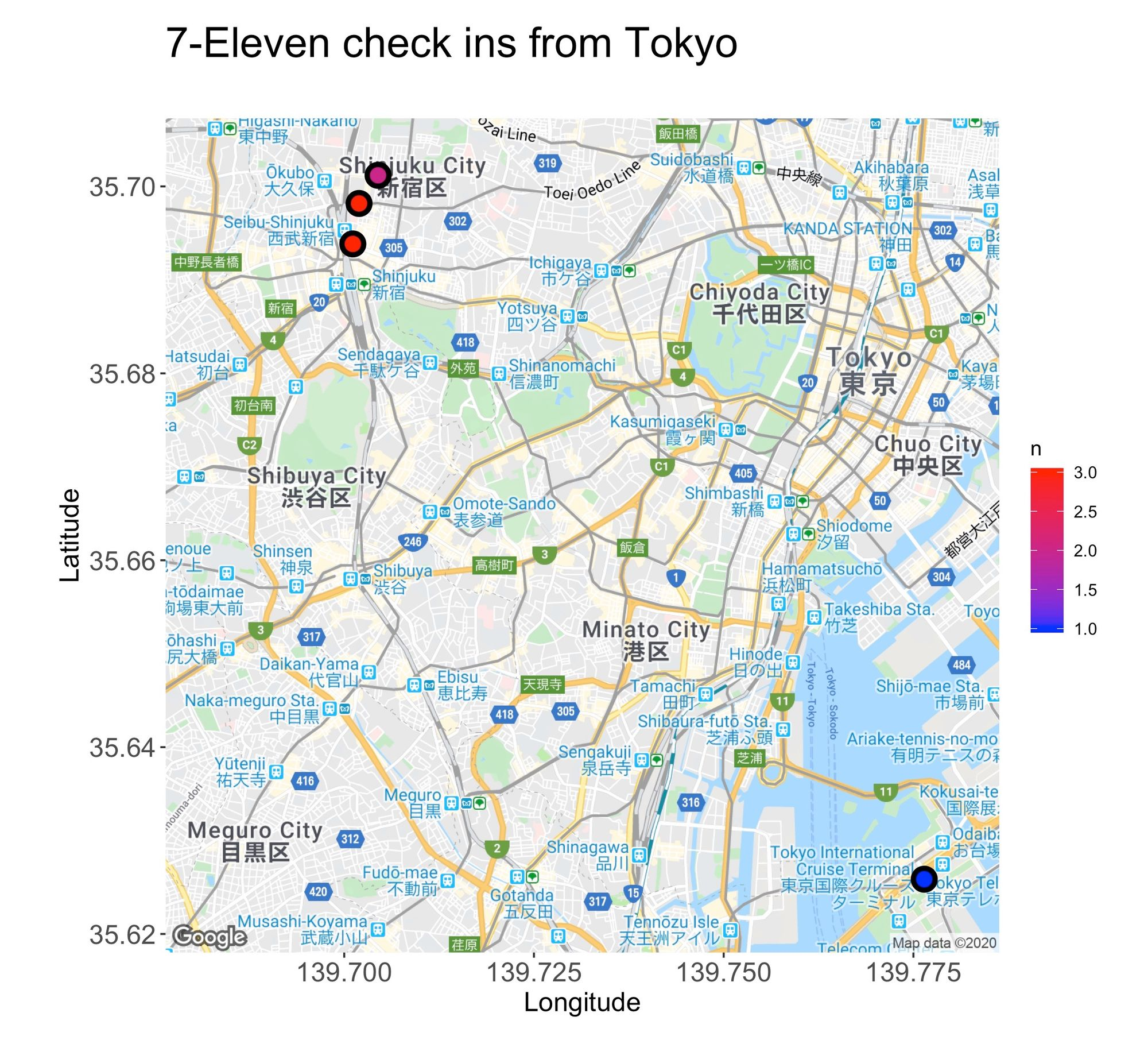
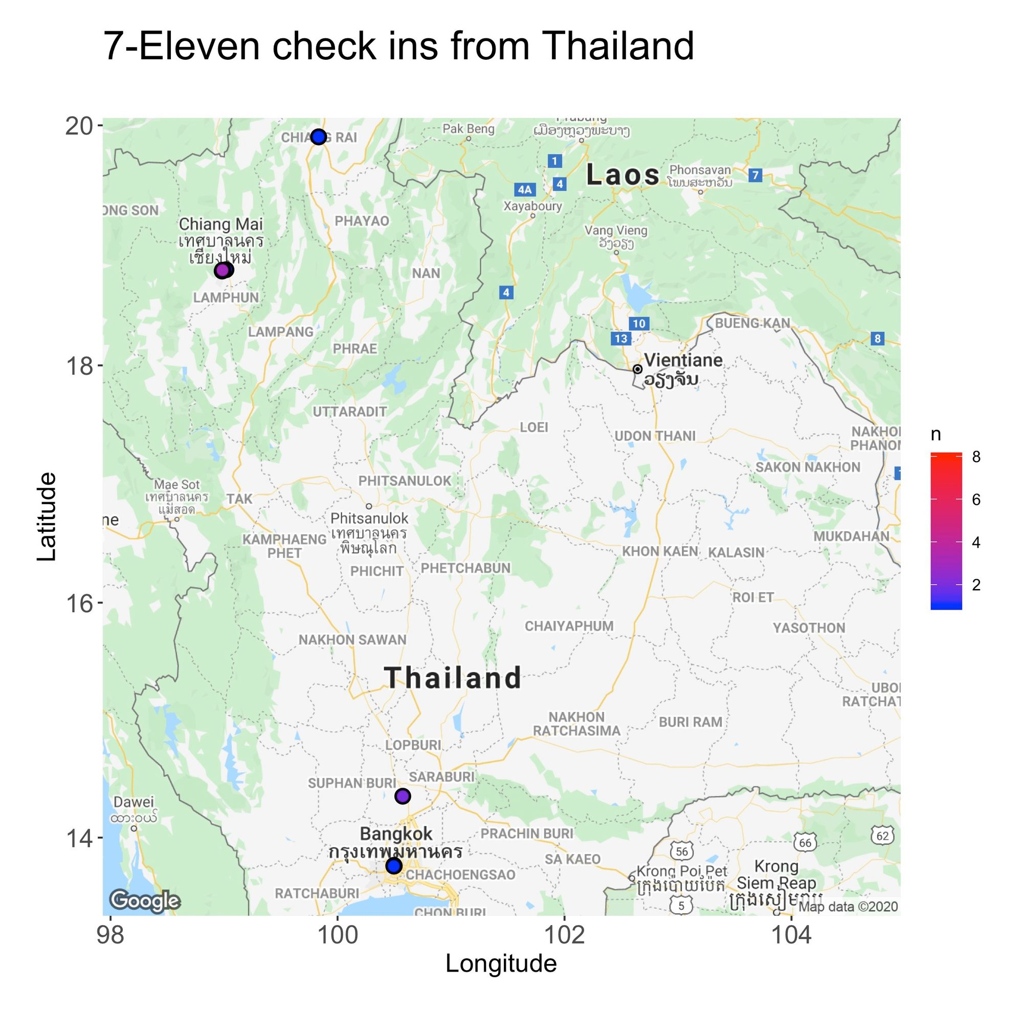
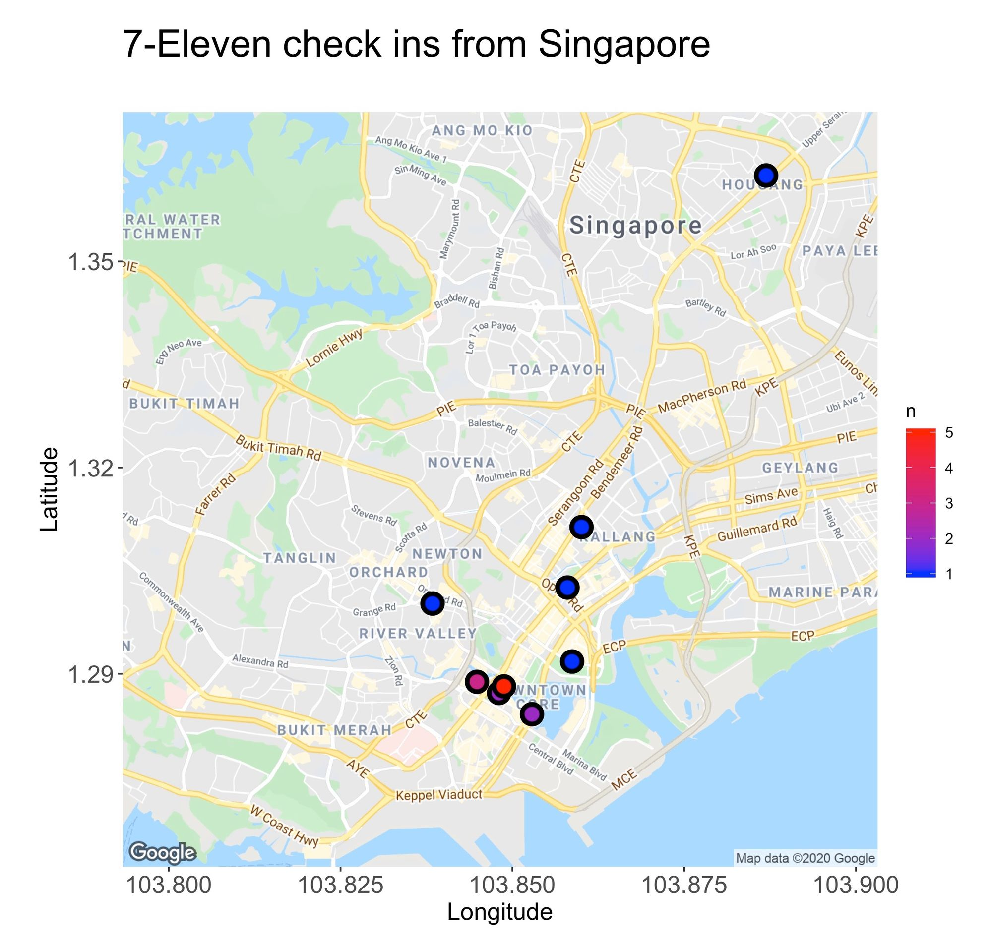
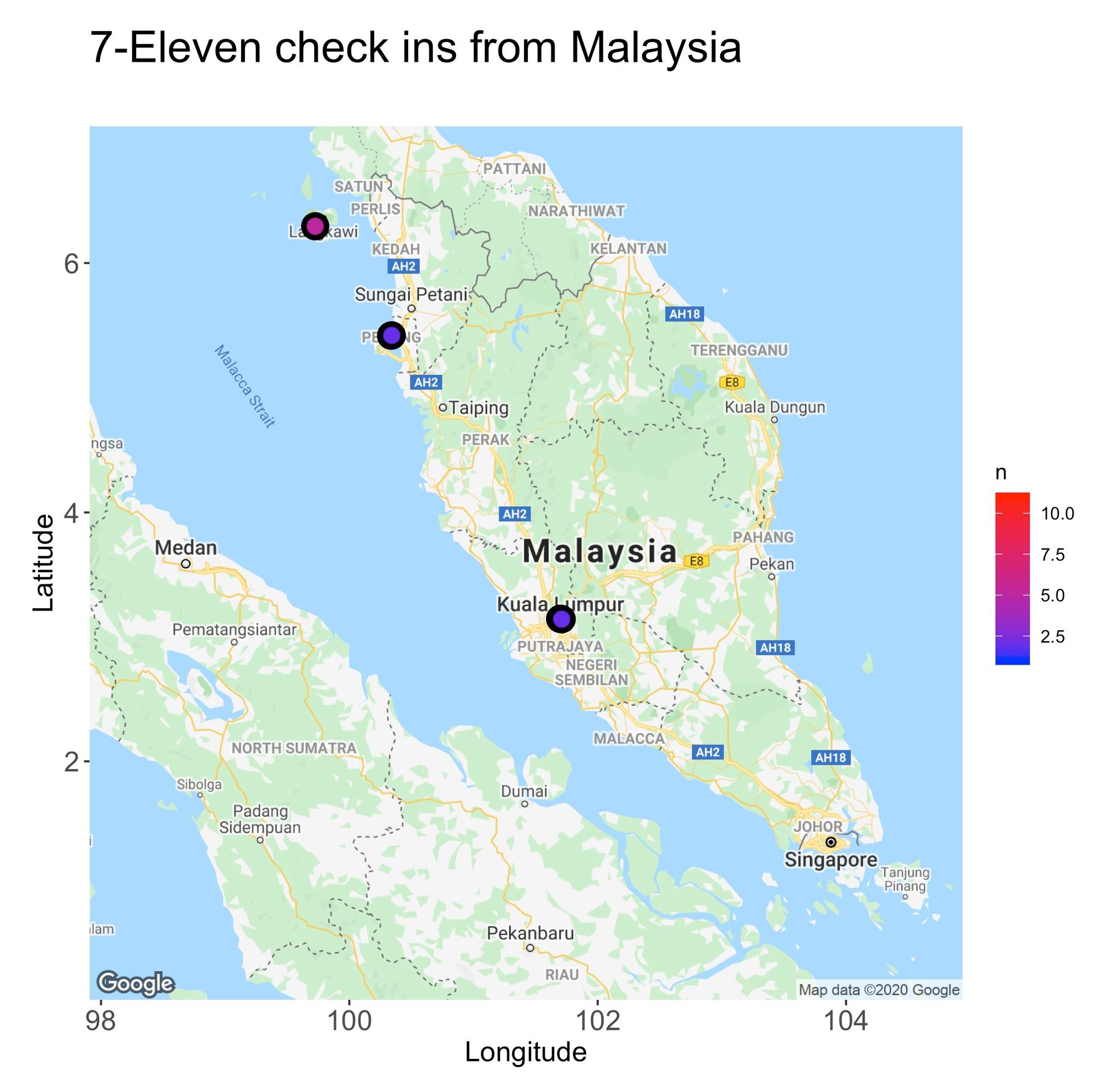
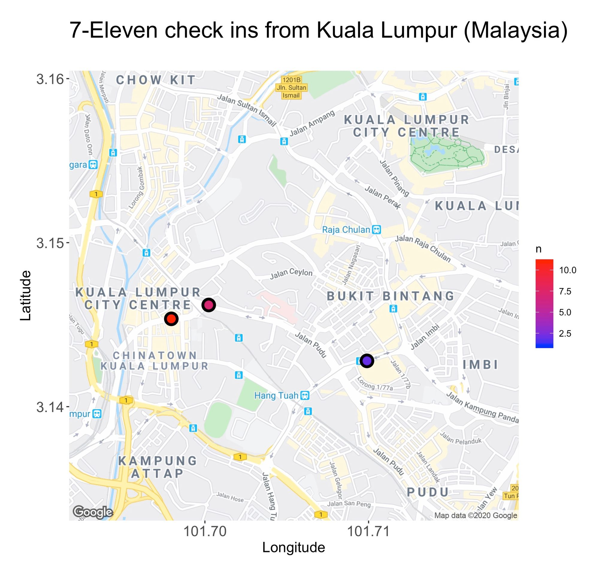
From the maps, there’s another piece of information we can deduct, and that’s the areas where I spent most of my time. For instance, in Tokyo, I typically hang around the flashy lights and neon vibes of Shinjuku, while in Singapore, I found my inner peace among the city’s skyscrapers.
To produce the maps, I used R’s package ggmap. Below is the code that created the Singapore map:
sg.map <- get_googlemap(center = c(103.8481362, 1.3169034), zoom = 13, maptype = 'roadmap', size = c(640, 640), scale = 2,
                        style = c(feature = 'poi', element = 'labels', visibility = 'off'))

sg.map %>% ggmap() +
  geom_point(data = singapore.summary, aes(venue.location.lng, venue.location.lat, fill = n), size=4, shape=21, stroke=2) +
  scale_fill_gradient(low='blue', high='red') +
  theme(plot.title = element_text(size = 22),
        plot.subtitle = element_text(size = 18),
        axis.text.x  = element_text(size = 14),
        axis.text.y  = element_text(size = 14),
        axis.title.x = element_text(size = 14),
        axis.title.y = element_text(size = 14),
        plot.margin = unit(c(1.0,1.5,1.0,0.5), 'cm')) +
  xlab('Longitude') + ylab('Latitude') +
  ggtitle('7-Eleven check ins from Singapore', subtitle = '')
While hard to distinguish, the maps also give an impression of the unique 7–11 stores I explored. For instance, in Kuala Lumpur, I frequented the same three. But counting them one by one is not an ideal nor scalable method, so to ease the process, I grouped all the unique 7–11s by country:
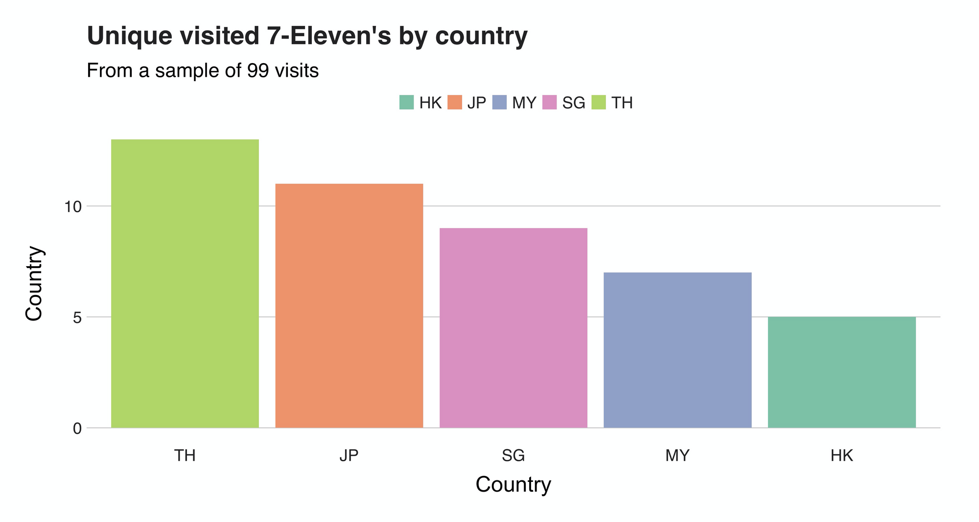
Once again, Thailand takes the top spot with 13 different 7-11s visited in 28 days (that's quite a tour!). Following it is Japan (11), Singapore (9), Malaysia (7), and Hong Kong (5).
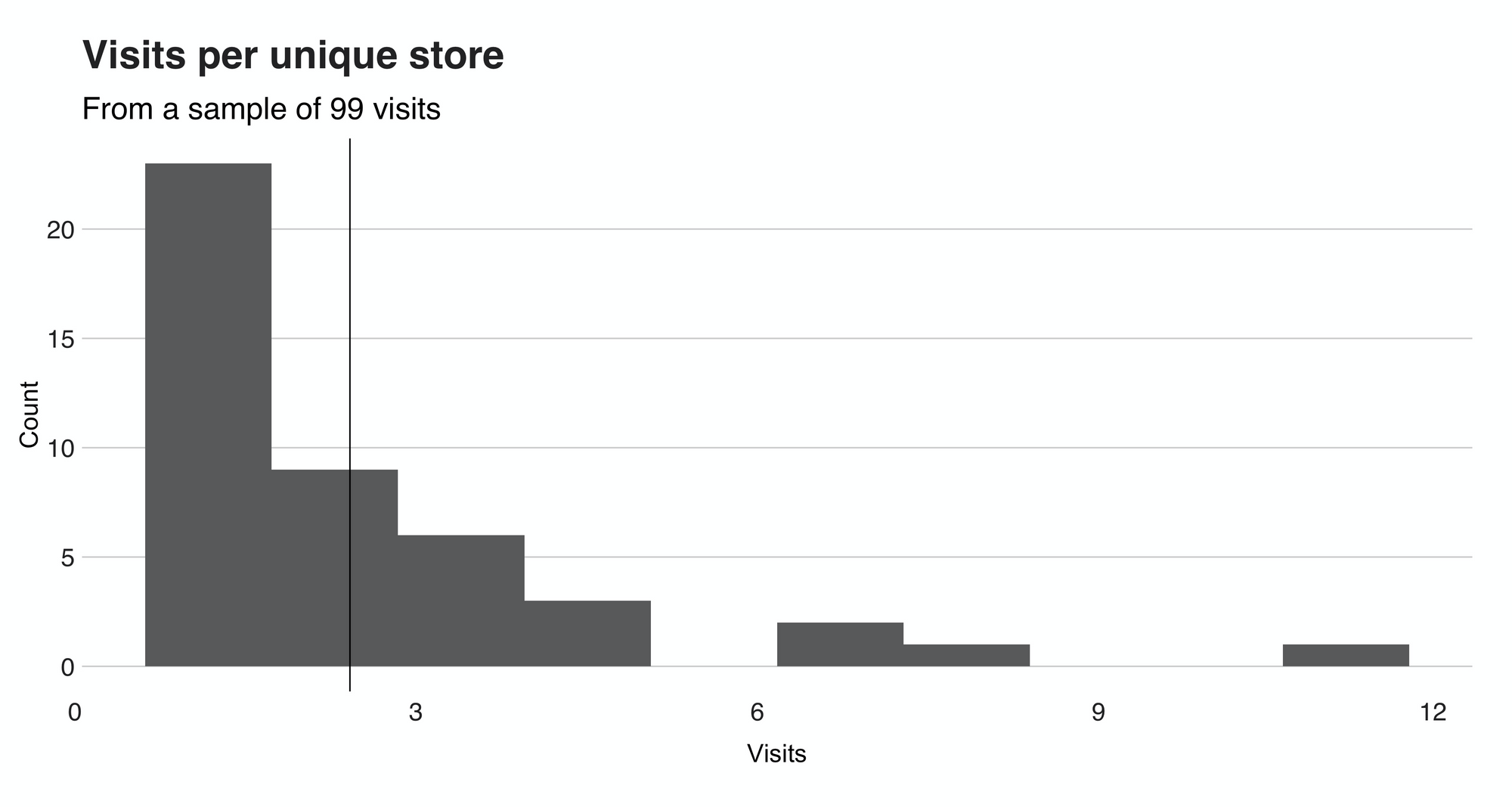
To end this section, I want to show a histogram that summarizes the visits per store. The chart — shown below — reveals that I usually visited each location only once. Precisely speaking, the median of the distribution is 1, while the mean is 2.32. However, don't trust the mean that much because that "11" value (a fitting number) at the farther end of the distribution shifts it a little.

When did I visit?
After that succulent overview, let's shift our attention to then when — when did I have those delightful visits to 7-Elevens? Was it in the morning, afternoon, or evening? Here, we'll find out.
I'll open this section with a histogram that illustrates the distribution of the "visiting hours."
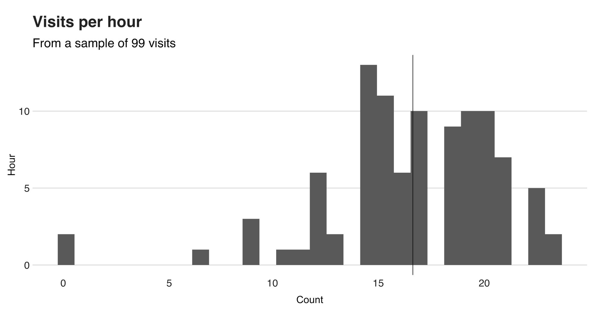
From this histogram, we can surely tell that there’s a preference for “late afternoon” and “early evening” times. In hindsight, this makes a lot of sense, considering that’s usually the time when I take a small pause after spending the entire morning exploring the city. To be more precise, the mean hour (shown with the vertical line) is 16.36, while the median is 17. Now let me ask something. Are “late afternoon” and “early morning” the only groups here? Are there more? Or, is it possible to split these groups further to find even more granular clusters? That’s the kind of question that clustering might be able to answer.
Hierarchical Clustering
“Splitting groups” and “granularity” are characteristics of an unsupervised learning technique known as hierarchical clustering. These algorithms seek to group and represents data as dendrograms. There are two kinds of hierarchical clustering algorithms: agglomerative and divisive.
The agglomerative algorithm (the one I applied), groups the data using a “bottom-up” approach, where each observation starts as an individual cluster. As you traverse up the tree, these individual clusters might merge — based on a similarity score — with others, until you have one big cluster. The second kind, divisive, is the complete opposite. Here, you start with the complete dataset under one cluster and then partition it until each observation is a cluster.
Using this algorithm, I clustered the “visiting hours” to see if I could discover additional groups:
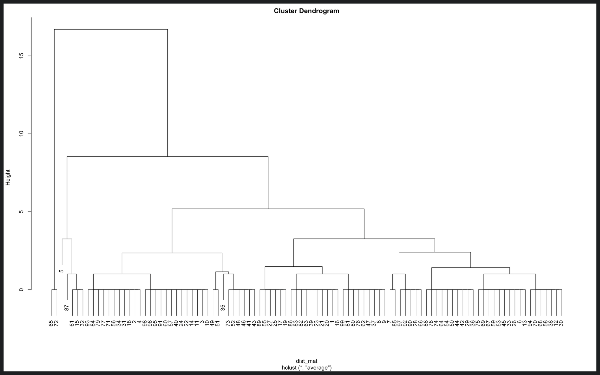
This image is a dendrogram of the visiting times. On the x-axis, you can find the dataset’s observations. The y-axis, height, represents the distance (according to the similarity metric) between the clusters. For example, the “visiting hour” value of the first two cases, data point 65 and 72 is 0 (midnight), so the distance between them is 0. As you see, at the lowest level, there are many clusters (14) where the distance is 0. But, one level up, the clusters start the take shape. Then up, up, and up, until there’s only one big cluster.
Now comes the tricky part, how do we interpret this? How can we deduct what groups are there? For that, first, we need to decide how many groups we want. For this case, let’s say five. Then, we need to cut the dendrogram in a way that exactly n clusters are produced. Like this:
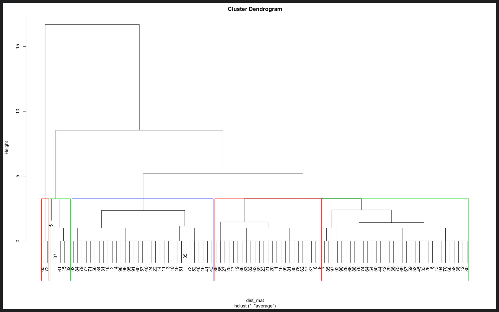
Here are the five groups. There is one consisting of two observations, another of five, 23, 33, and 34. But still, there’s something essential here missing, and that’s the actual visiting times. So, if we use the cluster memberships and the visiting time to which it belongs, we can plot this data to get our answer:
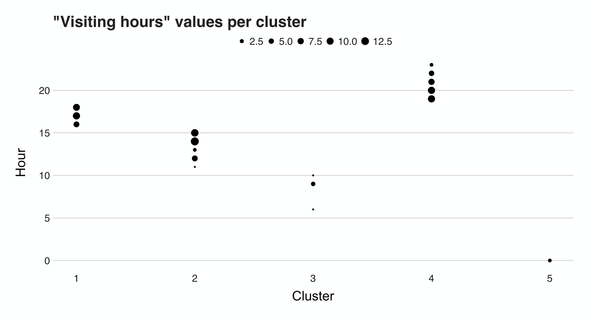
The plot we see here present the hour values (y-axis) and their cluster (x-axis). From it, we can discern the groups found by the clustering algorithm. The first of them, Cluster 1, can easily be called the "afternoon" cluster because the times fall between 15 and 18. Then we have cluster 2, the "morning" group, cluster 4, or the "evening" group. Last but not least is we have clusters 3 and 5. These two small groups consist of visits I did at odd times, e.g., 12 and 6 am.
By just looking at these unusual points from clusters 3 and 5, we could somehow agree that these visits are outliers, or anomalies, data observations that deviate from the norm. So, how can we confirm our beliefs? With anomaly detection, of course.
Anomaly detection
Before proceeding, there’s a small change I wish to do. To make the task more interesting (and to complicate it for no reason at all), I’ll add a second feature, the weekday of the visit, to the problem. That way, we will look for anomalies in a two-dimensional space. Figure 15 presents the data:
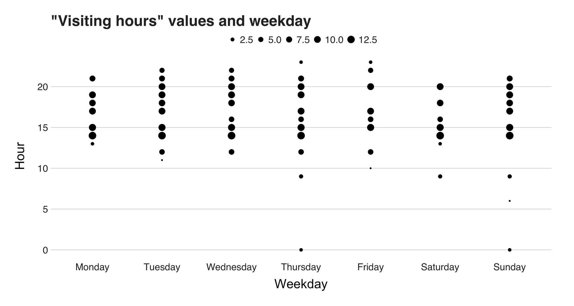
Do you see any outliers? Maybe the points in the bottom region? Could be.
To formally identify the anomalies, I’ll use the scikit-learn implementation of the isolation forest (Liu et al., 2008) algorithm. This unsupervised learning model and I quote the paper, “isolate(s) anomalies instead of profiles normal points.” In other words, an isolation forest separates the anomalous point from the rest of the dataset. When applied to the dataset, the algorithm finds the following:
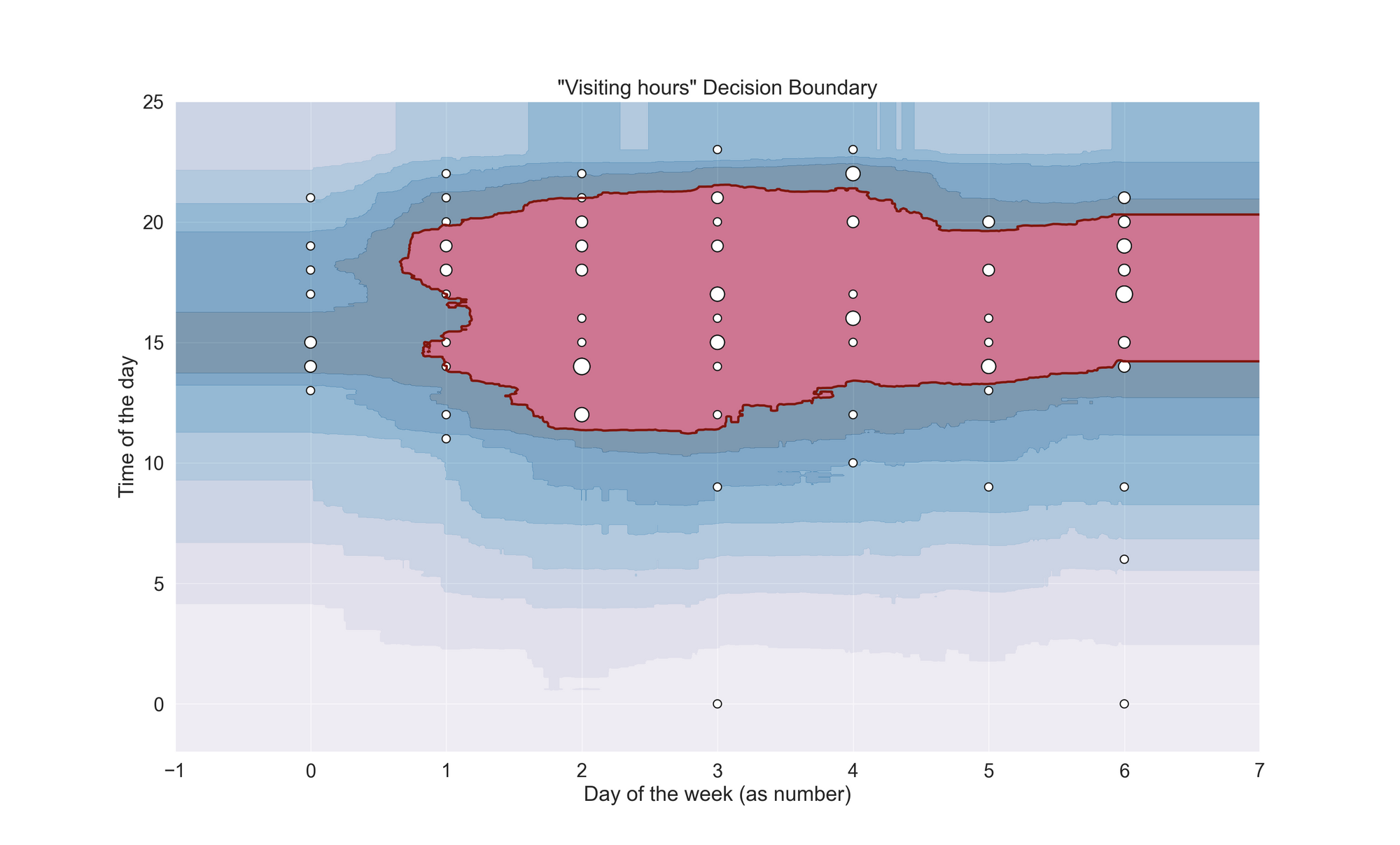
Well, well, well. This is a good surprise. The red-colored region is the “hard” decision boundary found by the algorithm, meaning that everything inside this area is an inlier, while the rest is an outlier. Moreover, we also have the “ripples” of the boundary, which let us see the algorithm’s output at different confidence levels. If we interpret the outcome by just looking at the hard boundary, we would have to categorize the whole Monday and most of the late evening visits as outliers. Personally, I don’t agree with that—to me, they are inliers.
But, if we consider the “soft” decision area, then the outcome is another one. For instance, the first level of the ripples covers Monday’s most popular times and some of those evening visits I consider inliers. With a bit of hyperparameter tweaking (I used the defaults ones), I’m pretty sure I could manage to get these points inside the main decision space. However, that would be “torturing the data until it confesses,” and maybe even cheating. The code below shows how I created the model (the data is on the GitHub repo).
"""
This script fits an Isolation Forest model
Code for plotting the decision function was taken from:
https://scikit-learn.org/stable/auto_examples/svm/plot_oneclass.html#sphx-glr-auto-examples-svm-plot-oneclass-py
"""

import pandas as pd
import matplotlib.pyplot as plt
import numpy as np
import seaborn as sns
from sklearn.ensemble import IsolationForest

# setting the Seaborn aesthetics.
sns.set(font_scale=1.5)

df = pd.read_csv('data/start_times.csv', encoding='utf-8')
X_train = df[['weekday', 'hour']]

clf = IsolationForest()
clf.fit(X_train)

# plot of the decision frontier
xx, yy = np.meshgrid(np.linspace(-1, 7, 500), np.linspace(-2, 25, 500))
Z = clf.decision_function(np.c_[xx.ravel(), yy.ravel()])
Z = Z.reshape(xx.shape)
plt.title("\"Visiting hours\" Decision Boundary")
# comment out the next line to see the "ripples" of the boundary
plt.contourf(xx, yy, Z, levels=np.linspace(
    Z.min(), 0, 8), cmap=plt.cm.PuBu, alpha=0.5)
a = plt.contour(xx, yy, Z, levels=[0], linewidths=2, colors='darkred')
plt.contourf(xx, yy, Z, levels=[0, Z.max()], colors='palevioletred')
b1 = plt.scatter(X_train.iloc[:, 0],
                 X_train.iloc[:, 1], s=(df['n'] * 50).tolist(),
                 c='white', edgecolors='k')
plt.xlabel('Day of the week (as number)')
plt.ylabel('Time of the day')
plt.grid(True)
plt.show()
Time series
Now comes the article’s last part: fitting a time series. In this section, I will use the time series and forecasting library Prophet, to fit an additive model using the visited time data. My objective here involves studying the daily seasonality and trend components of the model to interpret the visiting times from another perspective. Let’s see it:
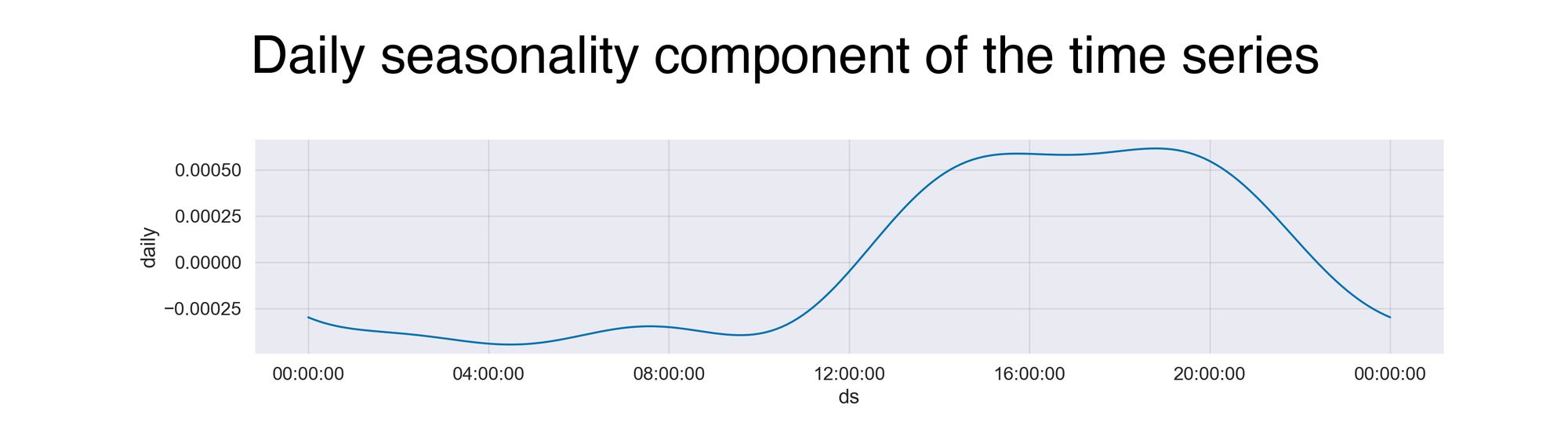
A daily seasonality component tells you the overall pattern observed throughout the day. On the x-axis is the time, starting at midnight and ending at 11:59 pm, while the y-axis presents the incremental effect on y of that particular time.
The pattern described in the plot is similar to what we saw in a past graph. In the early hours of the day, the activity is at its minimum level. Then, as the day starts, so do my visits, and that’s why the model reaches its maximum value around the afternoon.
Now comes the second component of the time series, the overall trend:
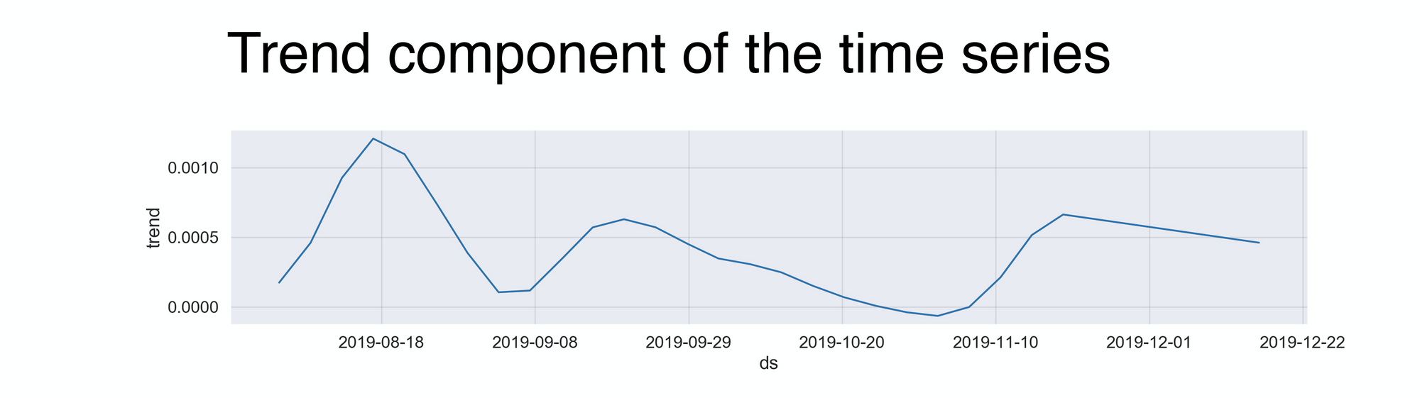
This line displays how my visits evolved over those four months. According to the graph (and I can confirm this), the highest activity occurred in the first month during my time in Singapore, Malaysia, and Thailand. But then, in the early days of September, while I was in Cambodia, the numbers went down because of the lack of 7-Elevens in this wonderful country. After that, during my second round in Malaysia, I went back to business. But unfortunately, it didn’t last that long, because my next destination, Indonesia, also had none. Last, the big push at the end is the result of spending several days in Japan, a country many would consider a 7-Eleven paradise. The code behind the time series is below:
import matplotlib.pyplot as plt
import pandas as pd
import seaborn as sns
from fbprophet import Prophet

# setting the Seaborn aesthetics.
sns.set(font_scale=1.3)

df = pd.read_csv('ts_df.csv')

m = Prophet()
m.fit(df)
forecast = m.predict(df)
fig = m.plot_components(forecast)
plt.show()
To briefly go through it, fitting a time series in Prophet can be done in four lines. First, we have to call the Prophet() function using an argument, the desired dataset. This input has to be a data frame with two columns: ds and y. The ds column, which stands for a datestamp, should either be a date (YYYY-MM-DD) or a timestamp (YYYY-MM-DD HH:MM:SS). The second column, y, is the numeric value we want to forecast.
Recap
Do you know what's better than analyzing data? Analyzing data about yourself. In the same way that we often look at other datasets to discover exciting findings, we should look at data about our own person to find unique and fun details about ourselves (if the companies do it, you can do it too!). In this project, I analyzed my 7-Elevens check-ins produced during my time backpacking through Asia. With merely 99 unique observations (I'm angry it wasn't 100), and an analysis that included data exploration, clustering, anomaly detection, and time series, I learned that I might have a bit of an obsession with 7-Eleven.
For the complete code, visit the project's GitHub: https://github.com/juandes/wanderdata-scripts/tree/master/7-eleven-swarm
Thanks for reading :).
The header picture is by me.
PS: To clarify, I don't work with 7-11 or have any sort of relationship; I just like the snacks.