Interpreting the 2020 Puerto Rico Earthquake Swarm with data
Using visualizations, maps, time series and Google Trends data to describe this event

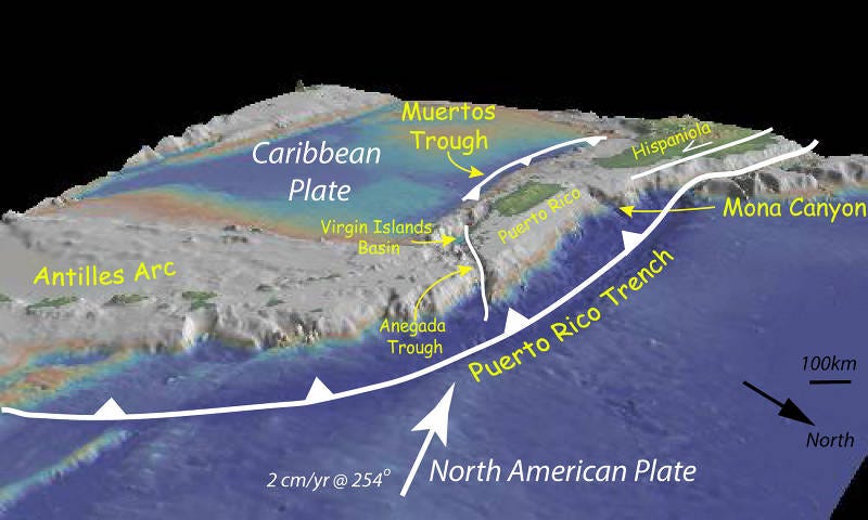
Since late December 2019 until early January 2020, the southwestern region of the island Puerto Rico has been experiencing a series or swarm of earthquakes, leaving in its wake a trail of destruction and uncertainty among Puertorricans. According to the United States Geological Survey (USGS) office, what’s causing these earthquakes is the convergence of the North American and Caribbean plates. The North America plate, located north of Puerto Rico, is converging with the Caribbean plate, while in the south, the Caribbean plate subducts under Puerto Rico at the Muertos Trough (source).
In this article, we’ll explore several attributes of these earthquakes using statistics, visualizations, time series analysis, and additionally, see the correlation between Google searches for the term “Puerto Rico” and the earthquakes’ magnitude.
The data
This report’s dataset consists of the earthquakes reported by USGS from December 20, 2019, until January 19, 2020, in a radius of 50km. from the latitude 19.949 and longitude -66.851. It has 2041 records where each one represents an individual earthquake, and 22 columns with attributes about the event. However, from these features, we’ll only use the coordinates, time, and the event’s magnitude.
This is the query used to get the data.
https://earthquake.usgs.gov/fdsnws/event/1/query?format=csv&starttime=2019-12-20&endtime=2020-01-19&latitude=17.949&longitude=-66.851&maxradiuskm=50
In the dataset, I’m filtering out those entries where the reported magnitude is below 0 (according to the USGS documentation, the lower value can be -1.0). You can find a copy of the dataset in the article’s code repository.
Besides this primary dataset, in this project, I’m using a second one consisting of Google Trends’ data of the query term “Puerto Rico” from December 19, 2019, to January 17, 2020.
The tools
The data analysis and most of the visualizations are done in R. The library ggmap was used to produce the graph of the earthquakes’ location and the time series analysis was done using the library Prophet in Python. The trend data comes from Google Trends.
Understanding the earthquakes
In total, there have been 2041 events reported in the period of 2019–12–20 to 2020–01–19 — an average of 66 per day. Of these days, December 31, 2019, was the most active one, with 220 earthquakes that had an average magnitude of 1.966. Overall, the strongest of the quakes, which occurred on January 7, 2020, at 04:24:26 local time, had a magnitude of 6.40, while the average magnitude is 2.467 with a standard deviation of 0.687, and a median of 2.390. The following histogram shows the distribution of the magnitude score.
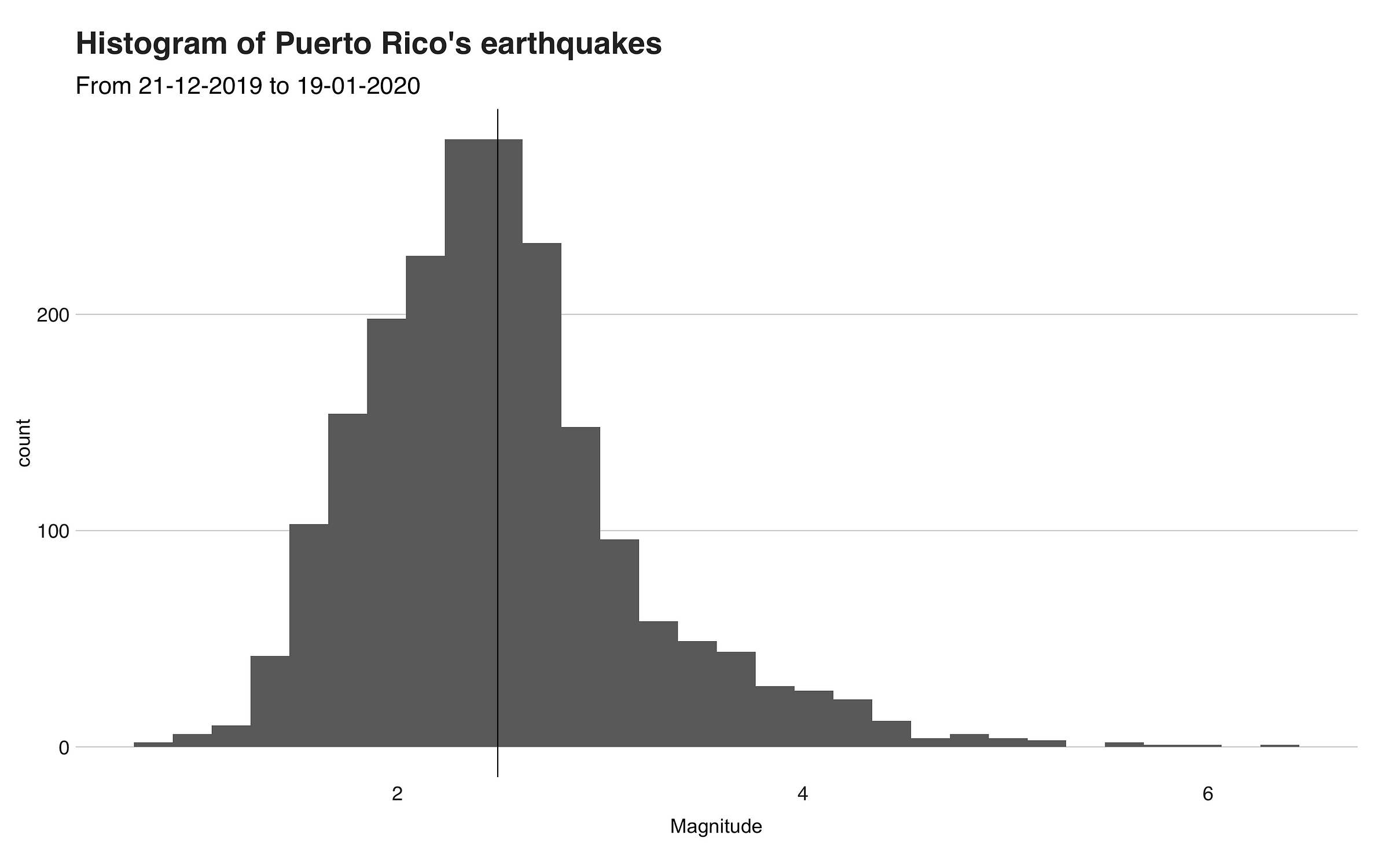
If it weren’t for the outliers points on the far right side of the histogram, this distribution would have been a normal one where most of the values are near the mean (the black line). In the following boxplot, we can better see the outliers.
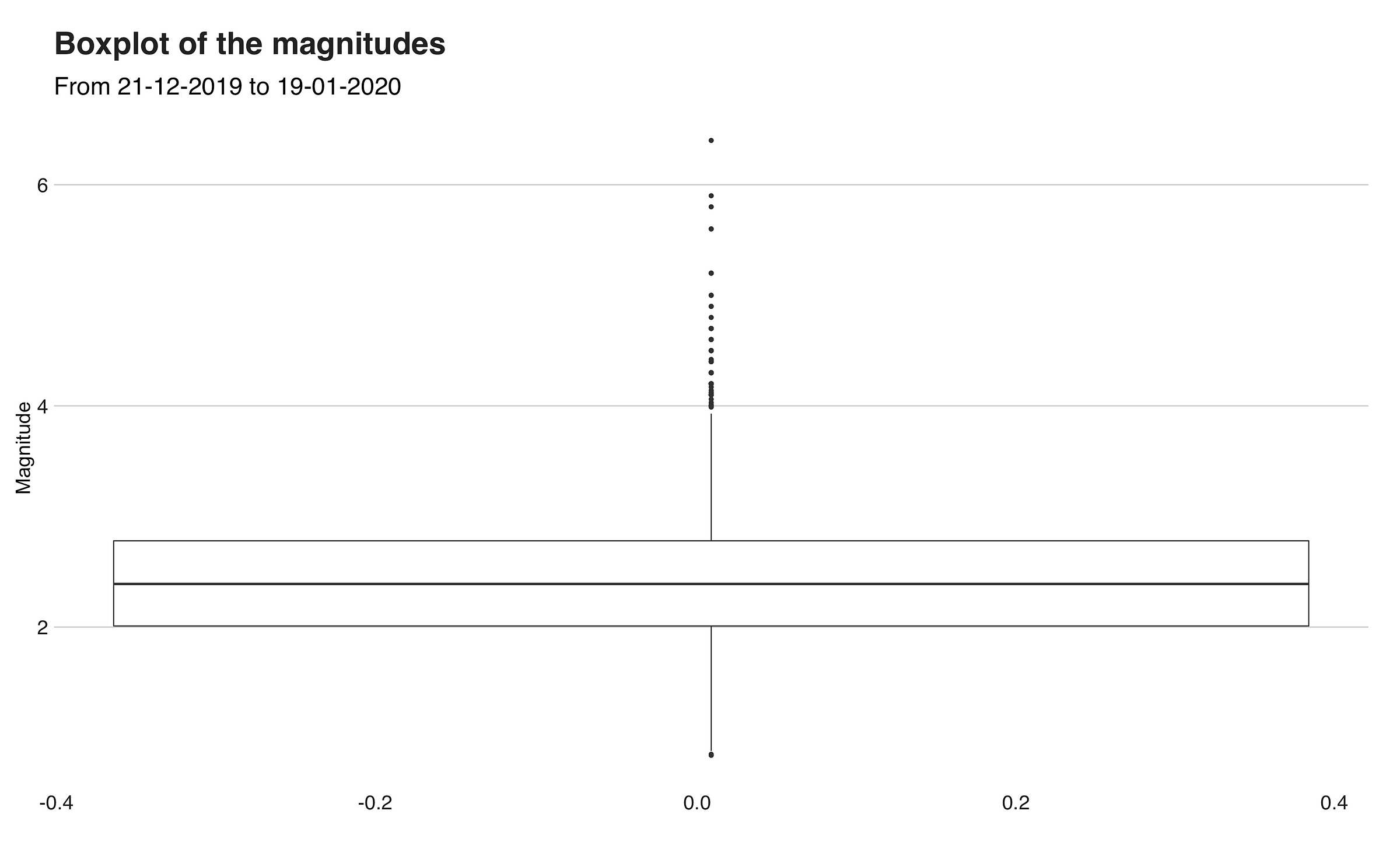
This boxplot is an example of a skewed right boxplot, one where the box, and hence, the variable’s values, are on the low end of the scale. Here we can see the symmetry between the first quartile (bottom of the box), third quartile (top of the box), and the median (bolded line), which represents the peak presented in the histogram. Then, above the box are the outlier points, which include the most energetic earthquake at 6.4.
The next visualization I want to illustrate is a scatterplot that shows the magnitudes of the earthquakes on the day that it happened. The plot also includes a smoothed line that points out the evolution of the attribute.
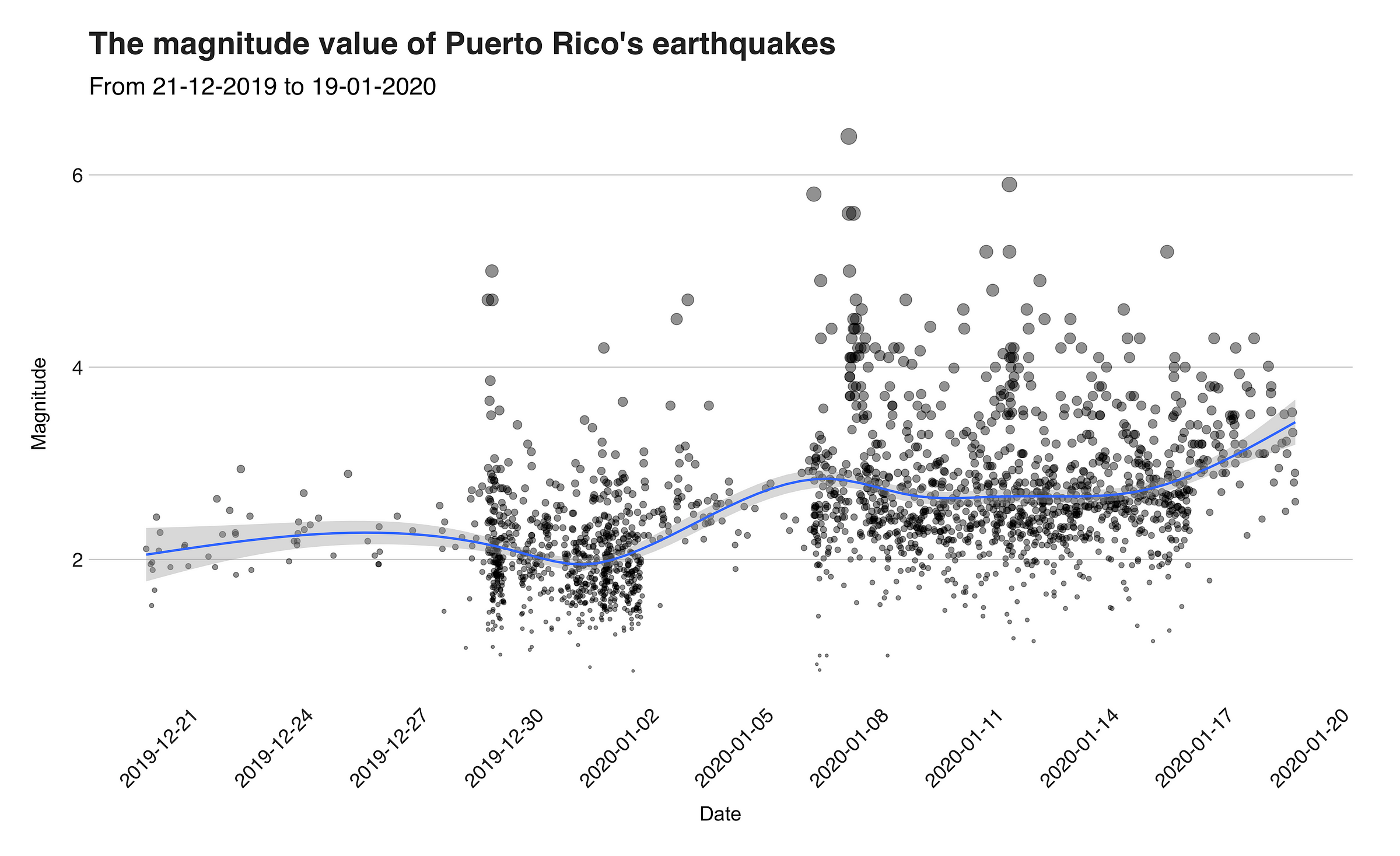
In the graph, we can see how the swarm started in the last days of 2019. Then, around January 2, the activity ceased a little, until January 6, and 7, when the powerful one arrived, hours after a previous one that was 5.80. In the days that followed, several strong aftershocks stroke the island, including one of 5.90 on January 11. Back at the beginning of the graph, you will find some earthquakes with a magnitude value of around 2. These correspond to “normal,” yet weak, earthquakes that happen all the time in Puerto Rico (most of them are generally not felt).
The locations
As stated in the introduction, the swarm is taking place in the southwestern region of Puerto Rico, near the Muertos Trough. More precisely, the affected region is within the latitudes (17.8, 18.0), and longitudes (-67.2, -66.6), an area that encompasses, or it’s near to the towns of Guanica, Guayanilla, Ponce, and Yauco, which are some of the places that suffered heavy losses. In the next visualization, we’ll see a map of this region with the locations of the earthquake’s epicenters that happened in it.
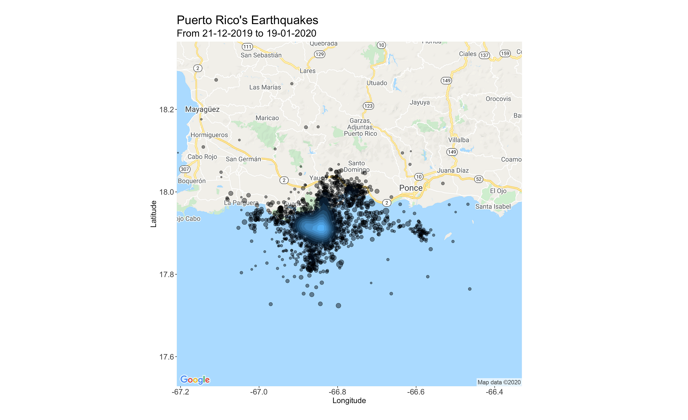
The average shake transpired in the latitude 17.92564, and longitude -66.83728.
Trend and daily seasonality
From the smoothed line of the scatterplot presented above, you can get an idea about how the intensity of the quakes has changed since the swarm started. While useful, this line does not represent the definitive trend of this variable.
To shed some light on this issue, and to better understand how the earthquake’s magnitude has developed, I computed the overall trend and daily seasonality using the time series tool, Prophet. Below you’ll find the trend.
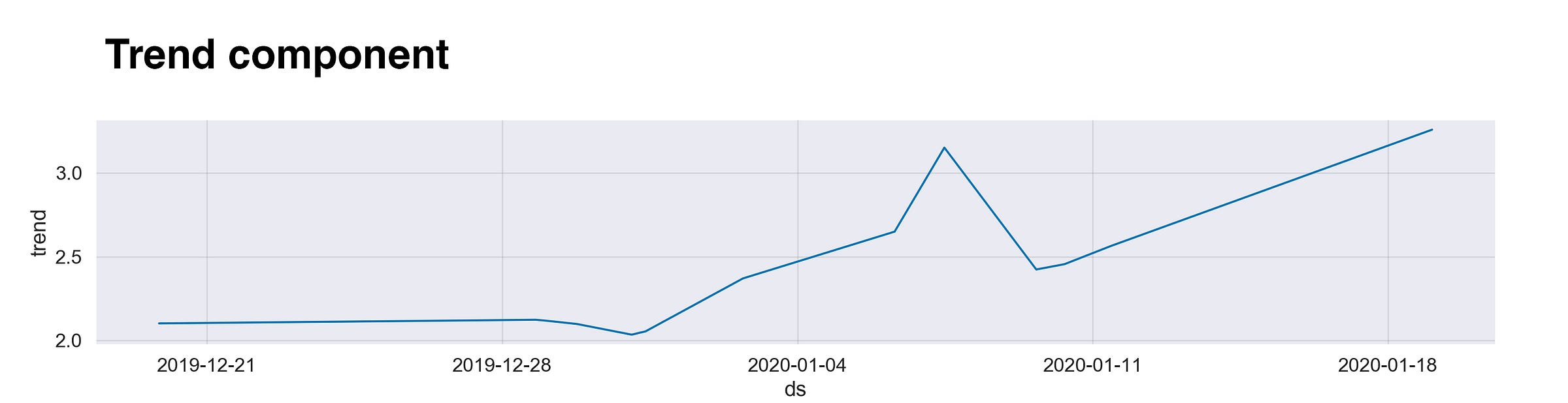
This line describes the evolution of the magnitudes since December 19, 2019. During that week, the trend line is at a low level, which corresponds to the “normal” behavior explained above. Then, once the quakes start, since there are numerous of them with a low magnitude, the average value decreases. However, right after, we have the major earthquakes and their aftershocks, followed by another decline. At the time of writing, the seismic activity is still active, which explains why the line keeps growing.
To clarify any possible confusion, I want to quickly explain the meaning behind the numbers you saw on the y-axis of the plots. These values aren’t the actual magnitude. Instead, we can interpret them as the incremental effect of that day in the trend component. For example, on the graph’s first day, the y-value is 2.0, meaning that this day has an effect of +2.0 on y.
The second graph from this section is the hourly seasonality. According to my knowledge (please someone correct me if I’m wrong), earthquakes are random events that follow no pattern. Still, even knowing this, I wanted to calculate its hourly seasonality since I got the impression (mind you, I’m not in Puerto Rico, so my “impression” refers to what I saw on the press and social media) that most of the earthquakes happened during the night. The following graph presents the data.
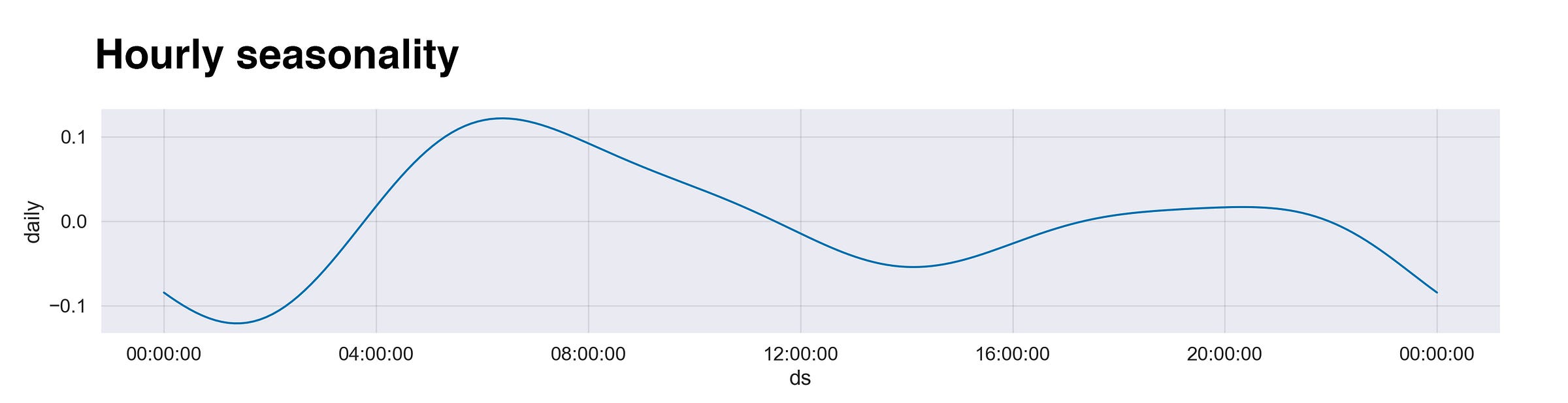
The first thing that catches the eye is the global maxima after 4 am, the time when the big one happened. Then, right after it, the curve decreases until 4 pm, before going up again (maybe that’s why I thought they happened at night), and dropping one last time until it reaches the lowest position at around 1 am.
Google Trends
Usually, when natural events like this happen, the country involved gets under the spotlight of the world. You see mentions of it in the news, the local paper, social media, and so on. To verify this idea, I used Google Trends' daily trend score for the search query “Puerto Rico” and correlated it with the maximum magnitude value of that day. I assumed that the fiercer the earthquake, the more Google searches concerning Puerto Rico. Does this assumption hold? Below you will find the data.
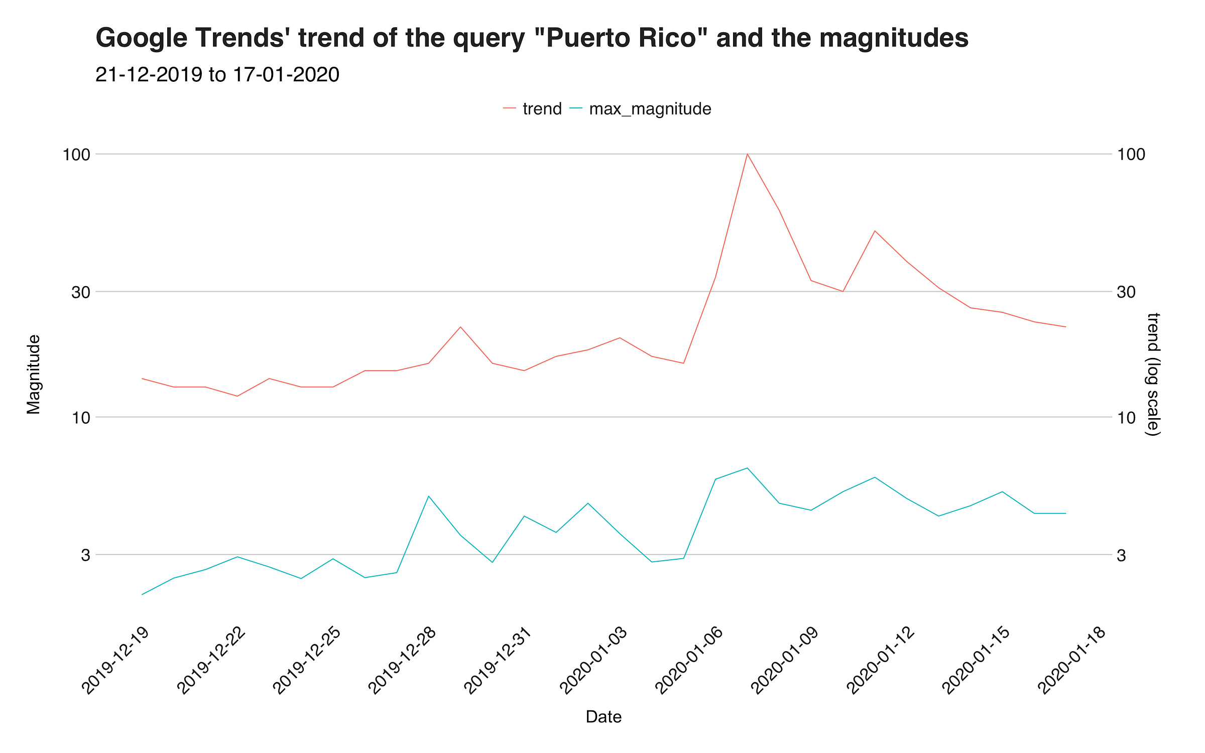
This visualization presents Google Trends’ “trend” value in red (the top line) and the maximum magnitude in blue (the bottom line). On the x-axis, you will find the dates and on the y-axis, the values. Note that the y-axis uses the log scale. Regarding the correlation, both lines seem to follow a similar pattern, which includes a small peak around the 28th and 29th, followed by a decrease and another raise on January 7. To convert and summary this association into a number, I calculated the Pearson’s correlation between the two variables and obtained the value of 0.7186471, which implies a medium-high positive correlation (1 is a perfect positive correlation). So, in some sense my assumption was correct.
However, as good as the connection seems to be, we can’t blindly confirm or say that it is purely caused by “people Googling Puerto Rico because of the earthquake.” While it may seem like this is indeed correct, we have to keep in mind that there could be other reasons behind the connection. Still, my personal opinion is that this the actual reason why.
Recap
Currently, the island of Puerto Rico is going through the most significant earthquake swarm it has experienced in decades. In this article, we analyzed several attributes of these earthquakes using data obtained from USGS to get to know better the behavior and patterns of this event. Through the data, we discovered several statistical properties of the events, such as the mean, and outliers, and found our that the average magnitude is 2.467 and the most active day was December 31, 2019. Then, we performed a time series analysis to find out the overall trend, and hourly seasonality and found out that some of the strongest quakes happened during the night. Lastly, we calculated the correlation between maximum magnitudes with Google Trend data and identified a possible connection between these two.
For more information about the earthquakes, I’d recommend this report by USGS. Moreover, for an interactive plot showing the magnitudes check out this web app created by Professor Humberto Ortiz-Zuazaga from the University of Puerto Rico.
Thanks for reading.
You can find the code used in this analysis in the following repository: https://github.com/juandes/pr-earthquakes-analysis