Interpreting 270862 Fitbit footsteps using time series analysis with Prophet
Learning how much I walk during my 24 days in Malaysia

Humans are continually moving. In the early years of humankind, our ancestors — let’s call them Helen and Josh — moved all across the world. Starting from Africa, Helen and her homo-sapiens friends migrated to the northern (and probably cold) lands of Europe. Likewise, Josh trekked all alone to the exotic areas of Asia, and after a while, went to retire in the mysterious (back then) region of America. Thousands of years later, we are still doing the same. We go to work, move across the country to study, travel to Las Vegas for a sinful weekend, and go back home after the school year to spend the summer with Mama. Movement defines us.
I’m more like (my great–great–….–great aunt and uncle) Helen and Josh. Like them, three months ago, I embarked on an adventure that so far has taken me to several countries of the vast Asian continent. As part of my backpacking adventure, on July 9, 2019, I visited Malaysia. In the three weeks spent at this tropical and diverse country, I got lost amid the buildings of Kuala Lumpur, explored the lushed jungles of the Cameron Highlands, had a traditional white coffee at Penang, and experienced the burning-looking sunsets of Langkawi. So, I moved a lot. Sure, there were busses, trains and such, but if there’s something I did was walking. In fact, according to my Fitbit, I walked 270862 steps.
In this article, I’ll present the results I found after studying and dissecting the steps I took across four different locations in Malaysia. To start with, I’ll open the report showing how I got the Fitbit data. Then, to understand better the dataset, I’ll summarize and explore it using a combination of both statistics and visualizations. Then, I’ll fit a time series model to analyze the seasonality and the trends of my walking behavior. Furthermore, throughout the article, I’ll be providing several pieces of code for those who wish to replicate the experiment.
The tools and data
This project uses a combination of both R and Python (the best of both worlds!). Using Python, I gathered the data using python-fitbit, a Fitbit API Python implementation and also conducted the time series analysis using the package Prophet. On the other hand, with R, I performed the descriptive analysis and exploratory analysis of the data. Said dataset consists of all the steps registered by my Fitbit from July 9, 2019, to August 1, grouped in 15 minutes intervals.

Exploring the dataset
During my time in Malaysia, I walked a total of 270862 steps across 24 days, an average of 11285.92 steps per day. The variable’s standard deviation is a staggering 4734.46, implying that I had all kind of days, e.g., lazy days in which I barely walked and energetic ones. Let’s take a look at them.
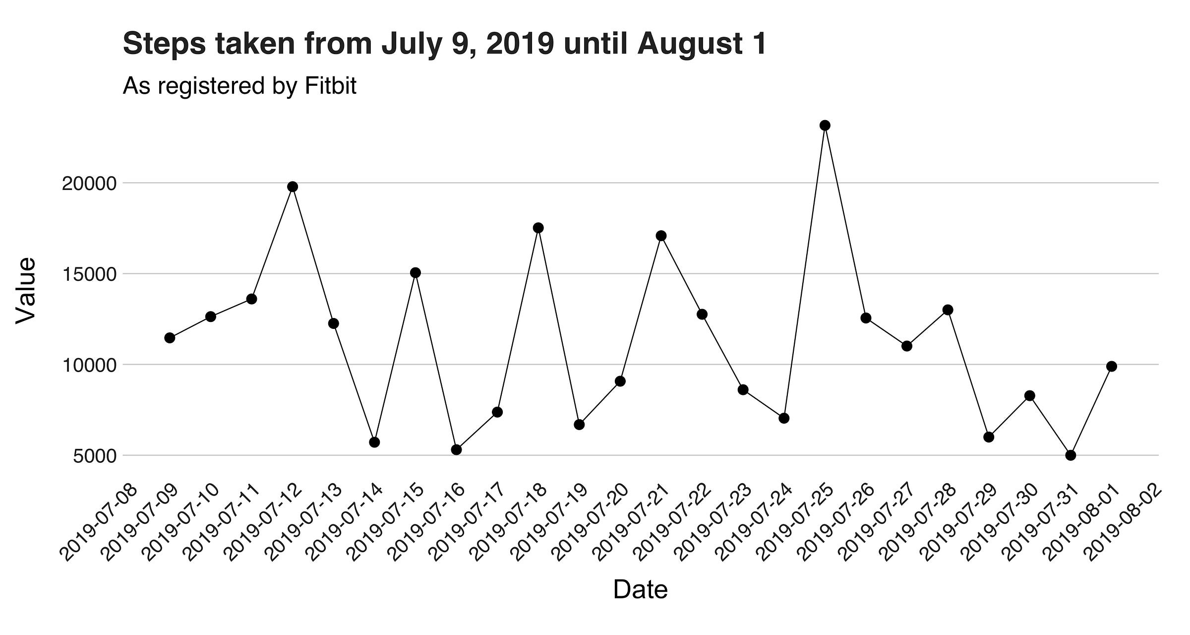
In this first plot, we are looking at the number of steps per day. The initial impression I got from this image is its zigzag pattern. This shape indicates that I barely had two highly active days in a row. Instead, it seems that after a long day, I usually take the next one easier. Next, I want to present the dataset’s histogram.
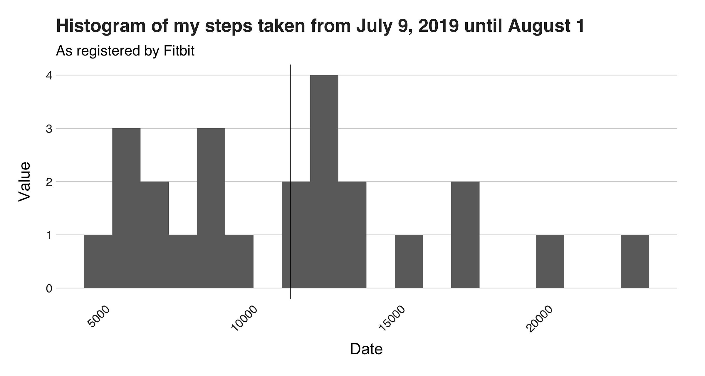
In this histogram, you can see that the graph’s shape doesn’t resemble a normal distribution at all, reinforcing my earlier comment where I said that my steps pattern is all over the place. Upon a closer examination, the histogram reveals what appear to be three divisions, or groups, one from the “5000” mark until the “10000” mark, another one at the center, and another from the “15000” point until the end. I call these sections the “lazy,” “default,” and “trekker” groups. The lazy one is from those days spent in bed, writing stories such as this one. The following one represents a typical, city-walking day, while the last category is all about the hardcore, and tough days in which I probably went hiking, took a tour or went somewhere exotic and breathtaking; these days constitute the outliers. To complement this histogram, I want to draw a boxplot to corroborate if any of these points is an actual outlier.

Voila! Just as I thought. For those of you who are curious, the exact number is 23162. On this day, I was hiking through the tropical, lush, and rainy jungle of the Penang National Park.

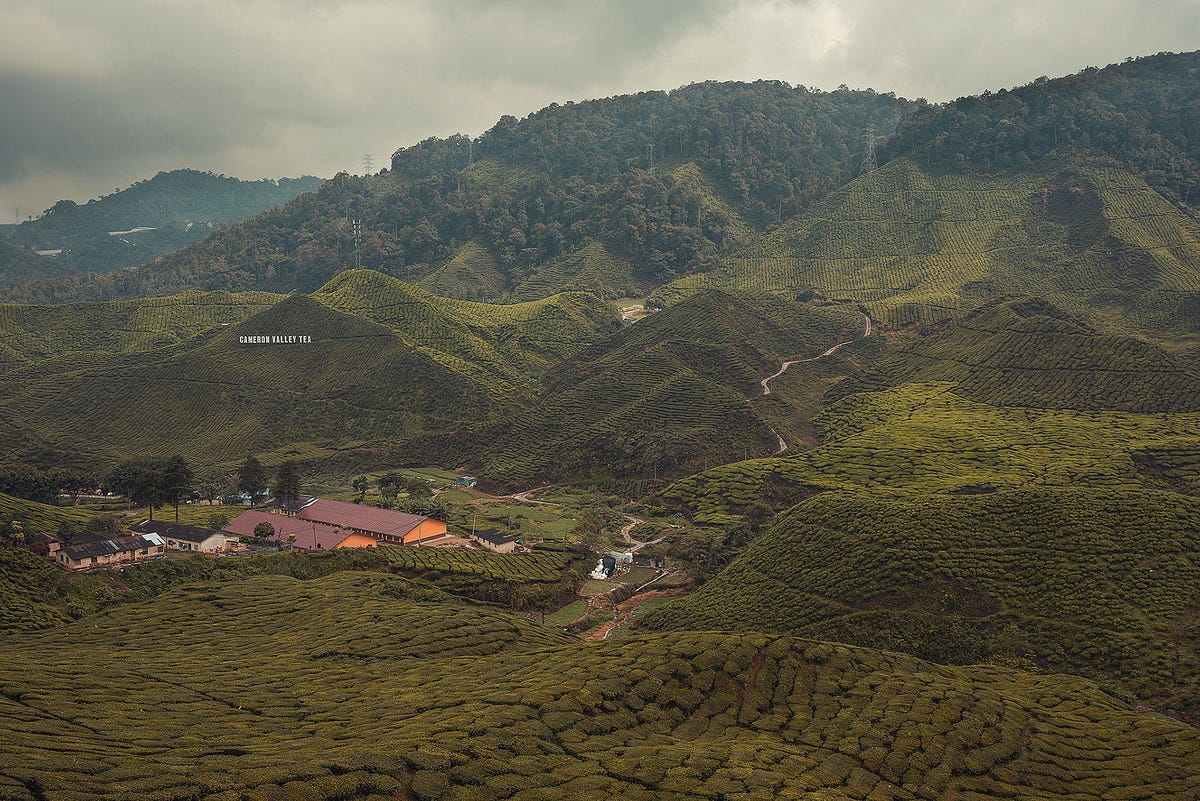
While in Malaysia, I visited four different regions: the capital Kuala Lumpur, Cameron Highlands, George Town, and the island of Langwaki. As expected, the activities one does in each of these places vary significantly from others, e.g., CH is the kind of place where you hike the whole day, followed by drinking a nice cup of tea, while in George Town one navigates through the maze-like shape of the city hunting those sweet photo stops. Likewise, the methods of transportation are also distinct. For example, KL has a convenient metro, while moving around in Langwaki requires a bike or motorcycle. Therefore, because of these reasons (plus other factors I won’t consider here), the number of steps one take in each of these places differs. To corroborate this information, I grouped my dataset by location and plotted them. The first graph I’ll present display the number of steps per city, and the one that follows, the mean and standard deviation per region.
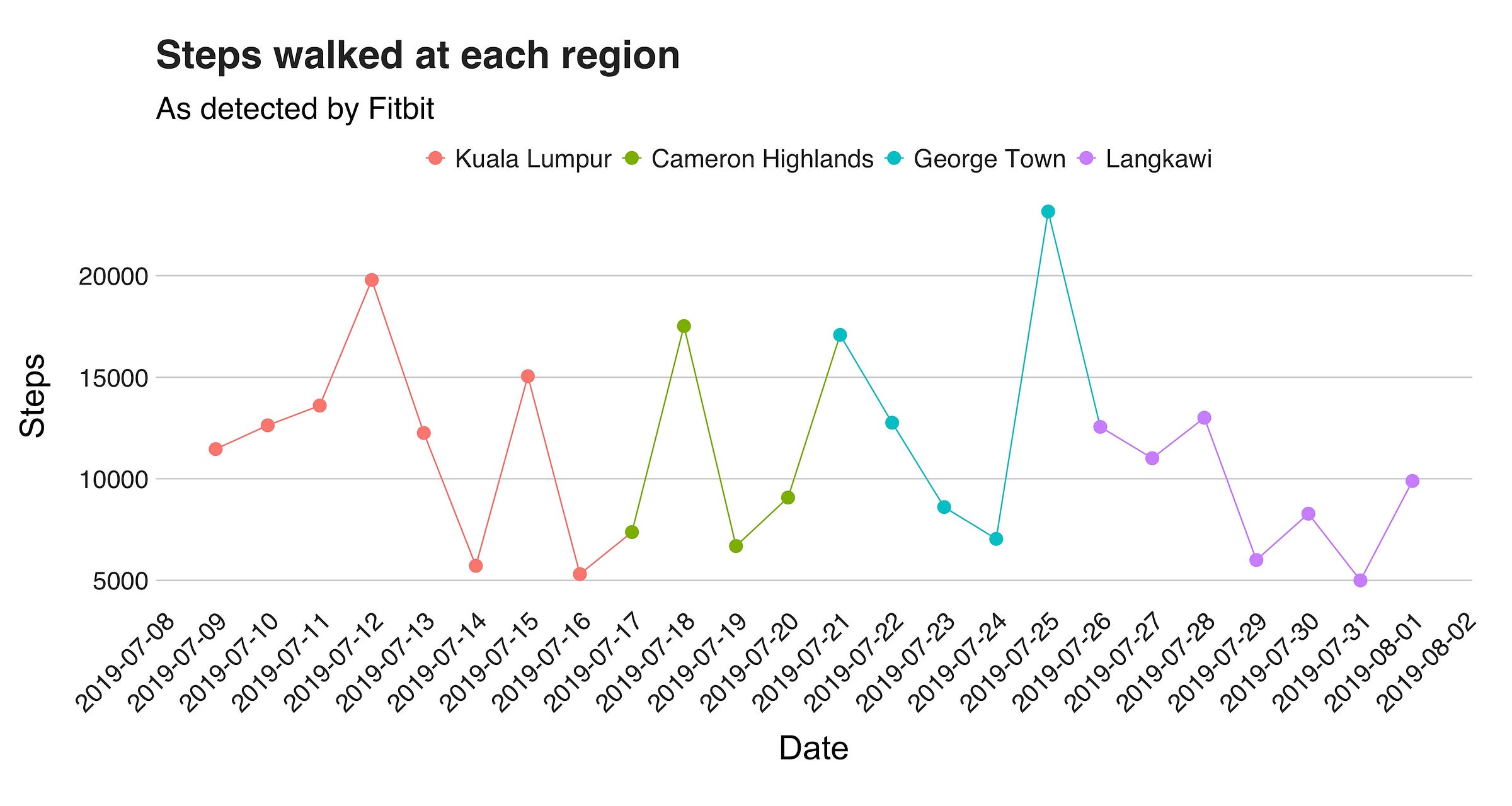
We’ve already seen this line, but now I’m coloring it to highlight the region I was on the given day. The first region the plots shows, KL (in red), shows two days with over 15000 steps, and another two in which I barely got out of bed. Then, in Cameron Highlands (green), we can see only one day with over 15000 steps (it was a hiking day), followed by George Town and the visit to the National Park, and lastly, Langkawi, the island where I didn’t do much (expect watching Infinity War and Endgame back to back, and doing a Harry Potter marathon). But how much did I exactly walked? In total, I took 95810 steps in KL, 40657 in CH, 68653 in George Town, and 65742 in Langkawi.
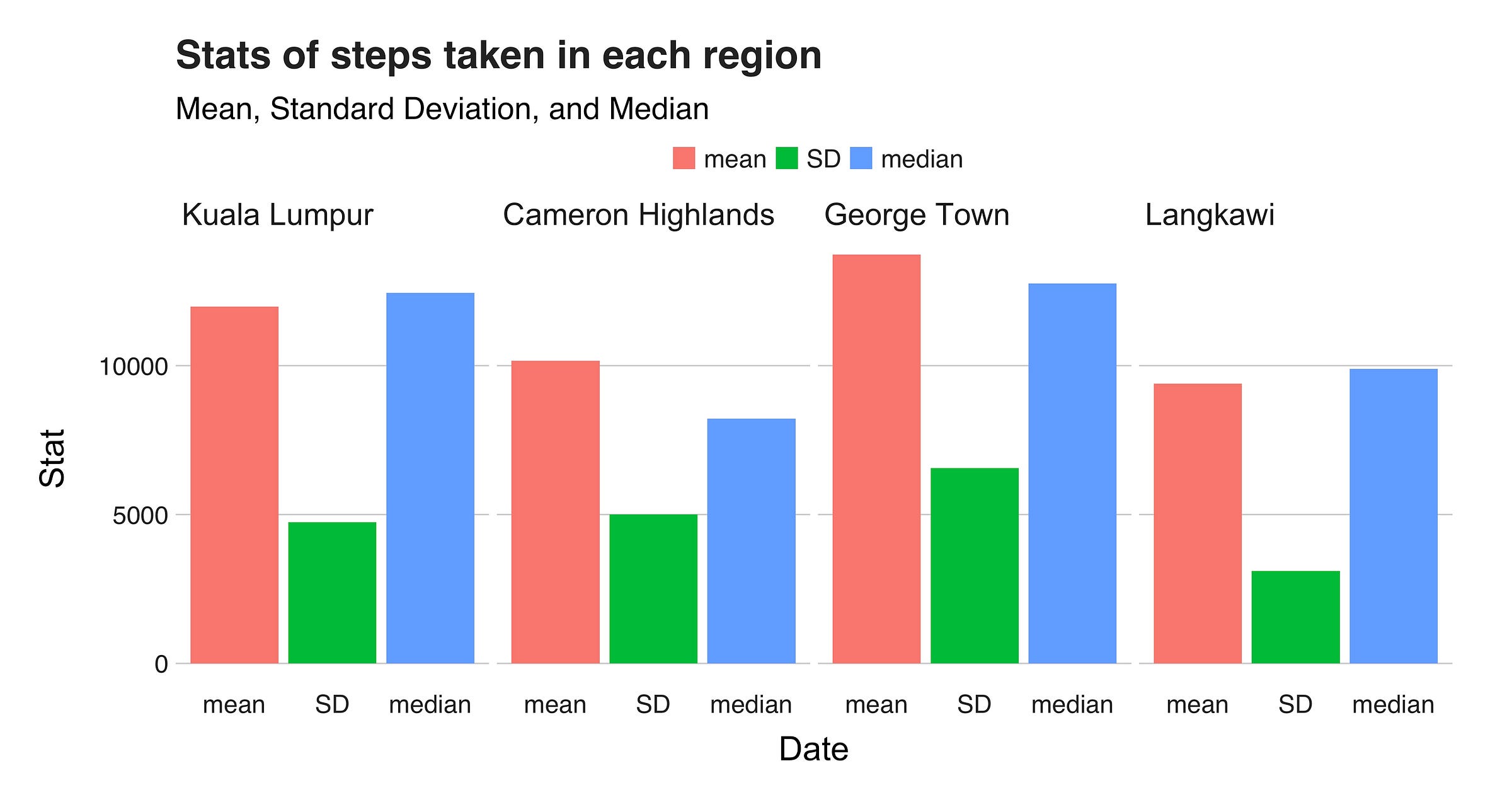
Nonetheless, since I didn’t spend the same amount of time in these places, these numbers don’t say much. So, we need the mean to have a better understanding of where, on average, I walked the most. And as you’ll see in the final plot of this section, the answer seems to be George Town. But beware! Keep in mind the outlier, and the effects it has on the distribution :).
Time Series Analysis
Back when I showed the first graph, I pointed out that it has a zigzag pattern, indicating that there are no two consecutive days with a similar number of steps. Honestly, I do believe this is the most exciting part of the dataset. For starters, it says something about me, and regarding how I led my days; have a nice walk today, take it easy tomorrow. However, the coolest part about it is that it gives me a legit reason to apply time series analysis to the dataset. In layman terms, the idea behind a time series analysis is to learn the patterns and trends from a sequence of events ordered by time to ultimately forecast future outcomes. For this project, I’m only interested in the first portion of this definition: learning the patterns. And for doing so, I’ll be using the Prophet package, a time series analysis library developed by Facebook.

In this analysis, there are three things I want to focus on: the general trend, weekly and hourly seasonality. The general trend component describes the overall evolution of the series. Then, there’s the weekly seasonality which explains the time series’ behavior over the seven days of the week, and similar to it is the hourly seasonality which provides insight about my hourly steps routine. By studying these three components, we’ll be able to know how my walking pattern evolved over my whole stay in Malaysia, and of course, my preferred times and days to walk.
To fit our model in Prophet, first, we have to call the prophet() function using as a parameter the desired dataset. This input has to be a data frame with two columns: ds and y. The ds column, which stands for a datestamp, should either be a date (YYYY-MM-DD) or a timestamp (YYYY-MM-DD HH:MM:SS). In this case, our columns are all the 15 minutes intervals elapsed from July 9 00:00:00, until August 2 23:45:00 e.g. “2019–07–09 00:00:00” and “2019–07–09 00:15:00.” The second column, y, is the numeric value we want to forecast, and again, here this means the steps taken. Now, armed with a tidy dataset, let’s proceed to fit our model, predict the forecast, and draw the seasonalities. The following code snippet shows how you can do it in Python.
"""
This script fits a time series model using my Fitbit steps data.
"""
import matplotlib.pyplot as plt
import pandas as pd
import seaborn as sns
from fbprophet import Prophet

# setting the Seaborn aesthetics.
sns.set()

df = pd.read_csv('hourly_values_R.csv')

# the trend line is a bit underfit, so I'll increase changepoint_prior_scale
# to 0.06 (from 0.05).
m = Prophet(changepoint_prior_scale=0.06)
m.fit(df)
forecast = m.predict(df)
fig = m.plot_components(forecast)
# this plot shows the trend, weekly and daily seasonality.
plt.show()
Let me explain this a little bit. As with most things in data, the first thing we’ll is loading the dataset. Then, after creating our Prophet object, we’ll fit our model. Once that’s done, we’ll call model.predict(df) to obtain our forecast, and following this, we need to call model.plot_components(forecast) using the newly acquired forecast as the parameter to create the trend and seasonalities components plots. Lastly, we need plt.show()to draw them. (I’m using Seaborn to change the look of the plots). To simplify these three graphs, and for better visibility purposes, I post-processed the returned image to separate each figure and to title them.
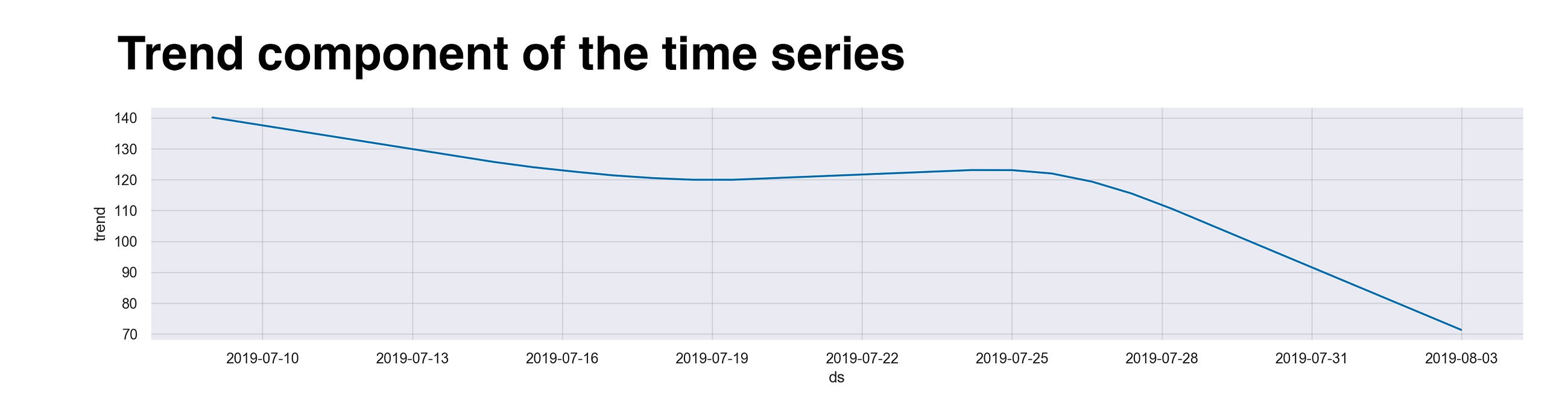
Wait! Before I show you the data, I want to quickly explain the meaning behind the numbers you’ll see in the y-axis of the plots. These values aren’t, I repeat, they are not, the actual number of steps taken at that particular time or day. Instead, we can interpret them as the incremental effect on y of that seasonal component (as stated here). For example, without spoiling too much, if you take a look at the following graph, you’ll find that the value of the first day, “2019–07–10”, is around 140, meaning that this day has an effect of +140 on y. Ok, now let’s see the data.
The first element I want to illustrate is the overall trend of the data. This component shows the series’ general changes over time. As we saw earlier, on the last days of my trip, I didn’t walk as much as I did during the first ones, and that’s what we see here. On the initial days, I was all hyped up and hungry for adventures in busy Kuala Lumpur. Then, after these hectic and rush days, I moved to the Cameron Highlands. There, high in the mountains, I slowed down a bit (Stranger Things season 3 is the culprit). After CH, I went down several hundred meters and reached the island of Penang, and its center, George Town. Honestly, the internet here wasn’t that stable, so I took solace in exploring the city, hence the small increase in the timeline. Lastly, at Langwaki, once again, I decided to slow down and enjoy the ocean breeze.
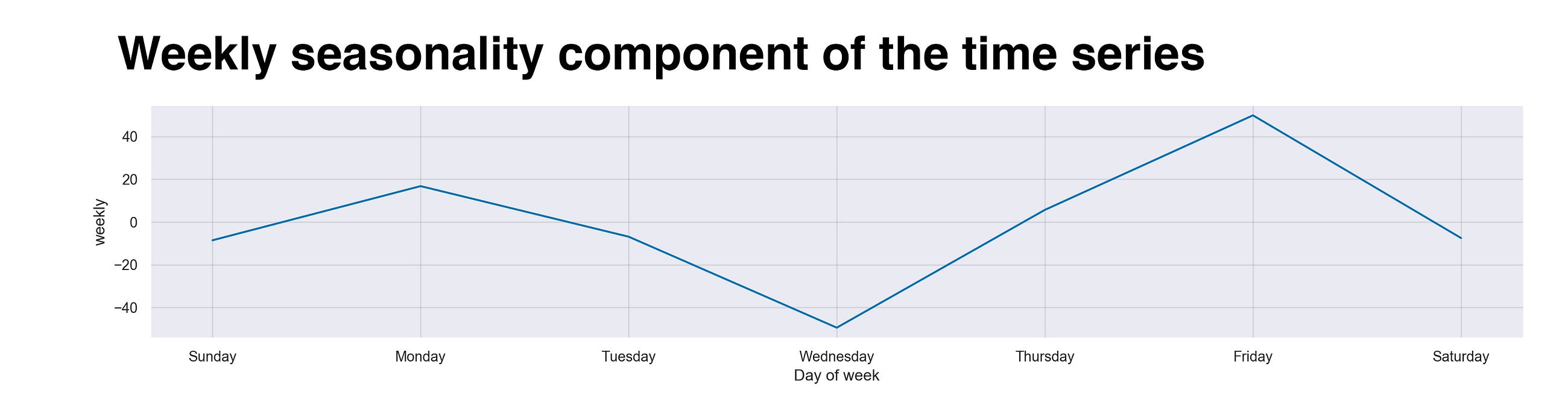
The next component I’ll present is the time series’ weekly seasonality. This line summarizes the cyclic pattern I showed during my weeks in Malaysia. Frankly, I wasn’t expecting such a line. It clearly describes a sequence that I didn’t experience during my days. To start with, Wednesdays seems to be my least-active day. And no, this is not on purpose. Could it be that most of my Netflix days were on this particular day? Guess I’ll have to investigate the data and come back to this in a future article. But what surprises me is that Friday, the king of days, is the highest one. Again, I don’t know why. After all, as a backpacker, all my days are “Friday.” The only plausible explanation I see is that even though all my days are in some sense Fridays, the feeling or the vibes that permeate on real Fridays, takes hold of me, thus, making me walk more on this particular day.
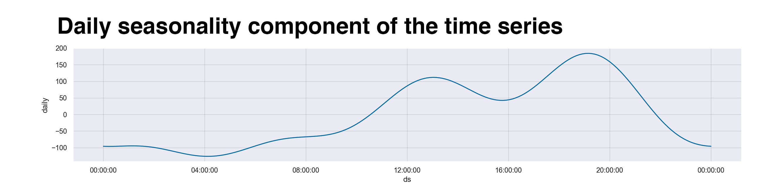
Finally, to end this article, I want to show what, in my opinion, is the best part of the whole analysis: the daily component. Like the previous one, this graph also presents a cyclic pattern. However, instead of focusing on the weekdays, this one studies the time of the day. If we analyze it from the beginning (midnight), we see that the line hits its minimum around 4 am. Makes sense, right? I don’t recall a single day in which I was out at that time. Sure, I might be up playing on my phone and such, but of course, not walking. Then, moving right, we see how as the Sun rises, so do my steps. Later, around noon, my stomach starts growling, and that calls for food. So, I grab my backpack, camera, and head out to stuff myself with some delicious noodles. Following lunch, I like to head somewhere indoors because of the tropical and sometimes unbearable heat to wait for the dusk. And when it arrives, once again, as the moon rises, so do my steps, but not for that long. Rinse and repeat, same thing the next day.
Recap and conclusion
In this article, I’ve shown how much I walked in Malaysia. With data collected from my Fitbit, plus with the power of fundamental data analysis, statistics, and time series, I was able to scrutinize every single step I took during my stay. In the process, I learned what seems to be my favorite days and time to walk, as well as realizing that watching too many things took a toll (not really) on my daily activities. However, explaining this whole process and talking about steps, the real motivation behind this article is showing how much we could learn from our data. We keep seeing and hearing that data is all around us and taking over the world, but very rarely I see people taking control of their data and use it for something, well, fun. So if you had fun reading this, or found it at least somehow interesting (hope so) or entertaining, I’d like to invite you to do the same! Remember, this is our data. Let’s bring it home, mess around with it, and give it a voice. You’ll be fascinated too by the things you’ll learn.
Thanks for reading.
This article is part of my Wander Data series, in which I’m telling and reliving my travel stories with data. To see more of the project, visit wanderdata.com.